You Drew the Pages. Now Make a Book People Want to Hold.
Most indie comic creators I talk to have spent months — sometimes years — on their pages. They know every panel, every line, every color choice inside out. But when I ask what paper stock they want or whether they have thought about how signatures affect page count, I usually get a blank stare. That is not a criticism. It is completely normal. Artists are not printers, and nobody teaches this stuff in art school.
The good news? Graphic novel printing is not as complicated as it looks once someone walks you through the decisions that actually matter. This guide covers everything: paper stocks that make your art pop, trim sizes that fit your format, CMYK color management that preserves what you drew, binding choices that affect how the book feels in hand, and a real cost breakdown at different print quantities. By the end, you will know exactly what to ask your printer — and what answers make sense for your project.
Paper for Graphic Novels
Paper is the single biggest factor in how your graphic novel looks, feels, and lasts. Pick the wrong stock and even brilliant artwork ends up looking flat or — worse — bleeding through to the other side. Here is what you need to know about the three main paper categories for graphic novel printing.
Coated Paper for Full-Color Art
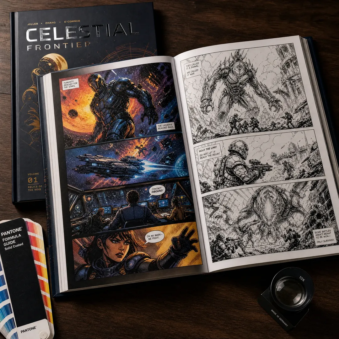
If your graphic novel uses full-color artwork, coated paper is the default choice for a reason. The coating seals the paper surface so ink sits on top rather than soaking in, which produces sharper dots, richer blacks, and colors that actually match what you see on screen — assuming your files are prepped correctly, which we will get to in the color management section. The most common coated stock for graphic novels is 128 gsm or 157 gsm gloss art paper. At 157 gsm, you get virtually no show-through from the reverse side, which matters a lot for double-page spreads.
There are two coating finishes to choose from: gloss and matte. Gloss coated paper gives you maximum color saturation and contrast — it is what Marvel and DC use for mainstream superhero books. Matte coated (sometimes called silk or satin) tones down the glare and gives a more subdued, gallery-like feel. Many indie graphic novelists prefer matte because it does not fight with reading lights and feels more literary. Either way, coated stock is what EcoPrinting recommends for any project where color is central to the storytelling. For a deeper dive, see our complete guide to coated paper options .
Uncoated Paper for B&W and Manga Aesthetic
Black-and-white graphic novels — and manga specifically — have a completely different relationship with paper. Uncoated stock absorbs ink slightly, which softens line edges just enough to create that warm, organic feel readers associate with the format. If you have ever held a translated manga volume from Viz or Kodansha, you know the texture: slightly toothy, lightweight, pleasant to flip through. That is typically 80–100 gsm uncoated woodfree paper, sometimes referred to as offset paper in the printing trade.
The tradeoff is that uncoated paper does not reproduce photographic color with any precision, so it is strictly for monochrome interiors. But for ink-heavy line art and screentone patterns, it is actually the superior option — the paper adds character rather than just being a neutral carrier. Many creators pair uncoated interiors with a color cover printed on coated stock, which we will talk about in the economics section. For more on uncoated options, check our uncoated woodfree paper guide .
Newsprint and Budget Options
Let us be blunt: newsprint is not for graphic novels. It yellows within months, tears easily, and makes color art look washed out before the reader even finishes chapter one. Newsprint works for single-issue floppy comics where the price point is $3.99 and nobody expects the book to survive a decade on the shelf. But if you are spending months — or years — creating a graphic novel that you want people to keep and reread, newsprint undercuts everything you built.
The budget-conscious alternative that actually holds up is lightweight uncoated paper in the 70–80 gsm range. It costs slightly more than newsprint but does not self-destruct, and it handles black-and-white line art respectably. For color work on a tight budget, a thinner coated stock around 100–105 gsm gets you color reproduction at a lower cost per page than 128 gsm, though you will see some show-through on heavier ink coverage areas. It is a compromise, but at least it is an informed one.
Graphic Novel Trim Sizes
Trim size is one of those decisions that feels cosmetic until you get it wrong. The dimensions of your book affect everything: how it sits on a bookstore shelf, how readers hold it, what printing presses can run it efficiently, and how your art is framed on each page. Here are the three sizes that cover the vast majority of graphic novel printing projects.
Standard US Comic Format: 6.625 × 10.25 Inches
This is the classic. If you walk into any comic shop in North America, most single issues and a good number of trade paperback collections are cut to 6.625 × 10.25 inches (168 × 260 mm). It is the native aspect ratio of American comics, and readers expect it. The format gives you a tall, narrow canvas that works beautifully for stacked panel layouts and vertical storytelling. Printing presses are set up for this size by default at most comic-focused printers, which means lower setup costs and faster turnaround. If you are publishing a superhero book or anything targeting the direct market, this is your size. Our complete book size guide covers additional regional variations.
Trade Format 7 × 10 Inches and Manga 5 × 7.5 Inches
The 7 × 10 inch format (sometimes called “trade paperback size”) has become the default for graphic novels sold through bookstores rather than comic shops. It is slightly wider than the standard comic format, which gives landscape panels more breathing room, and it matches the trim size of prose paperbacks on the shelf — a big deal when Barnes & Noble merchandises graphic novels next to traditional books. If your goal is bookstore distribution, 7 × 10 is the safer bet.
On the other end, manga traditionally prints at 5 × 7.5 inches (127 × 190 mm). This compact format keeps per-unit costs low, reads comfortably in one hand, and slides into a bag or jacket pocket. Japanese tankobon volumes are almost always this size, and English-language manga publishers have kept the convention. It works because manga art is designed for it — less detail per panel, bolder line weights, and page layouts that flow in the smaller frame. If you are creating original English-language manga (OEL manga), this is the format your audience expects.
Oversized Deluxe 8.5 × 11 Inches
Bigger is not always better, but when it is, it really is. An 8.5 × 11 inch (216 × 279 mm) format turns your graphic novel into an art object. Every panel gets more real estate. Every line and color gradation gets room to breathe. This is the format for books where the art is the main event — think European bande dessinée albums, art-book hybrids, or crowdfunded deluxe editions where backers are paying a premium and expect premium presence.
The tradeoffs are real, though. Larger pages mean heavier books, higher paper costs per copy, and shipping that costs more because dimensional weight kicks in. And not all offset presses run this size efficiently — you will want to confirm with your printer upfront rather than assuming. EcoPrinting runs this format regularly, so it is absolutely doable — just budget for it.
CMYK Color Management for Comic Art
This is the section where things get technical fast, but it is also the section that separates books that look professional from books that look like someone hit print on their home inkjet. Color management for graphic novel printing is not optional — it is the difference between your carefully chosen palette and a muddy mess.
Why CMYK Matters for Graphic Novels
Your screen uses RGB (red, green, blue) to display color. Printing presses use CMYK (cyan, magenta, yellow, black). The two color spaces do not overlap completely, and the RGB gamut is actually wider — meaning there are colors your monitor can show that no printing press on earth can reproduce. Electric neon greens, deep violet-purples, and certain bright oranges will shift when converted to CMYK, and if you do not do that conversion yourself in a controlled way, the printer’s RIP software will do it for you — with results you may not like.
For comic artists, the practical takeaway is: always work in CMYK from the beginning if you know the project is going to print, or at minimum convert to CMYK before sending files. Most professional coloring tools — Clip Studio Paint EX, Photoshop, Procreate (via export) — support CMYK workflows. If you are still working in RGB, convert using the FOGRA39 or GRACoL profile (your printer can tell you which), then check your blues and purples especially — those are the ranges where RGB-to-CMYK conversion causes the most visible shifts. For a detailed walkthrough, read our CMYK vs RGB guide .
Preparing Files: Color Profiles and Halftone Resolution
Resolution for print is straightforward: 300 DPI at final trim size. Do not upscale 72 DPI web images and hope nobody notices — everyone notices. For line art, 600 DPI or even 1200 DPI is preferable if your file sizes can handle it, because crisp black lines are what make comic art look like comic art.
Halftone screens are the invisible grid that translates continuous-tone color into printable dots. Standard line screen for graphic novel printing on coated paper is 175 LPI (lines per inch); for uncoated paper it drops to 133–150 LPI because the rougher surface cannot hold finer dots without them spreading. If you are printing at a shop that defaults to 150 LPI and you have not specified otherwise, your gradients and color blends will look slightly less smooth than they could. This is the kind of detail that separates decent-looking books from great-looking ones, and it is worth asking about before you sign off on a print run. Our print-ready artwork preparation guide walks through the entire checklist.
Spot Colors and Pantone for Special Effects
Spot colors use premixed ink — a specific Pantone formula — instead of building the color from CMYK dots. For most graphic novels, four-color process CMYK is all you need. But spot colors open creative doors that CMYK cannot reach: metallic golds and silvers, fluorescent pinks, or a specific brand color that has to match exactly across every copy. Spot UV coating — a gloss varnish applied to selected areas — is another technique that adds tactile dimension to covers. Imagine your title logo in gloss relief against a matte background, or a key panel on the cover that catches the light differently. It is not cheap — each spot color adds a plate and a press pass — but for limited editions and crowdfunding rewards, it creates a premium feel that justifies the cost. Read more about spot UV techniques here .
Color vs. Black-and-White Printing Economics
Color printing costs more than black-and-white. That is obvious. What is less obvious is how much more — and whether there are smart ways to split the difference.
Cost Difference: 4-Color vs. 1-Color Offset
Offset printing uses four plates for CMYK color work — one for each ink channel — plus makeready time to get registration and color balance dialed in. Black-and-white interior printing uses a single black plate. That alone makes B&W printing roughly 30–50% cheaper per page than full color at the same quantity. On a 128-page graphic novel printed at 1,000 copies, going B&W instead of full color can save you $1,500 to $3,000 on the print bill — money you could put toward a better cover finish, higher-quality paper, or a larger initial print run.
But cost is not the only factor. Some stories demand color. Some artistic visions fall apart without it. The economics matter, but they serve the book, not the other way around. The smart approach is to run the actual numbers with your printer, compare quotes side by side, and then decide whether the color budget makes sense for what you are trying to sell. For more on this decision, see our self-publishing printing comparison .
Mixed Approach: Color Covers + B&W Interiors
The mixed approach is one of the most common strategies in indie publishing, and for good reason. A full-color cover printed on coated stock with lamination does the heavy lifting at retail — it is what catches the eye on a table display or thumbnail in an online store. Meanwhile, black-and-white interiors keep the per-unit cost low enough that you can actually turn a profit at convention pricing. This is how most manga is published, and it is how a lot of successful Kickstarter graphic novels handle their print economics too.
One thing to watch: if you use a glossy coated cover stock with a matte uncoated interior, the tactile shift when a reader opens the book can feel intentional — like you deliberately chose each material for its purpose rather than trying to cut corners. But if you use an uncoated cover on a coated interior or vice versa without a clear reason, the mismatch can feel accidental. Be intentional about the material transition. For cover finishing options, our lamination guide explains glossy versus matte lamination in detail.
Binding: Trade Paperback vs. Hardcover
Binding is the skeleton of your book. It determines how the pages turn, how long the book lasts, and how it presents on a shelf. For graphic novel printing, three binding methods dominate.
Perfect Binding and PUR for Trade Paperbacks
Perfect binding — where pages are glued together at the spine with EVA (ethylene-vinyl acetate) adhesive — is the standard for trade paperback graphic novels. It is affordable, fast to produce, and familiar to readers. EVA glue works well for books up to about 200 pages, but it becomes brittle over time and does not handle extreme temperatures gracefully. Leave an EVA-bound book in a hot car and the spine may crack when you open it.
PUR (polyurethane reactive) adhesive is the upgrade. It costs slightly more than EVA but bonds pages far more durably, stays flexible across a wider temperature range, and allows the book to open wider without cracking the spine. For graphic novels — where readers often flatten books open to study double-page spreads — PUR binding is worth the small premium. It also works better with coated paper stocks, where EVA sometimes struggles to achieve a strong bond because the coating resists adhesive penetration. If you are printing more than 500 copies and want your books to survive rereading, go with PUR. See our perfect binding guide for complete specifications.
Sewn Hardcover for Premium Editions
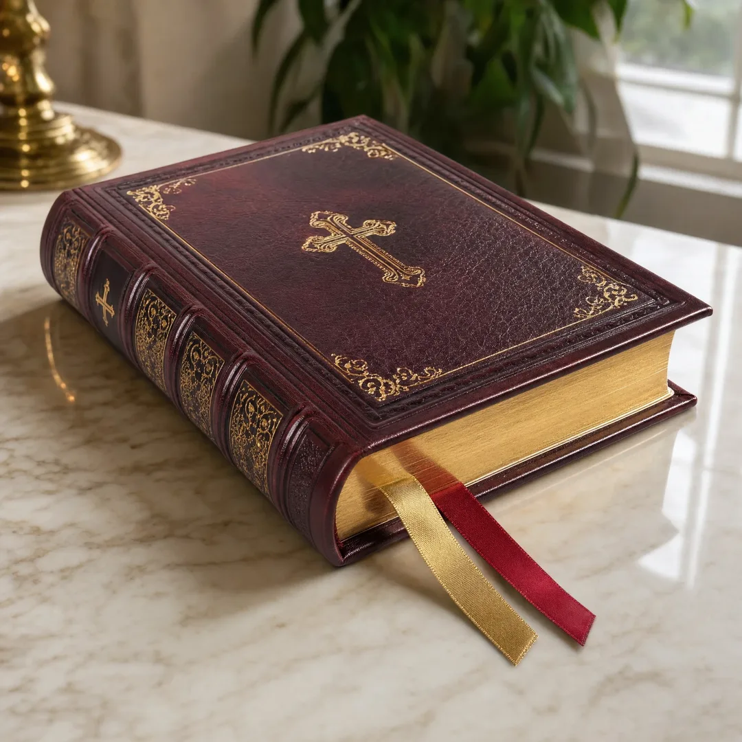
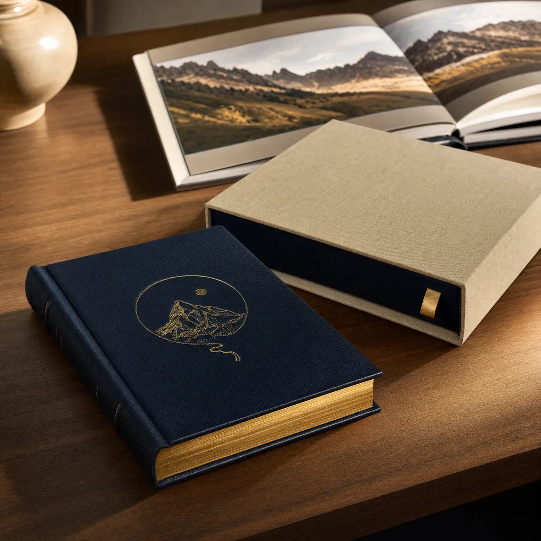
Smyth-sewn hardcover binding is what you choose when the book is meant to last decades, not years. Sheets are folded into signatures, stitched together with thread through the fold, and then cased into a hardcover board wrapped in printed paper or cloth. The result is a book that opens flat naturally, resists page detachment even with heavy use, and looks substantial on a shelf.
Sewn hardcover adds roughly $3–5 per copy over paperback at similar quantities, so it is typically reserved for deluxe editions, library market books, and crowdfunding tiers aimed at collectors. The production timeline is longer too — hardcover casing adds 5–10 business days to most print schedules. But for a graphic novel where the art quality justifies a permanent format, sewn hardcover is the gold standard. Compare the differences between our hardcover vs paperback and hardcover binding detail guides .
OTA Binding for Lay-Flat Art Spreads
OTA binding — short for Otabind, also marketed as RepKover or lay-flat binding — solves a specific problem that graphic novelists care about deeply: the gutter. In a conventionally perfect-bound book, the inner edges of double-page spreads disappear into the spine, which either hides art or forces you to avoid putting important details near the center of the spread. OTA binding attaches the book block to the cover via a glue strip on the side rather than the spine edge, creating a hinge that lets pages lie completely flat when the book is open.
The visual payoff is real. A two-page splash illustration in an OTA-bound book hits differently — no lost art in the crease, no fighting the binding to see the full image. The cost is roughly 15–25% more than standard perfect binding, and not every printer offers it, so you will need to ask specifically. For art-forward graphic novels where spreads are central to the storytelling, OTA binding can be the feature that makes your book stand out at a convention table. Check our full binding methods comparison for side-by-side specs.
Page Count and Signature Planning
If you have ever submitted a 102-page manuscript and had your printer come back with an awkward quote, signatures are why. Understanding how pages are grouped for printing will save you money, time, and frustration.
Standard Signatures: 8-Page and 16-Page Units
Offset printing presses print on large sheets that are then folded and trimmed into pages. These folded groups are called signatures, and they always contain page counts divisible by 4 — typically 8 or 16 pages per signature. That means your graphic novel’s total page count has to be divisible by at least 4, and ideally by 8 or 16, to print efficiently. If you submit a 98-page book, the press will print 100 pages with two blanks at the end — and you will pay for paper you are not using.
This also affects pricing. A 96-page book fits perfectly into six 16-page signatures. A 100-page book creates awkward partial signatures that waste paper and sometimes require additional makeready. The cost difference between 96 and 100 pages can be negligible per unit, or it can be noticeable — it depends on the press sheet layout your printer uses. Ask upfront. For design specifications, review our print-ready file preparation guide .
Page Count Conventions: 64, 96, and 128 Pages
Graphic novel page counts cluster around certain numbers for a reason. Single-issue comics run 22–32 pages plus cover. Collected trade paperbacks typically run 96–144 pages. Original graphic novels — where the story is conceived and published as a single volume — tend to land at 64, 96, 128, or 192 pages, all clean multiples of 16-page signature printing.
These are not arbitrary conventions. Printing costs per unit stay predictable at these counts, bookstore shelving expectations are built around them, and readers have a rough sense of what a 96-page book versus a 192-page book feels like in terms of reading commitment and value for money. If you are at 110 pages and can edit down to 96 or expand to 128, the printing economics usually favor one of the clean breakpoints.
What Happens When Page Count Does Not Fit Signatures
Short answer: you pay for the next clean multiple whether you use the pages or not. If your manuscript is 82 pages, a 16-page signature press setup means the printer will produce 96 pages — 82 of content plus 14 blanks. Those blanks cost you paper and sometimes press time, but they are unavoidable on offset equipment. Digital printing (toner-based, like Xerox iGen or HP Indigo) does not have this constraint because it prints single sheets rather than large press sheets folded into signatures, which makes digital a viable option for very short runs or odd page counts. But digital per-unit costs do not decrease with quantity the way offset does, so for runs over 300–500 copies, offset is almost always the better deal despite the signature constraint. Our 2026 book printing cost guide breaks down the digital vs. offset tipping points in detail.
Graphic Novel Printing Cost Breakdown
Let us talk actual numbers. The figures below are based on a standard 7 × 10 inch, 128-page graphic novel printed on 128 gsm coated paper, full-color throughout, with a 250 gsm coated cover and matte lamination. Prices are estimates for offset printing through a China-based printer like EcoPrinting — costs will be higher with domestic US or European printers, sometimes by a factor of two or more. For a complete overview of printing in China, see our guide to book printing in China .
500 Copies: Unit Cost and Setup Fees
At 500 copies, you are at the low end of where offset printing makes economic sense, but you are there. Expect a per-unit cost of roughly $4.50–$6.50 per book plus a one-time setup charge of $300–$500 for plates and makeready. At this quantity, the setup costs are amortized across fewer units, so they form a meaningful percentage of your total — roughly $0.60–$1.00 per copy just in setup. Your total print bill lands around $2,500–$3,800 before shipping. That comes out to $5–$7.60 per book. If you sell at $19.99 retail through conventions or direct-to-fan sales, your margin is healthy. Through distribution channels that take 40–55%, it tightens considerably. For further cost context, our detailed book printing cost page has additional scenarios.
1,000 Copies: Economies of Scale
At 1,000 copies, the per-unit cost drops noticeably because the same setup charges spread across twice as many books. Expect $3.00–$4.50 per book, with total print costs around $3,500–$5,000 including setup. The per-unit price at 1,000 copies is typically 30–40% lower than at 500, which is the single biggest percentage drop you will see at any quantity tier. This is the most common choice for Kickstarter-funded graphic novels with a built-in audience. At $3.50 per book and a $24.99 retail price, even with distribution discounts, the math works.
2,000 Copies: The Sweet Spot for Offset
At 2,000 copies, the economics really click into place. Per-unit cost drops to $2.20–$3.50, and total print spend lands around $4,800–$7,500. The paper cost per sheet stays constant regardless of quantity, but the press setup, plate costs, and bindery makeready get fully amortized. Beyond 2,000 copies, the per-unit price continues to drop but at a much slower rate — each additional thousand shaves off maybe $0.20–$0.40 per copy rather than the big jumps you see between 500 and 1,000.
A practical note: 2,000 copies is a lot of books. They take up significant storage space — roughly 30–40 cartons — and shipping from a printer in China by sea freight adds $400–$800 and 4–6 weeks of transit time. If you do not have a garage or storage unit ready, plan your fulfillment logistics alongside your print budget. For the complete picture on costs, timelines, and shipping, the book printing FAQ covers everything from order placement to delivery.
FAQ
What is the best paper for printing a graphic novel?
For full-color graphic novels, 128–157 gsm gloss or matte coated art paper is the standard because it reproduces color accurately with minimal show-through. For black-and-white or manga-style books, 80–100 gsm uncoated woodfree paper gives a warmer, more tactile reading experience that suits ink-based line art. The “best” paper depends on your art style, your budget, and how you want the book to feel in a reader’s hands — there is no single correct answer, only tradeoffs that you should make consciously. Our special paper guide covers additional options if you are looking for something distinctive.
How much does it cost to print 1,000 graphic novels?
For a 128-page, 7 × 10 inch, full-color graphic novel printed offset in China with PUR perfect binding and a laminated cover, expect to pay roughly $3,500–$5,000 for 1,000 copies, which works out to $3.50–$5.00 per book. The exact number depends on paper weight, page count, binding type, and finishing options. Domestic US printing at the same quantity typically runs 50–100% higher. Always get itemized quotes that break down paper, printing, binding, and shipping as separate line items — it makes comparisons between printers much easier.
Can I print a graphic novel in China?
Yes, and many indie publishers do exactly that. China-based printers like EcoPrinting offer offset printing at costs significantly below domestic rates, especially at quantities of 500 copies and above. Quality from established printers is on par with US and European shops — often on the same Heidelberg or Komori press equipment. The tradeoffs are longer lead times (4–8 weeks for production plus shipping), language barriers if you do not have an English-speaking account manager, and shipping logistics that require planning. Choose a printer with a track record of serving Western indie creators, ideally with client references or sample packs you can review before committing to a full run. For the complete picture, read our comprehensive China printing guide .
What file format should I send to the printer?
PDF/X-1a is the industry-standard format for print-ready files. It embeds all fonts, converts colors to the specified CMYK profile, and includes trim marks and bleed (typically 3 mm or 0.125 inches beyond the trim edge). Most printers also accept PDF/X-4, which supports live transparency, but X-1a is the safest choice because it flattens everything and removes variables that cause surprises on press. Do not send native application files (PSD, AI, INDD, CLIP) unless your printer specifically requests them. Every page should be a single page in the PDF, not spreads — the printer’s imposition software will handle the page pairing. Include 3 mm bleed on all edges and keep all important art and text at least 5 mm inside the trim line (the safe zone). See our print-ready artwork guide for a full checklist.