What Is Special Paper?
Walk through a bookstore and pick up a hardcover with a textured cover. Run your fingers across the grain. That tactile moment — the subtle ridges, the soft fibers catching light — is special paper at work.
Special paper refers to any paper that goes beyond standard coated or uncoated printing stocks. These papers carry distinct textures, embedded fibers, metallic finishes, or unique surface treatments. In book printing, they are most commonly used for covers, end sheets, dust jackets, slipcases, and occasionally interior pages in premium editions.
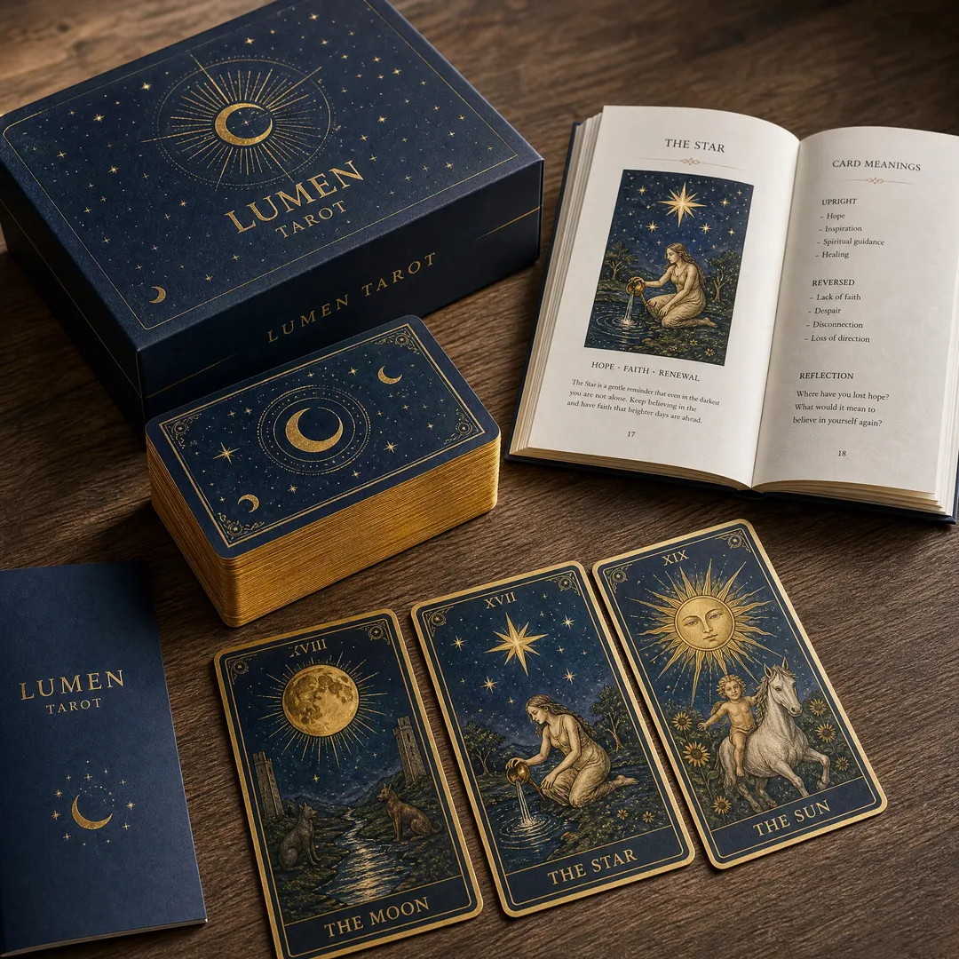
A linen-textured cover signals elegance before the reader opens page one. Parchment end sheets whisper vintage craftsmanship. A pearlescent dust jacket catches shelf-light differently. Each paper type tells its own story, and choosing the right one can determine whether a book gets picked up or stays on the shelf.
However, special paper is not just about aesthetics. Dark-colored special papers cannot reproduce full-color CMYK images — they require metallic or spot-color inks instead. Light-toned special papers in beige, light green, or pale pink can cause visible color cast when four-color images are laid over them. Understanding these constraints before you commit to a paper type will save time, money, and frustration at the proofing stage.
Types of Special Paper
Each special paper type brings a different personality to your book. Here are the five most commonly used varieties in book production — what they feel like, where they shine, and what to watch out for.
Parchment Paper
Parchment paper carries a marbled, slightly mottled surface with a translucent sheen, giving it the look of aged animal-skin parchment — but made from cellulose fibers treated for durability. It typically comes in the 90 to 150 GSM range for end sheets and covers, with natural cream and ivory tones being the most popular choices. Some mills produce colored variants in pale blue and soft green.
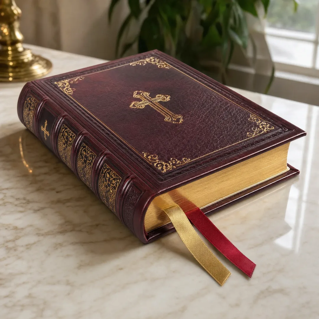
It works best for historical fiction dust jackets, poetry collections, wedding albums, and religious texts — any project that wants to feel timeless and personal. Printing requires planning: its slightly absorbent surface can dull ink vibrancy, so bold solid-color backgrounds may appear muted. CMYK works on lighter shades, but expect a warmer color shift. For darker parchment, stick to dark text or metallic foil stamping.
Synthetic Paper
Synthetic paper is a plastic-based substrate — typically polypropylene or polyester — that looks and feels like paper while being waterproof, tear-resistant, and exceptionally durable. Typical weights range from 100 to 300 GSM. The surface is smooth and non-porous, which means ink sits on top rather than soaking in, giving it excellent color reproduction with sharp, vibrant results.
It works best for children’s board books, outdoor field guides, marine manuals, and cookbooks that might encounter splashes. The main limitation is cost — synthetic paper is significantly more expensive than fiber-based stocks. It also requires UV-curable or oxidation-drying inks because standard offset inks will stay wet indefinitely on its non-absorbent surface. Heat sensitivity is another concern: it can warp under the high temperatures used in some digital presses.
Linen / Textured Paper
Linen paper features an embossed crosshatch pattern that mimics the weave of linen fabric. Hold it under light and you will see fine, regular lines creating a grid that catches shadows. Weight options range from 80 GSM text-weight to 250 GSM cover stocks built for case-bound hardcovers. The embossed texture is typically applied to one side only, with a smooth reverse that prints more predictably.
It works best for literary fiction hardcovers, business books, academic publications, and corporate annual reports — projects that communicate understated quality. Printing on the textured side requires care: fine text and thin lines can break across the raised pattern, and solid ink areas may show a subtle mottled effect. Save the textured side for bold typography and use the smooth reverse for detailed imagery.
Recycled / Kraft Paper
Kraft paper has a distinctive brown color and a coarse, fibrous texture that feels unprocessed and honest. Recycled variants blend post-consumer waste with virgin fibers, often retaining visible flecks that tell the story of their previous life. Weight ranges for book applications fall between 100 and 250 GSM, with 120 to 180 GSM as the sweet spot for softcover wraps.
It works best for environmental non-fiction, indie zines, artisan craft books, and sustainability-focused brand publications — the paper itself becomes part of the message. The printing challenges are real: kraft’s absorbency causes dot gain, making images darker and less sharp. CMYK color accuracy is difficult because colors always skew warm against the brown base. Many designers lean into this by using single-color or two-color designs, letting the paper’s character do the visual work.
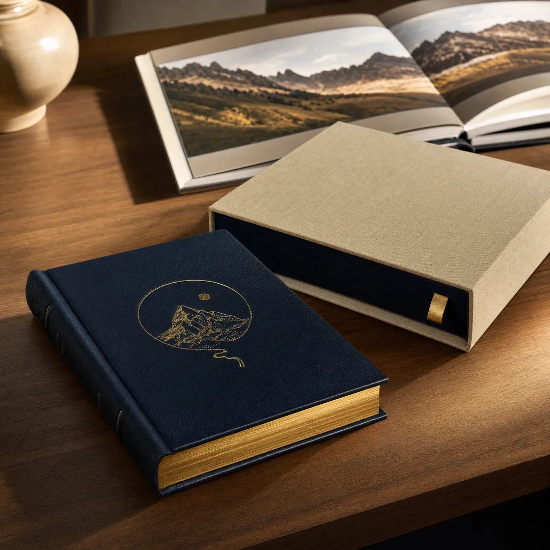
Metallic and pearlescent papers are infused with mica particles or metallic pigments, giving them an iridescent shimmer that shifts as light moves across the surface. Unlike foil stamping — which applies metal to specific areas — metallic paper shimmers across its entire surface. These papers come in weights from 100 to 300 GSM, with colors ranging from soft pearl white and champagne gold to deep copper and silver.
They work best for luxury book covers, limited-edition art books, wedding albums, and any publication where the cover needs to feel like a special occasion. Printing requires care: ink adhesion can be uneven on the mica-infused surface, and full-color images can look washed out against a strong shimmer background. Many designers print sparingly on these papers — a bold title, a single graphic element — and let the paper’s natural radiance carry the design.
Printing on Special Paper
Here is the critical rule every designer needs to internalize: CMYK inks are translucent. They rely on a white substrate beneath them to reflect light and create accurate color. Change the base color, and every color on top changes with it.
Dark Special Papers: Full-color CMYK images simply disappear against dark backgrounds. The translucent inks blend into the paper tone, producing a muddy ghost of your intended design. The solution: use metallic inks (gold, silver, copper) or spot-color (Pantone) inks. These opaque formulations sit on top of the paper, delivering clarity where CMYK cannot.
Light-Toned Special Papers: Papers in cream, soft green, pale blue, or blush pink can accept CMYK — but with a color cast. The base tone bleeds through the ink layers and shifts every hue. For example, cream makes whites warm and yellows more intense; pale blue cools down skin tones. The effect can be beautiful when intentional — a sepia-toned photograph on cream parchment feels cohesive. But when unexpected, it can ruin brand colors and product photography accuracy.
Spot Colors on Special Paper: When you need precise, predictable color on any special paper type, spot colors are the answer. A dedicated Pantone ink unit applies a single pre-mixed opaque color in one pass. This is especially powerful on dark papers where CMYK cannot function. The trade-off is cost: each spot color requires its own printing plate and ink wash-up.
Post-Press Finishing
Special paper and post-press finishing are a powerful combination. The right finishing technique on the right textured paper elevates a book from well-printed to unforgettable. Because special papers already have surface character, finishing processes interact with that texture in ways standard coated stocks cannot replicate.
Foil Stamping: Heated metal dies press a thin layer of metallic or pigmented foil onto the paper surface under high pressure. On linen paper, the foil sits on the raised peaks of the crosshatch pattern, creating a broken, artisanal metallic effect. Gold and silver are the classics, but rose gold, copper, and holographic foils open up creative possibilities beyond the traditional palette. A brass or copper die adds a one-time setup cost that is justified for runs in the hundreds and above.
Embossing and Debossing: Embossing raises a design above the surface; debossing presses it in. On special papers, the effect interacts with the existing texture — a debossed title on linen pushes the crosshatch pattern deeper into the relief, creating a double-texture effect. Blind embossing (without ink or foil) works especially well on parchment or kraft paper, where the contrast comes purely from light and shadow. For extra impact, combine foil stamping with embossing.
Spot UV Coating: Spot UV applies a high-gloss clear varnish to specific areas, cured with ultraviolet light. On matte special papers like kraft, a spot UV logo creates a striking gloss-against-matte contrast. The effect works best on relatively smooth surfaces; heavily textured papers may cause the coating to pool unevenly. Always test on a sample before committing.
Choosing the Right Special Paper
With so many options, making a confident choice can feel overwhelming. But the decision framework is simpler than it looks. Start with three questions.
Question 1: What does your book want to say before it is opened? Let the genre guide you. Literary fiction and memoirs lean toward linen and parchment for timeless elegance. Art books benefit from pearlescent paper’s luminous quality. Children’s books need synthetic paper’s durability. Environmental titles find their voice in recycled kraft.
Question 2: What is your printing plan? If your cover depends on full-color photography, dark special papers are out — they require metallic or spot inks. Light-toned papers will cause color cast, so budget for test proofs. If your design is minimalist — a bold title and a single mark — you have maximum freedom to use any paper with spot colors or foil.
Question 3: What is your budget reality? Special papers cost more than standard stocks, and synthetic or metallic papers can run two to three times the price of equivalent-weight coated paper. Finishing processes like foil stamping require custom dies. If budget is tight, use special paper selectively: a linen dust jacket over a standard case, or parchment end sheets with a conventional cover. You still get the tactile upgrade without the full premium.
When in doubt, ask for samples. A swatch book tells you more in five seconds of touch than any specification sheet ever will.
FAQ
Can I print full-color photographs on special paper?
It depends on the paper color. On light-toned special papers (cream, pale blue, soft green), yes — but expect a visible color cast because the base tone shifts every hue. On dark special papers, the answer is no. CMYK inks lack the opacity to show up against a dark background; use metallic inks or spot colors instead.
Which special paper works best for foil stamping?
Linen and parchment papers deliver outstanding foil stamping results. The texture creates a dimensional effect as the foil bonds to the raised surface areas. Smooth synthetic paper also takes foil well, yielding a glossy, mirror-like finish. Avoid heavily fibrous kraft paper for fine-detail foil work because the rough surface can cause uneven bonding.
Is special paper more expensive than regular coated paper?
Yes, often significantly. Synthetic and metallic papers can cost two to three times more than standard coated stock. Recycled kraft and some parchment varieties are more moderately priced. Factor in that special papers may also increase printing costs through slower press speeds, special inks, or additional setup time.
Can I use special paper for the interior pages of my book?
Technically yes, but it is unusual. Most special papers are designed for cover and end-sheet applications in the 100–250 GSM range, which is heavier than typical text paper (60–100 GSM). Using special paper throughout the interior dramatically increases cost and weight. Exceptions include premium art books and limited editions where the tactile experience is central to the product.
Does special paper work with digital printing?
It varies. Linen and parchment often run well on digital presses, though the embossed texture may cause toner adhesion issues. Synthetic paper can warp under high fuser temperatures. Metallic papers may not feed reliably. Always confirm compatibility with your printer and run a test before committing to a full print run.
Conclusion
Special paper is one of the most underutilized tools in a publisher’s arsenal. In a market where thousands of books compete for attention, a cover that feels different the moment someone picks it up gives you an instant advantage. The right paper communicates quality, taste, and intention before the reader reaches the first paragraph.
The key is treating special paper as a creative collaborator, not just a substrate. Dark papers demand spot colors. Light papers shift your palette. Textured papers make fine detail harder to reproduce. But when you work with those constraints instead of fighting them, the results can be extraordinary — a book that is not only read but remembered.
Ready to explore special paper options for your next book project? Get in touch with our team for a free sample pack and personalized paper recommendations tailored to your genre, design, and budget.