An Art Book Is Not a Book — It Is Your Work in Someone Else’s Hands
A photographer I worked with last year spent eleven months curating images for his retrospective. Every frame was processed on a calibrated Eizo monitor in a light-controlled studio. The prints he made for his gallery show were stunning — deep blacks, smooth tonal transitions, color that felt three-dimensional. Then he printed 200 copies of the catalog on standard 128 gsm coated stock with generic CMYK conversion and a perfect-bound spine. The gallery called him three days after delivery. “The images look nothing like your prints,” they said. “The blacks are washed out. The skin tones have a green cast. And the book won’t stay open on the viewing table.”
He had done everything right — or so he thought. What he had missed is that art book printing is a completely different discipline from commercial book printing. The paper has to hold color like a gallery print. The binding has to present spreads without losing image area to the gutter. The color pipeline has to be calibrated from capture to plate, not left to an automated RIP conversion. When the book is the artwork — not just a container for it — every material decision matters.
This guide covers what fine art book production actually demands: paper that renders color the way you intend, binding that honors the images rather than hiding them in the gutter, color management that translates your calibrated screen to ink on paper, format decisions that shape how viewers experience the work, and real production costs at three quantity levels. If you are an artist, photographer, gallery, or independent publisher preparing to print an art monograph, catalog, or portfolio book, this is the reference you need.
The Paper Makes the Print
In commercial book printing, paper is a substrate — something to carry ink. In art book printing, paper is the print itself. The surface texture, coating, weight, opacity, and color temperature of the paper directly determine what the reader sees. Choose wrong and you will spend months post-processing images to compensate for a material that was never right to begin with.
Coated Art Paper — The Workhorse That Works
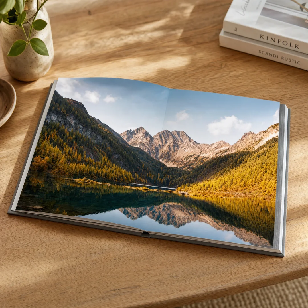
Coated art paper is the baseline for any art book with photography or illustration. The coating layer — a fine mineral compound pressed onto the surface — holds ink on top of the fiber rather than letting it soak in. The result is sharper dot reproduction, higher D-max (the deepest black the paper can produce), and wider color gamut than any uncoated alternative. For a photography monograph, coated art paper is non-negotiable.
Within coated papers, two decisions drive the outcome. The first is weight: 157 gsm is the minimum for single-sided printing where show-through from the reverse page would distract from the image. At 200 gsm, you approach gallery-print weight — the page has heft, opacity approaches 98%, and the book feels substantial in the hand. For a high-end art monograph, 200 gsm coated art paper is a reasonable investment; the per-copy material cost increases roughly $0.80–1.20 over 157 gsm, but the perceived quality difference is immediately obvious to anyone who picks up the book. For deeper specifications on coated stock grades, see our complete coated paper guide .
The second decision is finish: gloss versus matte. Gloss coated paper delivers the highest D-max and the widest color gamut — blacks look deeper, saturation is higher, and fine detail in highlights is better preserved. This is why most art and photography books use gloss stock. The trade-off is that gloss reflects ambient light aggressively. Under gallery track lighting or near a window, a gloss page can become a mirror. Matte coated paper diffuses light rather than reflecting it, producing a softer, more painterly rendering that many fine art photographers prefer for black-and-white work. It also eliminates the glare problem entirely. The color gamut on matte coated stock is roughly 10–15% smaller than gloss, and the D-max is lower — blacks will read as dark charcoal rather than true black. For color photography books, gloss is standard. For monochrome portfolios or paintings reproduced in an art catalog, matte often looks better and reads more comfortably.
Uncoated and Textured Papers — When the Surface Tells a Story
Some art books deliberately reject the clinical precision of coated paper. A painter might want the tooth of the paper to echo the canvas texture of the original work. A letterpress art book printed from hand-set type gains meaning from the impression pressed into thick cotton stock. An artist’s book — a conceptual work where the book form is the art — may use handmade washi, recycled kraft, or deckle-edged mould-made paper specifically for its tactile and visual qualities.
If you choose uncoated or textured paper, understand what you are trading away. Ink absorbs into fiber rather than sitting on the surface, which reduces contrast by 25–35% and compresses the color gamut significantly. Halftone dots spread unevenly on textured surfaces, softening fine image detail. These are not defects if the effect is intentional — they are characteristics that can enhance certain types of artwork. But they will ruin a photography book. The rule: if color accuracy and fine detail are priorities, use coated paper. If atmosphere, texture, and the physical experience of the page matter more than reproduction fidelity, uncoated and specialty papers open creative possibilities that coated stock cannot offer.
Opacity and Show-Through
Art books are often designed with full-bleed images that run to the edge of the page. When images on facing pages both have dense dark areas, ink show-through from the reverse side becomes visible at lower paper weights. At 128 gsm, show-through is noticeable on most coated stocks. At 157 gsm, it is minimal. At 200 gsm, it is effectively eliminated. If your book has heavy ink coverage — deep blacks, rich color saturation, full-bleed images on every spread — 157 gsm is the practical floor and 200 gsm is the professional standard.
Color Accuracy Is Not Optional
The single most common failure in art book production is color. An artist or photographer views their work on a calibrated screen, sends RGB files to the printer, and receives proofs where the colors have shifted in ways that feel unpredictable and wrong. This is not a printer error. This is the RGB-to-CMYK conversion happening at the RIP — the raster image processor that translates digital files into printing plates — without any of the control that would have been available if the conversion had been done manually upstream.
Why You Need ICC Profiles and Soft-Proofing
The gap between what your screen displays and what ink on paper can reproduce is real and measurable. An sRGB display can render approximately 16.7 million colors; a CMYK offset press on coated paper can reproduce roughly 400,000–600,000 distinguishable colors. That means roughly 96% of the colors your screen shows cannot be printed exactly as you see them. ICC profiles bridge this gap by describing how a specific printer-paper-ink combination renders color, allowing you to preview — accurately — what the printed result will look like before plates are made.
Ask your printer for their press-specific ICC profile. Most China-based offset printers working to international standards use FOGRA39 for coated paper and FOGRA47 for uncoated. If your printer cannot provide a profile, find another printer. Soft-proof in Photoshop or Lightroom using View → Proof Setup → Custom, load the printer’s ICC profile, and check Relative Colorimetric rendering intent with Black Point Compensation enabled. Pay attention to what happens in the shadows (below 15% luminance) and in highly saturated reds and blues — these are where gamut clipping is most visible. Make adjustments with the soft-proof active, not after the fact. For a comprehensive explanation of the RGB-to-CMYK pipeline, see our CMYK vs RGB guide .
The Hardcopy Proof — Do Not Skip This
A soft proof on your screen tells you roughly what to expect. A hardcopy proof — a physical print made on the actual press or a closely calibrated digital proofing system — tells you exactly what you will get. For art book printing, a hardcopy proof is not a luxury. It is the cheapest insurance available against printing hundreds or thousands of copies with off-color images.
Professional printers offer two proofing tiers. A digital contract proof (often made on an Epson or Canon large-format inkjet using the same ICC profile and paper type as the press run) costs $50–150 and takes 2–3 days. A press proof — a short run of a few signatures printed on the actual press — costs $300–800 and takes 5–7 days plus setup time. For a first art book project, a digital contract proof is the minimum. For a high-budget monograph where color precision is critical, a press proof is worth the cost. The proof is also your contractual reference: if the final print run does not match the approved proof within industry tolerances (typically ΔE ≤ 5), the printer is obligated to reprint.
Black-and-White Images on CMYK
Monochrome photographs printed on a four-color press present a specific challenge. CMYK black builds — mixtures of cyan, magenta, yellow, and black ink — can produce rich blacks with more depth than 100% K alone, but they are also prone to color casts from slight plate registration shifts. A monochrome image printed as a four-color build may show subtle magenta or cyan fringing under close inspection.
The approaches worth discussing with your printer: duotone printing, where the image is printed using black plus one additional ink (often a warm gray or cool gray), produces richer tonal range than 100% K alone and eliminates color cast issues. Alternatively, stochastic (FM) screening — which uses randomly distributed micro-dots instead of a regular halftone grid — eliminates moiré and produces smoother gradients in monochrome work at the cost of a $0.30–0.50 per-copy premium. For a black-and-white photography book, these are not marginal improvements; they are the difference between images that look like reproductions and images that look like silver gelatin prints.
Binding for Art Books — The Structure Must Serve the Images
A novel can be read with a binding that fights the reader a little. An art book cannot. The binding of an art book has one job that matters more than any other: present full spreads without losing image content to the gutter and without forcing the viewer to wrestle the book open. Every binding choice flows from whether the book will be looked at — on a table, in a gallery, on a collector’s shelf — or actively handled.
Smyth-Sewn Hardcover — The Gallery Standard
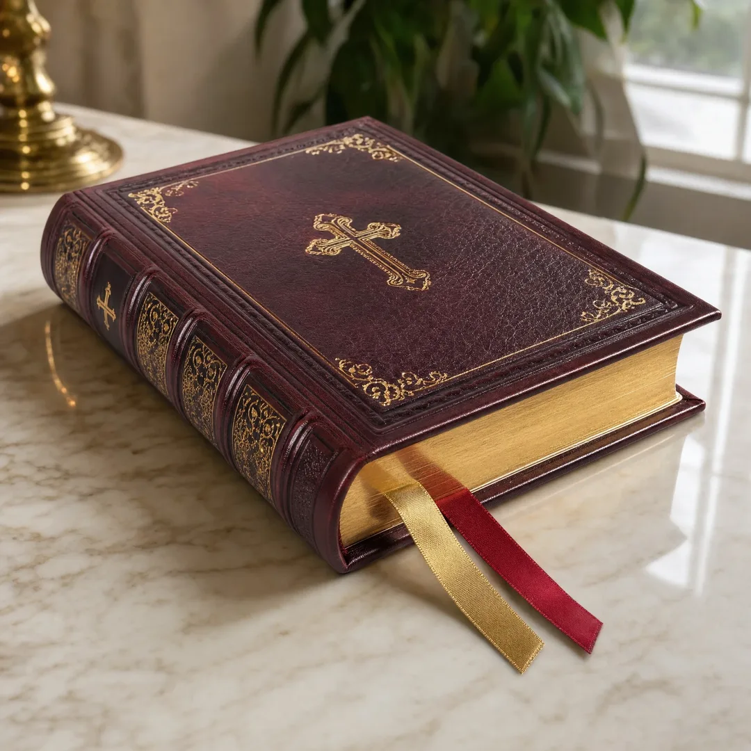
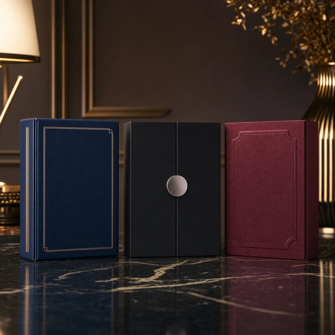
Smyth-sewn hardcover binding is what most people picture when they imagine a fine art book. Individual signatures — folded groups of sheets, typically 8 or 16 pages — are sewn together through the fold with thread, then the sewn block is glued into a rigid case wrapped in cloth, printed paper, or leather. Because each signature is independently hinged at the fold, a well-made Smyth-sewn hardcover opens relatively flat and distributes stress across the spine rather than concentrating it at a single glue line.
The critical specification for art books: the gutter loss. Even a Smyth-sewn book loses 3–5 mm of visible image area into the center fold on each page, and more — up to 8 mm — on pages near the center of thick signatures. If you have crossover images that span two pages, a 5 mm gutter loss means 10 mm of total image content disappears into the fold. The photo of a horizon line across a double-page spread will show a visible break. The solution is to build gutter compensation into your layout: add 3–5 mm of image bleed into the gutter on each page so the visible crossover aligns correctly. Talk to your printer about their specific gutter loss numbers before designing spreads. For a full breakdown of hardcover construction, see our hardcover binding guide .
Lay-Flat Binding — When Every Millimeter Counts
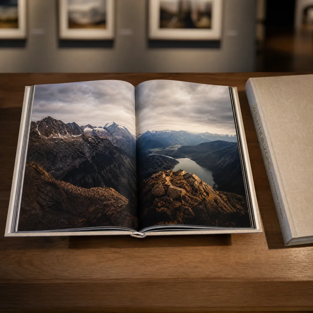
For photography books, exhibition catalogs, and portfolios where crossover spreads are central to the design, lay-flat binding is worth the investment. OTA-binding (also called open-flat or lay-flat perfect binding) uses a flexible glue and a detached spine that allows the book block to open completely flat. Unlike Smyth-sewn hardcovers, there is zero gutter loss — the two facing pages form a single continuous surface. The image crossing the spread is unbroken.
The engineering detail that matters: OTA-binding requires the book block to be trimmed on all four sides after gluing, which means the paper grain direction must run parallel to the spine. If your printer does not specify grain direction in their quote, ask. Paper folded against the grain produces wavy pages that resist lying flat, defeating the purpose of the binding. OTA-binding adds roughly $1.00–2.00 per copy over standard sewn hardcover at 500–1,000 copy quantities, but for a photography book with crossover images, the visual impact justifies the cost.
Swiss Binding and Exposed Spine — Aesthetics as Structure
Swiss binding is a hybrid: the book block is glued to the back cover only, leaving the spine exposed and the front cover unattached at the spine edge. When the book is opened, the spine reveals the raw binding tape, the thread, and the signature folds — the structure of the book becomes part of its visual language. Swiss binding is popular for design portfolios, architecture monographs, and artist’s books where the physical object is as considered as the images inside.
The technical constraint: the exposed spine has no protective case, so the binding is more vulnerable to wear and shelf damage. The paper on the spine edge of the signatures will pick up dust and handling marks over time. Swiss binding is best suited for editions where the book will be displayed and handled carefully, not for high-circulation library or institutional copies. Production cost is roughly comparable to Smyth-sewn hardcover, though the finishing work requires more hand labor.
Wire-O and Screw-Post — For Portfolios and Working Documents
Wire-O binding gives up the hardcover spine for complete 360-degree page rotation — the book opens flat and can be folded back on itself. This makes it the practical choice for photographer’s portfolios that need to be reviewed across a table, working proof books, and catalog raisonnés that will be consulted frequently. The metal wire loops are visible on the spine, which some clients find less prestigious than a hardcover; for a portfolio that is a working tool rather than a collectible object, the functionality outweighs the aesthetic concern. For detailed Wire-O specifications, see our Wire-O binding guide .
Screw-post binding uses metal posts threaded through drilled holes to hold loose pages or mounted prints. It is common for portfolio books where pages may need to be removed, reordered, or displayed individually. Screw-post books lie perfectly flat and allow maximum flexibility, but the binding hardware is visible and the book cannot be printed on the spine for shelf identification. Production cost is low — comparable to Wire-O — but the labor of assembly is manual and per-copy cost does not scale down as aggressively with volume.
Format Choices That Shape the Viewing Experience
The book’s dimensions are not just a design decision — they determine how the viewer’s eye moves across the image, how the book sits on a shelf or coffee table, and what printing equipment can accommodate the job. A format mismatch with the artwork is one of the hardest problems to fix after the fact; you cannot crop images that were composed for a specific aspect ratio without destroying the composition.
Portrait Format — The Intimate Vertical
Portrait-oriented books — typically in the range of 8.5″ × 11″ to 10″ × 12″ — mirror the proportions of most single-subject photographs and painted portraits. They feel natural to hold, they shelve easily, and they work well for images composed with a strong vertical subject. The limitation: crossover spreads in portrait format create a very wide (up to 24″ across) horizontal panorama that can feel disconnected — the left and right halves of the spread are far apart in the viewer’s visual field, which makes it harder to perceive the spread as a unified composition.
Landscape Format — The Gallery Wall
Landscape-oriented books — 11″ × 8.5″, 12″ × 10″, or wider — create a cinematic viewing experience. Crossover spreads feel cohesive because the two pages sit side by side in a roughly 3:2 proportion that mirrors the human field of view. Landscape books are harder to shelve (they stick out past standard shelf depth) and harder to hold comfortably for long viewing sessions because the weight distribution is wider. But for panoramic photography, architectural work, and any project built around horizontal compositions, landscape is the correct choice.
Square Format — The Gallery Statement
Square books — 10″ × 10″, 12″ × 12″ — are the coffee table book standard for a reason. They sit solidly on a flat surface, they feel substantial and deliberate, and they give equal visual weight to portrait and landscape compositions within the same book. The square format is also forgiving for mixed-orientation content: an image shot in portrait and an image shot in landscape both find their place without either orientation feeling cramped. The production consideration: square books use paper less efficiently than rectangular formats, which pushes per-copy cost up slightly — roughly 5–8% over an equivalent-page-count rectangular book. For a breakdown of standard sizes by market, see our book sizes guide .
The binding and format must be considered together. A landscape book with Smyth-sewn hardcover binding will fight the reader when opened — the wide page block puts leverage against the spine hinges. A landscape photography book really needs lay-flat binding. A square book with sewn hardcover works beautifully. A portrait book with any binding type is structurally neutral. Match the binding to the format, not the other way around.
What Art Book Printing Actually Costs
Art book printing costs more than standard book printing because the materials are heavier, the color requirements are stricter, and the binding is more labor-intensive. Below are real cost ranges based on current China-based offset printing prices. The spec: 10″ × 10″ square format, 144 interior pages on 200 gsm gloss coated art paper, full-color throughout (4/4), Smyth-sewn hardcover with linen-wrapped case, foil-stamped title on spine and front cover. Prices include platemaking and setup but exclude shipping and any import duties. These are ballpark estimates for early 2026 — use them for budgeting, not as a binding quote.
500 Copies
At 500 copies, you are at the minimum viable offset print run for an art book with sewn hardcover binding. Unit cost: $12.00–15.00 per copy. Total print cost: $6,000–7,500. Sea freight to a US or European port (roughly 7–9 kg per book, so 3,500–4,500 kg total): $800–1,200. Landed cost per book: $13.60–17.40. At this quantity, the book needs to retail at $45–65 to achieve healthy margins after trade discounts. This is viable for a gallery edition sold direct to collectors, but challenging for bookstore distribution where the standard trade discount is 40–50%.
1,000 Copies
At 1,000 copies, unit costs drop meaningfully: $8.50–10.50 per copy. Total print cost: $8,500–10,500. Sea freight: $1,200–1,800. Landed cost per book: $9.70–12.30. This is the quantity sweet spot for art books — costs are low enough to support bookstore distribution at a $40–55 retail price, and the print quality from offset production at 1,000 units is indistinguishable from gallery-edition quality. A full breakdown of how quantity drives unit cost across binding types is available in our book printing cost guide .
2,000 Copies
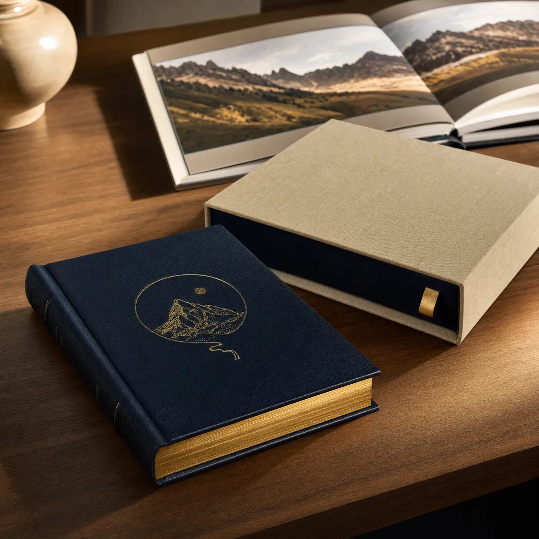
At 2,000 copies, the economies of scale become significant: $6.80–8.20 per copy. Total print cost: $13,600–16,400. Sea freight: $2,000–3,000. Landed cost per book: $7.80–9.70. At this quantity, a $35–45 retail price yields solid margins through all channels. This is also the quantity where specialty options — a slipcase, a ribbon marker, head and tail bands — become affordable line items rather than budget-busters.
Quantity
Binding
Paper
Unit Cost
Total Print Cost
Sea Freight (Est.)
500
Smyth-Sewn Hardcover
200 gsm Gloss Coated
$12.00–15.00
$6,000–7,500
$800–1,200
1,000
Smyth-Sewn Hardcover
200 gsm Gloss Coated
$8.50–10.50
$8,500–10,500
$1,200–1,800
2,000
Smyth-Sewn Hardcover
200 gsm Gloss Coated
$6.80–8.20
$13,600–16,400
$2,000–3,000
A note on lead times: from signed-off proofs to books on your doorstep, budget 5–8 weeks by sea freight (10–14 days printing and binding, 25–35 days shipping, 3–5 days customs clearance). Art books take longer in production than standard books because the heavier paper stock requires longer drying time between color passes and the hardcover casing-in process adds 2–3 days. Air freight cuts shipping to 5–7 days but adds $3.50–5.00 per copy for a book this heavy — only worth it for a hard launch deadline.
Frequently Asked Questions About Art Book Printing
What is the best paper for art book printing?
For photography and color-critical art books, 157–200 gsm gloss coated art paper is the professional standard — it delivers the widest color gamut, highest D-max, and best detail reproduction. For monochrome photography, matte coated paper at the same weight eliminates glare and produces a softer tonal range that many fine art photographers prefer. For painting catalogs where surface texture matters, consult your printer about textured art papers like Tatami or linen-embossed stock — but understand that texture will soften image detail. For a complete breakdown of paper options including specialty stocks, see our coated paper guide .
How do I ensure color accuracy when printing an art book?
Work in a calibrated color pipeline from start to finish. Calibrate your monitor using a hardware colorimeter (X-Rite i1Display or Datacolor Spyder). Convert images to CMYK manually using your printer’s ICC profile — do not send RGB files and trust the RIP. Request a hardcopy proof and review it under D50 (5,000K) standard viewing light. Compare the proof directly to your calibrated monitor with soft-proofing active. If colors do not match within acceptable tolerances, communicate specific adjustments to your printer before the full run proceeds.
What binding works best for a coffee table art book?
Smyth-sewn hardcover with a linen or cloth-wrapped case is the gallery and coffee table standard. It looks prestigious, it opens reasonably flat, and it protects pages when the book is stored or displayed. If the book features crossover images that span two pages, consider OTA lay-flat binding — it costs more but eliminates gutter loss entirely, allowing two-page spreads to read as a single continuous image. For portfolio books that need to fold completely flat on a table during reviews, Wire-O or screw-post binding are the practical choices despite the less traditional spine appearance.
What is the minimum order for art book printing from China?
Most China-based offset printers accept a minimum order of 300–500 copies for hardcover art books. Below 300 copies, the setup and plate costs are amortized across too few units, pushing per-copy cost prohibitively high. Digital printing is an option for quantities under 200 copies, but the paper choices are limited and color consistency across the run is harder to guarantee. For the full picture on print run economics, see our MOQ guide and our hardcover vs paperback comparison .
What file specifications do I need for art book printing?
Files must be PDF/X-1a format, CMYK with embedded ICC profile (FOGRA39 for coated paper), 300 DPI minimum at final placed size, with 3 mm bleed on all four sides. Text and critical image elements must stay at least 6 mm inside the trim line. For crossover spreads, add 3–5 mm of gutter bleed on the inside edge of each page. Fonts must be fully embedded or outlined. Do not submit RGB files, Word documents, Canva exports, or loose image files — prepress will reject them and the schedule will slip. For a step-by-step walkthrough, see our print-ready files guide .
An Art Book Is an Investment in How Your Work Is Remembered
The prints in a gallery show are seen by hundreds of people over the course of an exhibition. The book is seen by thousands, over years, on shelves and coffee tables and library collections. It outlasts the show. It travels farther. It is the version of your work that most people will encounter first and remember longest. That fact should shape every decision you make about paper, binding, color, and format.
Spend the money on heavy coated stock. Invest in a hardcopy proof and review it under proper lighting. Choose the binding that serves the images, not the one that looks familiar. Match the format to the composition of your work rather than forcing your work into a standard trim size. These decisions are not line items on a quote — they are what determine whether someone who opens your book sees your work the way you intended, or sees a compromised reproduction that flattens every careful choice you made in the studio.
If you are ready to get a quote for your art book project, EcoPrinting offers free file review and paper sample kits so you can feel the stock before committing to a print run. Our prepress team works with artists, photographers, and publishers to dial in color and match proofs before plates are made. No obligation, no pressure — just production expertise from a team that understands what an art book is supposed to be.