Cookbooks Are Not Novels — Get the Specs Wrong and Readers Notice Immediately
A friend of mine self-published a beautiful sourdough cookbook two years ago. The photography was stunning — golden crusts, airy crumb shots, flour-dusted countertops. She printed 300 copies on standard uncoated stock with a perfect-bound spine. Within three weeks, the complaints started rolling in. Pages wouldn’t stay open on the counter. A splash of olive oil on page 34 left a permanent stain. The vibrant red of her tomato focaccia had shifted to a muddy brown that made the dish look unappetizing. She sold out, but her Amazon reviews never recovered.
Cookbooks are the most technically demanding print category in the publishing world. A novel just needs readable text on decent paper. A cookbook has to survive the kitchen — flour, water, grease, steam, and being propped open with a can of beans. The binding has to lay completely flat. The paper has to resist stains and reproduce food colors accurately. Get any one of these wrong and your readers will tell you, loudly, in public reviews.
This guide walks through every decision you’ll face when you order cookbook printing as a self-publisher: paper selection, binding that actually stays open, cover lamination, color management for food photography, and — yes — real cost breakdowns with numbers you can budget against. No generic advice. Just what matters when ink hits paper in a professional print shop.
The Paper Inside Your Cookbook Makes or Breaks the Book
Paper is where most first-time cookbook authors make their first expensive mistake. They choose the same 80lb uncoated text stock they’d use for a novel — it feels nice in the hand, it’s affordable, and nobody told them otherwise. Here is the problem: uncoated paper absorbs oil, warps with moisture, and dulls food photography because ink soaks into the fiber rather than sitting on the surface.
Your paper choice affects three things simultaneously: how the food images look, how the book handles kitchen accidents, and how much the whole project costs per copy. Let’s break down the options that actually work.
Coated Paper for Food Photography
If your cookbook has full-color food photography — and most do — coated paper is the baseline. The coating (a thin layer of clay or mineral compound sealed onto the paper surface) prevents ink from absorbing deep into the fiber. Instead, the ink sits on top, which produces sharper dots, higher contrast, and more saturated color. For food images, this is the difference between a roast chicken that looks golden and appetizing versus one that looks flat and gray.
The industry standard for cookbook interiors is 128 gsm or 157 gsm gloss art paper. At 128 gsm, you get a sturdy page that feels substantial without making the book too thick. At 157 gsm, you get near cardstock-level opacity — important if your design includes full-bleed images that run to the edge of the page, because thinner paper allows show-through from the reverse side.
You will also encounter the C1S versus C2S decision. C1S (coated one side) means the coating is applied to only one face of the sheet. This makes sense for a cookbook with photos on one side and recipes on the other — the uncoated side takes pen ink if readers want to scribble notes. C2S (coated two sides) applies coating to both faces, which gives you maximum color pop but adds cost. Most commercial cookbooks use C2S because the photography is the selling point, and the extra $0.30–0.60 per copy in paper cost is almost always worth it.
One thing nobody tells you: gloss coated paper under kitchen lighting can create glare that makes recipes hard to read at certain angles. If your book will be used under pendant lights or near a window, consider matte coated art paper instead. It delivers 90% of the color quality with significantly less reflection. For a deeper dive into coated paper specs, see our complete coated paper guide .
Uncoated Paper — When a Rustic Feel Works
Uncoated paper has its place. If your cookbook is text-heavy — say, a family recipe collection or a narrative-driven food memoir with occasional photos — uncoated offset paper at 100–120 gsm can work beautifully. It has a tactile warmth that coated paper cannot replicate. The pages feel softer, the book is lighter, and the reading experience is more intimate.
The trade-offs are real. Uncoated paper shows grease stains almost instantly. A single fingerprint from buttered fingers becomes a permanent mark. Colors appear approximately 20–30% less saturated than on coated stock because the ink absorbs into the fiber. Black text looks deep gray rather than true black. If your book has any food photography beyond simple line drawings or ingredient shots, uncoated paper is a compromise you will probably regret.
Synthetic and Water-Resistant Paper
For the ultimate kitchen-proof cookbook, synthetic paper — most commonly sold under the Yupo brand — is worth understanding. Yupo is not actually paper. It is extruded polypropylene film that looks and prints like paper but behaves like plastic. It is 100% waterproof, tear-resistant, and wipes clean with a damp cloth. You can spill red wine across a full spread and wipe it off without a trace.
The downsides: synthetic paper costs roughly 3–5× more than coated art paper at equivalent thickness. It also requires special inks and drying time during offset printing, which pushes production costs higher. Most cookbook authors reserve synthetic paper for specific use cases — outdoor grilling guides, cocktail recipe books for bar use, or children’s cooking books where spills are guaranteed. For a standard kitchen cookbook, coated paper with a matte or gloss lamination on the cover (which we’ll get to) offers 95% of the practical protection at a fraction of the cost.
Binding Options That Actually Lay Flat on a Kitchen Counter
A cookbook that refuses to stay open is useless. You have two hands covered in flour, a timer counting down, and a recipe you need to reference. If the book snaps shut the moment you let go, the binding has failed its only job. Here are the binding methods ranked by how well they perform in a real kitchen.
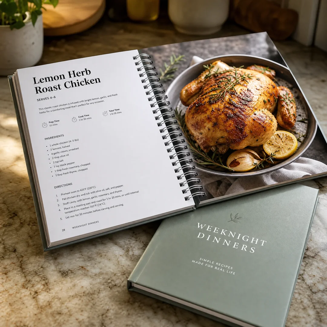
Spiral and Wire-O Binding — The Gold Standard
Wire-O binding (also called twin-loop, double-loop, or D-wire binding) is what most professional cookbooks use. Pages are punched with a series of holes along the binding edge, and pre-formed metal wire loops are inserted and crimped closed. The result: pages turn a full 360 degrees, the book stays open on any surface without a paperweight, and spreads align perfectly across the gutter — no step or misalignment between left and right pages.
The technical detail that matters: Wire-O comes in two pitch sizes. 3:1 pitch punches three holes per linear inch — this is used for books up to roughly 120 pages because the smaller holes and closer spacing look more refined. 2:1 pitch punches two holes per inch and uses thicker wire, making it the right choice for cookbooks with 120–250+ pages. If you try to bind a 180-page cookbook in 3:1 pitch, the wire won’t close properly and pages will snag during turning. If you use 2:1 pitch on a 60-page book, the binding looks clumsy and oversized.
Plastic spiral coil binding is Wire-O’s less expensive cousin. It uses a continuous plastic coil threaded through punched holes rather than individual metal loops. The coil is more crush-resistant — step on a Wire-O book and the loops bend permanently; a plastic coil book may survive. But plastic coil allows a slight vertical step between pages on opposite sides of a spread, which can break a crossover image. For cookbooks where food photography spans two pages, Wire-O is worth the premium.
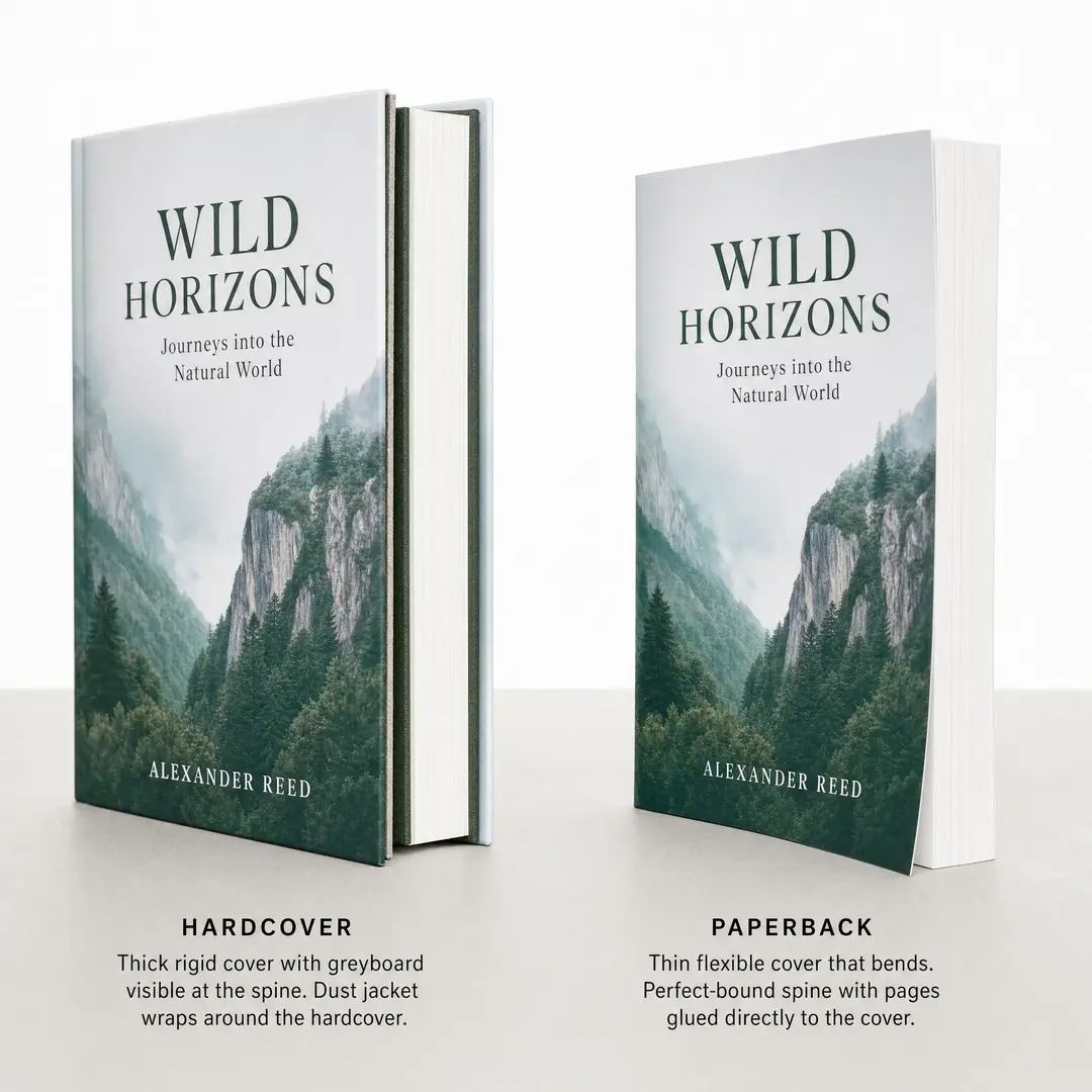
Sewn Hardcover — Lay-Flat Without the Wire Look
Some cookbook authors want a bookstore-quality hardcover that still opens flat. Smyth-sewn binding is the answer. Individual signatures (groups of folded sheets, typically 16 or 32 pages each) are sewn together through the fold with thread, then the entire book block is glued into a hard case. Because the sewing creates a flexible hinge at each signature, a properly made sewn hardcover opens much flatter than a perfect-bound paperback.
The combination to ask for: Smyth sewing plus a rounded spine. The rounded spine distributes tension across the binding and prevents the spine from cracking when the book is opened wide. A square-backed sewn hardcover will fight you. A round-backed one will cooperate. Expect to add $1.50–2.50 per copy over Wire-O binding at quantities under 1,000. For a premium cookbook with a $30+ retail price, the hardcover is often the right move — but verify with your printer that their Smyth-sewn books actually lay flat before committing. Not all do.
Saddle Stitch and Perfect Bound — When They Work, When They Don’t
Saddle stitching (stapling through the fold) is the cheapest binding method, typically used for booklets up to 64 pages. If your cookbook is a short community fundraiser or a thin recipe zine, saddle stitch is adequate. Pages lay reasonably flat, and the cost is minimal. Beyond 64 pages, the spine bulges and the staples can’t hold.
Perfect binding — the glued spine you see on most paperbacks — is the binding most first-time cookbook authors mistakenly choose. It looks professional on the shelf. It has a printable spine for the title. But it does not lay flat. Period. A perfect-bound cookbook fights you every time you try to keep it open. The glue spine cracks with repeated use. After six months in a kitchen, the book will fall open to the same three recipes because the spine has broken in those places, while every other page resists. For a cookbook, perfect binding is almost always the wrong choice.
Here is a quick comparison to reference when you are talking to printers:
Binding Type
Lays Flat?
Durability
Cost Level
Best For
Wire-O / Twin-Loop
Yes — 360° turn
Good (bendable)
$$
Working cookbooks, 80–250 pages
Plastic Spiral Coil
Yes — 360° turn
Very good (crush-resistant)
$
Budget cookbooks, high-use kitchen books
Smyth Sewn Hardcover
Mostly — varies by printer
Excellent
$$$
Premium gift cookbooks, 120+ pages
Perfect Bound
No — snaps shut
Fair (spine cracks)
$
Not recommended for cookbooks
Saddle Stitch
Mostly flat
Low (staples)
$
Thin recipe booklets, ≤ 64 pages
For a detailed breakdown of Wire-O specifications and design requirements, see our Wire-O Binding Guide .
Cover Design: Matte, Gloss, or Soft-Touch Lamination
The cover of a cookbook is not just a design element — it is the first line of defense against kitchen grime. It gets wiped down, handled with wet hands, propped against backsplashes, and tossed into shopping bags. The lamination you choose determines how well it survives.
Gloss Lamination
Gloss lamination puts a shiny, reflective film over the entire cover. It makes colors pop — reds look richer, blacks look deeper, and full-bleed food photography on the cover has a magazine-cover vibrancy. Gloss lamination also fingerprints far less than matte. Run a greasy finger across a gloss-laminated cover and it wipes away with a single pass of a cloth. This is why restaurant menus and high-use cookbooks lean toward gloss.
The downside: gloss lamination reflects kitchen lighting aggressively. If your cookbook’s cover design relies on subtle gradients or fine typography, the glare can wash it out under bright pendant lights. Also, gloss shows scratches more visibly over time — every micro-abrasion catches the light.
Matte Lamination
Matte lamination has a soft, velvety surface that scatters light rather than reflecting it. It feels premium. It reads beautifully under any lighting condition. It is the default choice for high-end cookbooks that will live on coffee tables as much as kitchen counters.
The practical problem: matte lamination is a magnet for grease marks. A single fingerprint from buttered hands leaves a visible dark smudge that does not wipe away cleanly. After a year of kitchen use, a matte-laminated cover can look permanently dirty along the edges. For a daily-use working cookbook, this is worth considering.
Soft-Touch Lamination
Soft-touch lamination (sometimes called velvet lamination) is a matte film with a tactile additive that makes the cover feel almost rubbery — smooth, warm, and slightly grippy in the hand. It is the most premium lamination option and delivers a distinctly luxury unboxing experience. Readers notice it immediately.
The kitchen durability question: soft-touch film is more scratch-resistant than gloss, but it has the same grease-mark visibility problem as standard matte. The rubbery texture can also pick up dust and flour residue more readily. For a cookbook that will be displayed and occasionally used, soft-touch is a beautiful choice. For a daily workhorse in a busy kitchen, gloss lamination probably holds up better over time.
Cover Board Thickness
One more thing: specify your cover board thickness. Standard paperback covers use 250–300 gsm cardstock. A cookbook cover should be at minimum 300 gsm, and ideally a hardcover case with 2.0 mm or 2.5 mm greyboard underneath. The extra rigidity prevents the cover from curling when it sits on a slightly damp counter. It’s a $0.15–0.30 per-copy difference at quantity and it pays for itself in the first week of use. See our lamination guide for more on finish options.
Color Management: Why Your Food Photos Look Different on Paper
Here is a scenario that plays out every week in a print shop somewhere: an author submits their cookbook files and the first proof comes back. The vibrant strawberry tart on page 12 now looks like a tomato. The golden roast chicken has turned orange. The deep chocolate ganache reads as black sludge with no detail in the shadows. The author panics. This is not a printing error. This is the RGB-to-CMYK conversion that nobody warned them about.
Why CMYK Is Non-Negotiable
Your camera, your monitor, and your phone all display color in RGB (red, green, blue) — an additive color model where mixing all colors produces white light. Offset printing uses CMYK (cyan, magenta, yellow, black) — a subtractive model where layered ink absorbs light rather than emitting it. The two color spaces have fundamentally different gamuts. Some colors your screen can display simply cannot be reproduced with ink on paper.
Food photography hits the worst parts of the RGB–CMYK gap. Bright, saturated reds in tomatoes and strawberries lie near the edge of the sRGB gamut and often fall outside the CMYK printable range entirely. The conversion shifts them toward brick-red or orange. Greens in fresh herbs and vegetables shift toward olive. The golden-brown Maillard tones on roasted food — the most appetizing colors in food photography — require a careful balance of yellow and magenta with minimal cyan, and an automatic conversion rarely gets this right.
The fix: do your own CMYK conversion in Photoshop or InDesign before submitting files, using the correct ICC profile for your printer’s press conditions. If your printer uses FOGRA39 (common in Europe and increasingly in Asia), convert to that profile. If they use GRACoL or SWOP (common in North America), use those. Ask your printer which ICC profile they recommend. Do not send RGB files and hope the RIP handles it — by that point, you have surrendered all control.
Full-Color Printing Specifications for Cookbooks
All cookbook pages with photography should be printed 4/4 (full-color both sides). Black-and-white interiors waste the food photography and immediately signal “budget” to buyers. For screen ruling, specify 175 LPI (lines per inch) as your minimum. At 150 LPI, halftone dots become visible to the naked eye in smooth gradients like a sunset sky or a creamy soup. At 175 LPI, the dot pattern is fine enough that the eye perceives continuous tone. Some premium art books go to 200 LPI, but for a cookbook, 175 LPI is the sweet spot between quality and cost — the press setup time is the same, and the plate cost difference is negligible.
Stochastic (FM) screening is an option worth asking about. Instead of a regular grid of halftone dots, stochastic screening uses randomly distributed micro-dots that eliminate moiré patterns and produce smoother gradients. It adds perhaps $0.30–0.50 per copy at small quantities but makes a visible difference in food images with fine texture — think the crumb structure of bread, the grain of sliced meat, or the seeds on a strawberry.
Common Color Mistakes in Food Printing
Three issues come up again and again in cookbook proofs:
Over-saturated reds. Strawberries, tomatoes, red bell peppers, and rare steak all suffer from a phenomenon called “gamut clipping” — the printer’s CMYK gamut cannot reproduce the red your camera captured, so it clips to the nearest printable red, which is almost always too orange and too saturated. The solution is selective desaturation of the red channel during prep — counterintuitive, but it brings the color back into the printable range and actually looks more natural on paper.
Muddy shadows in chocolate and dark sauces. Dark food subjects — chocolate ganache, soy-glazed meat, black bean soup — need shadow detail to look appetizing. If the total ink coverage (TAC) exceeds 300%, the shadows become a solid, featureless dark blob. Set your black generation to GCR (Gray Component Replacement) with a TAC limit of 280–300% in your color settings, and boost the black channel slightly to preserve shadow definition without blowing out the CMY layers.
Inconsistent skin tones on meat. Roasted chicken, pork chops, and grilled fish all have subtle variations in pink-brown tones that the human eye is extremely sensitive to. A slight magenta shift makes chicken look undercooked. Too much yellow makes pork look grey. The fix is manual curve adjustment on the magenta channel — a small pull-down in the midtones is often all it takes.
What Cookbook Printing Actually Costs: Real Numbers for Self-Publishers
Talking about print costs in vague terms helps nobody. Here are three real scenarios based on current China-based offset printing prices for a standard cookbook spec: 8.5″ × 8.5″ square format, 160 interior pages on 157 gsm coated art paper (C2S), full-color throughout (4/4), Wire-O binding, and a 300 gsm cardstock cover with gloss lamination. Prices include platemaking and setup but exclude shipping and any import duties. These are ballpark figures from early 2026 — use them for budgeting, not as a binding quote.
500 Copies
At 500 copies, you are at the minimum offset print run for most Chinese printers. Below this quantity, digital printing makes more sense but sacrifices color consistency and paper options. Unit cost lands around $5.80–7.20 per copy, giving a total print cost of $2,900–3,600. Sea freight shipping (25–35 days to a US port) adds roughly $400–600. Your all-in landed cost is roughly $3,300–4,200, or $6.60–8.40 per book on your doorstep. This is the quantity where you break even at a $19.99 retail price if you sell roughly 200 copies direct at full margin (no Amazon cut).
1,000 Copies
At 1,000 copies, you cross into a more comfortable unit economics zone. The same spec drops to $4.20–4.90 per copy. Total print cost: $4,200–4,900. Sea freight shipping: $550–750. Landed cost per book: $4.75–5.65. At this quantity, a $19.99 retail price gives you healthy margins even after Amazon’s 40% print-on-demand royalty structure, making it viable to sell through multiple channels. For a detailed breakdown of how print quantities affect cost, see our book printing cost guide .
2,000 Copies
The economy of scale really kicks in around 2,000 copies. Unit cost drops to $3.30–3.80 per copy. Total print cost: $6,600–7,600. Sea freight: $700–950. Landed cost per book: $3.65–4.28. At this quantity, you are in a strong position — your per-unit cost is low enough to offer wholesale pricing to independent bookstores (typically 40–50% off retail) and still make money. This is also the quantity range where printers may offer to absorb plate costs or throw in a few extras like rounded corners or a ribbon marker at no additional charge.
Quantity
Binding
Unit Print Cost
Total Print Cost
Sea Freight (Est.)
500
Wire-O
$5.80–7.20
$2,900–3,600
$400–600
1,000
Wire-O
$4.20–4.90
$4,200–4,900
$550–750
2,000
Wire-O
$3.30–3.80
$6,600–7,600
$700–950
One note on lead time: from file approval to books arriving at your door, budget 5–7 weeks by sea freight (8–10 days printing, 25–35 days shipping, 3–5 days customs clearance and final delivery). Air freight cuts shipping to 5–7 days but adds roughly $2.00–3.50 per copy depending on weight — only worth it if you have a launch deadline you cannot move.
Special Finishes That Make a Cookbook Feel Premium
The difference between a cookbook that feels self-published and one that feels professionally produced often comes down to three small finishing choices.
Water-Resistant Cover Coating
Lamination provides the primary protection, but the type of coating underneath matters too. Aqueous coating is a water-based seal applied during printing that provides basic scuff resistance and dries fast. UV coating is cured with ultraviolet light and creates a harder, glossier surface — it adds about $0.15–0.25 per cover but provides noticeably better moisture resistance. Film lamination (gloss or matte) goes over the coating and is the real workhorse: it is a thin plastic film heat-sealed to the cover that makes it essentially waterproof. For a kitchen cookbook, film lamination is the standard. Skip it to save money and you will regret it within a month.
Rounded Corners
Square corners on a cookbook cover get dog-eared fast. They catch on apron pockets, bend in tote bags, and eventually split open at the tip. Rounded corners eliminate this failure point entirely. They also make the book safer in the kitchen — a sharp 90-degree corner near a hot stove or a busy prep area is an accident waiting to happen. Die-cutting rounded corners adds roughly $0.10–0.20 per copy at quantity and improves both durability and perceived quality. Most premium cookbooks use a 6–8 mm radius.
Ribbon Marker and Pocket Pages
A sewn-in ribbon bookmark costs about $0.08–0.12 per copy. It lets readers mark their place without a greasy finger or a random scrap of paper, and it signals that you thought about how the book would actually be used. A pocket page (a folded sheet tipped into the back cover) costs a bit more — maybe $0.25–0.40 per copy — but gives readers a place to stash recipe clippings, shopping lists, or conversion charts. These are small costs that generate disproportionate goodwill.
Frequently Asked Questions About Cookbook Printing
What is the minimum order quantity for cookbook printing?
For offset printing — the method that delivers consistent color and gives you full control over paper and binding — most China-based printers accept a minimum of 500 copies. Some will take 300 for softcover or Wire-O binding, though the per-unit cost becomes much higher. Digital printing has no practical minimum (you can print one copy), but your paper options shrink to a handful of stock choices and color consistency across a run is less reliable. If your cookbook has heavy food photography, offset printing at 500+ copies is the standard recommendation. For more on the hardcover versus softcover decision, see our hardcover vs paperback guide .
How long does cookbook printing and shipping take from China?
Production time averages 8–12 working days from file approval to finished books, assuming no revisions after the proof stage. A hardcopy proof adds roughly 5–7 days (including courier delivery) but is strongly recommended for first-time cookbook projects — the proof reveals color shifts and binding behavior that a PDF on screen cannot. Sea freight to US or European ports takes 25–35 days. Air freight takes 5–7 days. Budget 5–7 weeks total for sea freight and 3–4 weeks for air freight, including customs clearance and final delivery.
Can I get a sample or proof before the full print run?
Yes, and you should insist on it. Most professional printers offer two options: a digital proof (PDF soft proof, free or low cost) and a hardcopy proof (a physical printed copy, typically $50–100 including courier shipping). The digital proof confirms layout, pagination, and text. The hardcopy proof is what tells you whether the roast chicken looks appetizing or alarming. For a first-time cookbook project where color fidelity matters, a hardcopy proof is not optional — it is the cheapest insurance you can buy against printing 1,000 copies of a book with off-color food photos.
What file format should I submit for cookbook printing?
PDF/X-1a is the industry standard. It embeds all fonts, converts images to the CMYK color space with the ICC profile baked in, and flattens transparency so nothing shifts during RIP processing. Submit one PDF for the cover (including spine and back cover as a single spread, with bleed) and one PDF for the interior. Interior files should be single pages, not reader spreads, in reading order. Every image must be at least 300 DPI at its placed size. Do not submit native InDesign or Illustrator files unless your printer specifically requests them — and even then, always include a packaged PDF/X-1a as your reference. For a complete walkthrough, see our print-ready files guide .
Your Cookbook Deserves Better Than a Generic Print Job
Writing a cookbook takes hundreds of hours — recipe testing, photography, layout, editing, tasting, re-testing. By the time you are ready to print, you have poured months of work into every page. The printing is the last mile. It is also the part where most self-publishers compromise, because the decisions feel technical and the cost difference between “good enough” and “right” seems significant on the invoice. It is not significant compared to what the book cost you to create. And it is definitely not significant compared to what bad reviews cost you in lost sales.
Get the paper right. Get the binding right. Convert your own CMYK. Order a hardcopy proof. These four decisions separate the cookbooks that readers treasure and recommend from the ones that sit on a shelf with a cracked spine and stained pages. You have already done the hard part. Now finish it properly.