Your Work Deserves More Than a Thumbnail Gallery
I’ve been on both sides of the table. As a designer, I once handed a prospective client a tablet to swipe through my portfolio. They nodded politely, scrolled for maybe twelve seconds, and handed it back. No questions. No follow-up. That project never materialized. Six months later, I brought a printed portfolio book to a different pitch meeting. The potential client spent four minutes with it. They touched the pages. They asked about the paper. They noticed the foil-stamped logo on the cover before I even mentioned it. We signed the contract the following week.
The difference wasn’t my work — it was the medium. A printed portfolio or lookbook doesn’t just show what you make. It tells people how seriously you take it. The weight of the paper, the way a spread lays flat, the color fidelity on a full-bleed photograph — every one of those details communicates intention. In a world where most creative work gets consumed on screens at 72 dpi, handing someone a beautifully printed book is a power move. This guide walks you through every decision that goes into printing a portfolio or lookbook that people actually want to hold onto — from choosing the right binding to understanding why paper weight and coating matter more than you think.
Portfolio vs. Lookbook
What exactly is the difference?
A portfolio and a lookbook serve two fundamentally different purposes, even though they often share similar production methods. A portfolio is about you — the photographer, the illustrator, the architect, the designer. It is a curated selection of your best work, assembled to win jobs, secure gallery representation, or apply for competitive programs. The audience is a decision-maker: an art director, a curator, a potential client who needs to be convinced that you are the right person for the project.
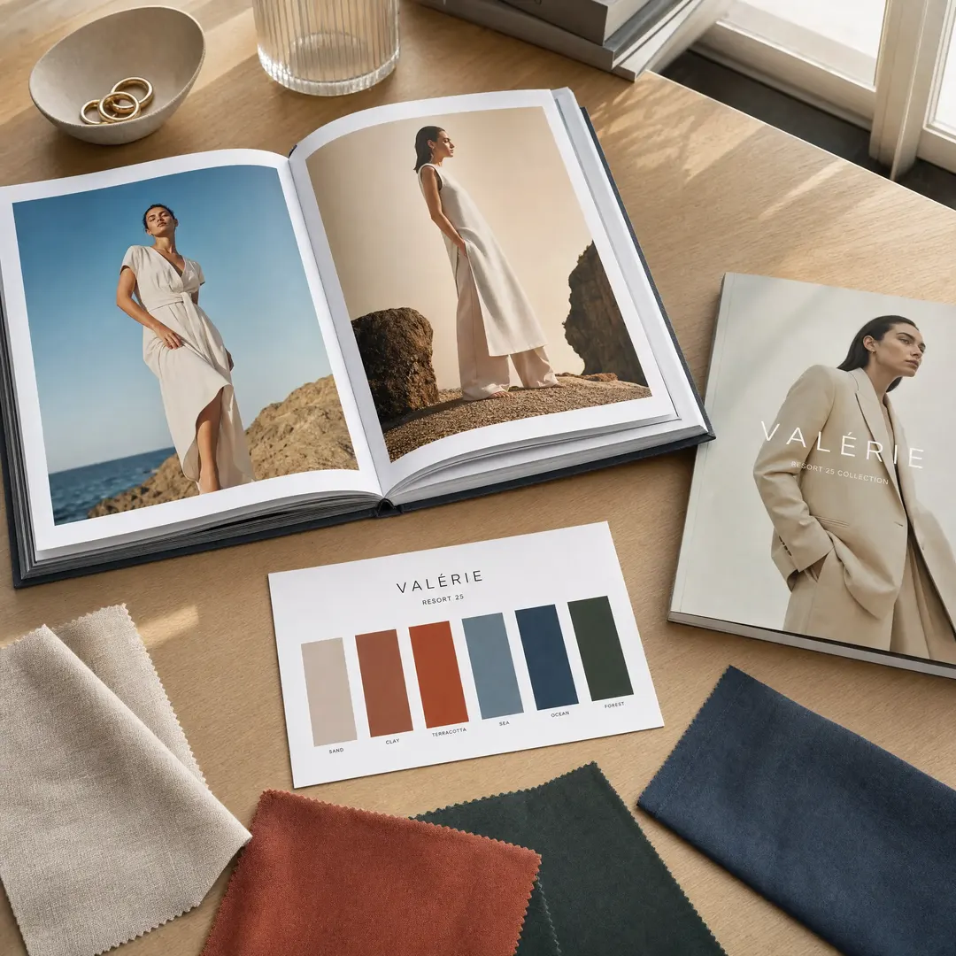
A lookbook, by contrast, is about the brand or the collection. Fashion labels use them to present seasonal lines to buyers and press. Interior designers use them to showcase completed projects. Product brands use them to tell a visual story around a new launch. The audience is a buyer, a stylist, a journalist — someone who needs to fall in love with the collection, not necessarily the person who made it. Lookbooks emphasize narrative, mood, and styling. They are image-heavy, text-light, and designed to be flipped through quickly.
How the design approach changes
Portfolios tend to favor clean layouts with generous white space. Each image gets room to breathe because each image is meant to be studied. Captions are minimal — usually just the project name, client, and your role. The sequencing matters enormously because you are telling the story of your capability. A strong opening spread, a varied middle, and a memorable closer — that is the rhythm most successful portfolio books follow.
Lookbooks lean into editorial energy. Full-bleed photography, dynamic layouts, mixed typography, and contextual lifestyle shots dominate. Text might appear as pull quotes, brand messaging, or short product descriptions. The pacing is faster — spreads change tone and composition frequently to hold attention through the entire book. If a portfolio is a solo exhibition, a lookbook is a runway show.
Who reads what — and why it matters
Understanding your audience shapes everything from paper choice to binding. A portfolio going to a photography agent needs immaculate color reproduction and a binding that lets spreads sit flat for close inspection. A lookbook mailed to retail buyers needs to survive shipping, look expensive, and convey the brand’s identity in under ten seconds. The same printer can produce both — but the specifications should diverge at every decision point after the file export.
Size and Format
Portfolio dimensions that work
Standard portfolio sizes cluster around A4 (210 × 297 mm) and A5 (148 × 210 mm), with square formats like 210 × 210 mm gaining traction among photographers and fine artists. A4 gives you enough real estate to present detailed architectural drawings or full-page photographs without forcing the viewer to squint. A5 is more portable — it fits in a tote bag and feels intimate when handed across a table. Square formats create a distinctive object that stands out in a stack of rectangular books, but they force you to think differently about composition since every image must work within equal sides.
If your work is highly detailed — technical illustrations, large-format photography, architectural renders — go A4 or larger. If your portfolio is something you expect people to carry around at a conference or portfolio review, A5 or square makes more practical sense. The format itself is a design decision, so match it to how you want the work to be experienced.
Lookbook dimensions for impact
Fashion and product lookbooks most commonly use A4 for full-impact presentation and A5 for mailers and show handouts. A third option — the slim A5 landscape or a custom booklet format around 148 × 210 mm in a smaller page count — works well for brands sending lookbooks as part of a press kit. The key insight here is that lookbook dimensions should align with how the book will be distributed. A bulky A4 hardcover lookbook shipped to 300 buyers costs a fortune in postage. A slim A5 saddle-stitched booklet mailed in a rigid envelope costs a fraction of that and still looks intentional when designed well.
Some luxury brands use oversized formats — 280 × 280 mm or larger — for flagship lookbooks that function more as coffee table books. These make a statement on a retail buyer’s desk, but they also cost significantly more to produce and ship. Reserve oversized formats for the lookbook that defines your brand’s season, not the one you send to every boutique on your mailing list.
Paper That Speaks
Interior pages: coated, uncoated, and everything in between
For image-heavy portfolios and lookbooks, coated paper is the default for good reason. The mineral coating prevents ink from soaking into the fibers, which keeps dots crisp and color saturation high. Gloss coated stock delivers the deepest blacks and widest color gamut — exactly what you want for photography-heavy portfolios. The downside is glare. Under bright gallery lighting or near a window, a gloss page can turn into a mirror, which is why many fine art photographers now prefer matte coated stock for portfolios destined for gallery review.
Matte coated paper diffuses light instead of reflecting it. Blacks come out as dark charcoal rather than true black, and the color gamut narrows by roughly 10-15% compared to gloss. But the trade-off is worth it when your portfolio will be viewed under uncontrolled lighting conditions — which describes most real-world situations. For lookbooks, matte coated stock has become the industry standard in fashion precisely because it photographs well when buyers snap pictures of spreads with their phones.
Uncoated paper — what the industry calls offset or woodfree paper — has a tactile warmth that coated stock cannot replicate. It works beautifully for illustration portfolios, poetry collections, and design monographs where the feel of the page matters as much as the images on it. The catch is that uncoated stock absorbs ink, which softens detail and reduces contrast. If you go this route, compensate in prepress by boosting contrast slightly and avoid images that rely on subtle shadow detail.
Cover stock and what it signals
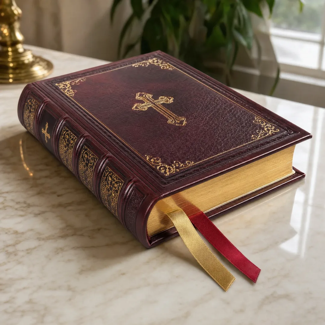
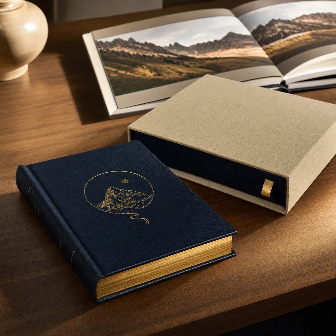
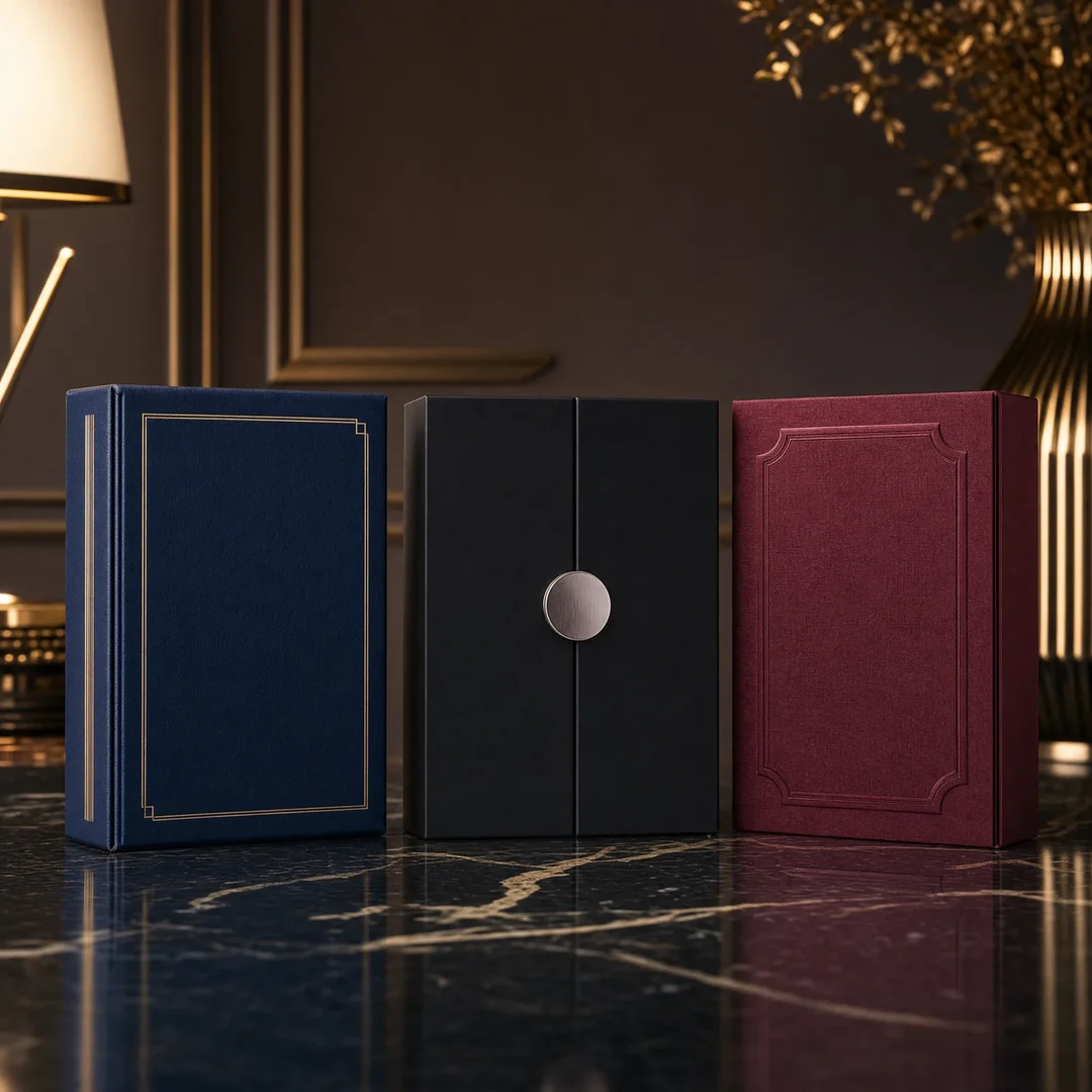
The cover is the first thing anyone touches. For hardcover portfolios, the cover material choices range from printed paper wraps laminated for durability, to cloth — buckram, linen, or cotton — that adds a traditional, tactile presence, to bonded leather for editions meant to feel archival. A linen-covered hardcover with a foil-stamped title communicates craftsmanship before the book is even opened. For softcover lookbooks, cover stock weight matters enormously. Anything below 250 gsm feels flimsy. At 300-350 gsm with a matte or soft-touch lamination, a softcover lookbook can feel substantial and expensive without the cost of case binding.
Binding That Works
Hardcover case binding
Case binding wraps a sewn book block inside rigid cover boards, producing a book built to last decades. The pages are gathered into signatures — groups of 4 to 16 pages — and sewn through the fold with thread. This Smyth sewing process creates flexible hinges at each signature’s spine edge, allowing the book to open without cracking. For a portfolio representing years of work, case binding is the obvious choice. It signals permanence and justifies a higher perceived value.
The trade-off is cost and weight. A 100-page A4 hardcover portfolio weighs roughly twice as much as the same book in perfect binding, and production costs run 40-60% higher. For lookbooks being mailed in bulk, that weight difference alone can double shipping costs. Reserve case binding for the portfolio you hand to someone in person or the flagship lookbook that represents your brand’s identity.
Lay-flat binding (Otabind / Eurobind)
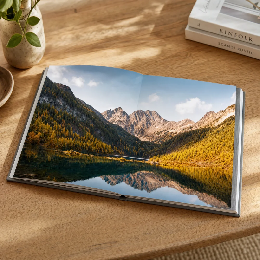
Lay-flat binding solves the single most frustrating problem with printed portfolios: the gutter. In a standard perfect-bound book, the glue along the spine prevents pages from opening fully, which means images that cross spreads lose roughly 5-8 mm of content to the gutter. Lay-flat binding uses a flexible adhesive that lets the cover spine lift away from the page spine as the book opens, so spreads lie completely flat with zero gutter loss. For panoramic photography, architectural drawings, or any portfolio where full-spread images are central to the design, lay-flat binding is transformative.
Some printers also offer an exposed-spine hardcover — sometimes called a Coptic-inspired or open-spine binding — where the sewn signatures are visible along the spine edge. This is a design-forward choice that turns the binding itself into a visual feature. It pairs beautifully with minimalist cover designs and has become increasingly popular among independent fashion labels and design studios.
Saddle stitching and perfect binding
Saddle stitching — folded sheets stapled through the center fold — is the most economical binding method. It works well for slim lookbooks up to about 64 pages. The booklets are lightweight, inexpensive to produce, and cheap to mail. Fashion brands often use saddle-stitched lookbooks for seasonal mailers: they feel like a considered object without the production cost of a case-bound book.
Perfect binding — pages gathered and glued at the spine with a wraparound cover — is the paperback standard. It works for both portfolios and lookbooks in the 40-400 page range. The finished product looks professional, the square spine can be printed with a title, and production costs sit in the middle of the range. The limitation is durability. After repeated opening, the glue can crack, and pages near the front and back of the book may eventually loosen. For a portfolio that will be handled frequently, consider sewn perfect binding — the pages are gathered into signatures and sewn before gluing — which dramatically improves longevity for a modest cost increase.
Image Quality at Scale
Why CMYK matters more than you think
Your screen uses RGB — additive color created by mixing red, green, and blue light. A printing press uses CMYK — subtractive color created by layering cyan, magenta, yellow, and black ink on paper. Converting from RGB to CMYK is not a simple translation. The RGB color space is larger than CMYK, which means some colors visible on screen simply cannot be reproduced in print. Vivid neon greens, electric blues, and certain saturated oranges often fall outside the CMYK gamut and will appear duller on paper than they do on your calibrated monitor.
The single most effective thing you can do is design in CMYK from the start. Set your document color profile to a recognized CMYK standard — GRACoL or FOGRA39 are widely used — and soft-proof your images using the printer’s ICC profile if they provide one. This won’t prevent every color surprise, but it eliminates the worst offenders before they reach the press. For photographers, a hard proof — a single printed copy on the actual paper stock — is worth every dollar. Color accuracy issues that look subtle on screen become glaringly obvious on paper.
Resolution and file preparation
Print resolution needs to hit 300 DPI at the final trim size. A full-bleed A4 page at 300 DPI requires an image roughly 2,488 × 3,508 pixels — far larger than most web-optimized files. If you are pulling images from a portfolio website or social media, those files are typically 72 DPI and heavily compressed. They will look soft, pixelated, or jagged in print. Always work from original high-resolution files, preferably TIFF or high-quality JPEG with minimal compression.
File format matters too. Export your final print-ready pages as PDF/X-1a or PDF/X-4 with fonts embedded and images at full resolution. Include 3 mm of bleed on all sides if your design includes images or color that runs to the edge of the page. Add crop marks and confirm the total page count is divisible by 4 for saddle stitching or by 2 for perfect binding — printers need page counts that match their signature sizes.
Premium Finishing
Foil stamping and embossing
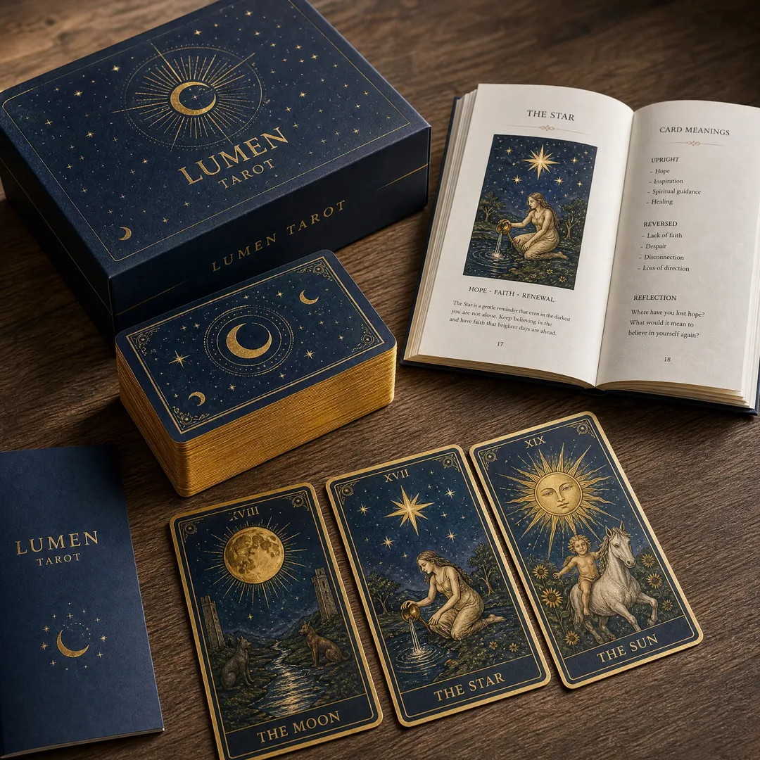
Foil stamping transfers a thin layer of metallic or pigmented foil onto the cover using heat and pressure. Gold, silver, copper, and holographic foils are the most common, but matte black foil on a black cloth cover creates a subtle, tonal effect that feels exceptionally refined. Foil works best on hardcover cases — the rigid board provides the stable surface needed for clean registration — and on heavy softcover stock above 300 gsm. Thin covers wrinkle under the heat and pressure of foil stamping, so save this technique for premium editions.
Embossing raises a design element above the surface of the cover, while debossing presses it inward. Both techniques add a tactile dimension that photographs poorly but feels unmistakably premium in person. Combining foil stamping with embossing — a raised metallic logo — is a classic high-end finish that immediately signals attention to detail. For a portfolio or lookbook representing a brand or a studio, this combination often pays for itself in the impression it leaves.
Coatings and lamination
Gloss lamination gives covers a shiny, protective layer that resists scuffs and fingerprints. It intensifies colors underneath, which makes it popular for photography-heavy covers. Matte lamination provides a smooth, non-reflective surface that feels sophisticated and modern. Soft-touch lamination — sometimes called velvet lamination — adds a suede-like texture that people instinctively want to hold. It has become the go-to finish for premium lookbooks precisely because the tactile experience is so distinctive.
Spot UV applies a clear, high-gloss varnish to specific areas of the cover — a logo, a title, a geometric pattern — creating a contrast between the glossy treated areas and the matte background. The effect is subtle enough to feel elegant rather than flashy. Spot UV requires precise registration during production, which adds cost, but on a dark cover where the gloss catches light at different angles as the book is handled, the result justifies the expense.
Quantity and Cost
Small batch vs. bulk: the real economics
The economics of printing change dramatically with quantity, and understanding where the breakpoints sit helps you make smarter decisions. At 50 copies, you are paying for setup — plate making, press calibration, and bindery configuration — amortized across a tiny run. Your per-unit cost might be $12-18 for a 64-page A4 perfect-bound portfolio. At 500 copies, the same book drops to $4-6 per unit because the setup costs are spread thin and the press runs at optimal speed. At 2,000 copies, you might be looking at $2-3 per unit.
For individual creatives printing portfolios, small batch printing from China has become a viable path. Many printers now accept minimum order quantities as low as 50 copies for standard specifications, with some specializing in even smaller runs at slightly higher per-unit prices. The trade-off is lead time — printing in China typically adds 3-5 weeks for production and shipping, compared to 1-2 weeks from a local printer. But the cost difference can be 40-60%, which on a run of 100 copies at $10 per unit from a local printer versus $5 from a Chinese supplier translates to a $500 saving.
What drives the price up
Paper weight is the biggest variable after quantity. Moving from 128 gsm to 200 gsm coated stock on a 100-page book adds roughly 30-40% to the material cost. Binding choice is next: case binding costs roughly 2-3 times what perfect binding costs for the same page count, and lay-flat binding sits somewhere in between. Premium finishes compound quickly — adding foil stamping, embossing, and spot UV to a cover can add $1-3 per unit, which on a small run of 50 copies translates to $50-150 total, but on 1,000 copies becomes a $1,000-3,000 line item.
Page count is the third major lever. A 48-page saddle-stitched lookbook costs a fraction of a 120-page case-bound portfolio of the same trim size. Every additional 16-page signature adds material cost, binding complexity, and weight for shipping. The lesson is straightforward: define your budget before you fall in love with specifications, and understand which variables give you the most impact per dollar. For most projects, upgrading the paper stock from 128 gsm to 157 gsm coated and adding a matte lamination to the cover delivers 90% of the premium feel at a fraction of the cost of full case binding with foil stamping.
The China advantage: when it makes sense
Printing portfolios and lookbooks in China works best for runs of 100 copies and above, where the per-unit savings outweigh the shipping cost and lead time. Chinese printers have deep experience with art books, photography monographs, and fashion lookbooks — these are high-value products where quality expectations are demanding and specifications are complex. For designers and brands who plan ahead and can accommodate a 4-6 week timeline from file submission to delivery, the economics are compelling. For rush jobs or single-digit quantities, a local digital printer is almost always the better choice.
Making It Real
Printing a portfolio or lookbook is not a transaction — it is a translation. You are taking work that exists as pixels on a screen and giving it weight, texture, and permanence. Every decision along the way, from the paper coating to the binding method to whether the cover feels rough or smooth under a thumb, shapes how your work is received. None of these choices are neutral.
Start with the audience. What do they need to feel when they hold your book? Confidence? Desire? Trust? Work backward from that answer through every specification. If you are a photographer printing a portfolio for gallery review, your priority list probably looks like: color accuracy, lay-flat binding, matte coated paper, minimalist cover. If you are a fashion brand printing a seasonal lookbook for buyers, your list might read: full-bleed photography, soft-touch lamination, saddle stitching for lightweight mailing, bold cover design. Same printer, same basic production process, completely different books.
The best advice I can give is also the simplest: order a single proof before committing to a full production run. Check the color. Check the binding. Check how the cover feels after being handled for five minutes. A proof costs money upfront, but it saves you from discovering that the matte lamination you ordered looks muddy on your dark cover design, or that the 128 gsm paper you chose to save budget shows through from the reverse page. When the book is your work in someone else’s hands, every detail is either an argument for your professionalism or against it. Make sure every page is arguing in your favor.