Touch Is the Last Luxury in a Digital World
We spend our days swiping glass. Tapping keyboards. Scrolling feeds. Most of what we “make” vanishes into clouds and servers. In a world this flat and frictionless, physical texture has become quietly radical.
Think about the last time you picked up a print product that made you pause. A business card you turned over in your fingers. A book cover you kept touching while you read. A gift box you hesitated to throw away. That instinct — the one that made you stop and feel — didn’t happen by accident. Someone chose debossing.
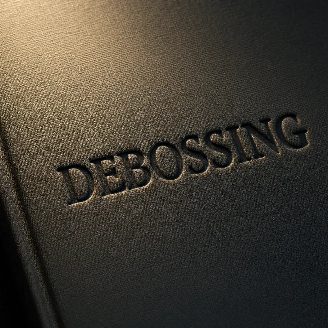
Debossing is the print finishing technique that presses a design into the surface of a material, creating a recessed, sunken impression that you can feel with your fingertips. It’s the opposite of flat. It invites touch, slows people down, and whispers something that glossy full-color printing can’t quite say: this was made with intention .
Whether you’re a packaging designer hunting for that unboxing moment, a self-published author who wants the first touch of your cover to land, or a brand owner tired of looking like everyone else at the trade show, debossing is one of the most reliable tools in your arsenal. It doesn’t shout. It doesn’t need to. This guide walks through everything you need to know to spec it, design for it, and get results you’re proud of.
What is Debossing, Really?
Let’s strip away the marketing language. Debossing is a mechanical process: a custom metal die gets pressed into a material under heat and pressure, permanently compressing the surface to create a recessed design. That’s it. But the devil — and the beauty — is in the details.
The die itself is a mirror image of your artwork, precision-etched or engraved onto a metal plate. When the press cycles, that die pushes into your material from the top while a counter-die (for thinner stocks) or a flat bed (for thicker substrates) supports from below. The material fibers compress, reform, and set in their new shape. What you get is a crisp, dimensional impression that catches light differently depending on the angle you hold it.
This isn’t ink. It isn’t varnish. It isn’t a simulation of depth — it is depth. And because there’s nothing to scratch off, fade, or peel, a debossed impression will outlast any print that sits on top of the surface.
People sometimes confuse debossing with a few other techniques, so let’s clear that up quickly. Embossing is the same process but in reverse — the design rises up instead of sinking in. Letterpress also creates an impression, but it simultaneously applies ink to the surface; debossing typically does not. Foil stamping uses heat to transfer metallic pigment onto the surface, and it can be combined with debossing for a two-in-one effect (more on that later). Blind embossing/debossing specifically means doing it without any ink or foil — just raw texture on raw material.
The machines that do this work are called platen presses or clamshell presses. They range from vintage hand-fed Heidelbergs to modern pneumatic systems with programmable temperature and dwell-time controls. What matters for your project isn’t what brand name is on the press — it’s whether the operator knows how to dial in the right combination of heat, pressure, and time for your specific material.
Key Benefits of Debossing
Why choose debossing over any of the dozen other finishing options a print shop will offer you? Let’s work through the benefits one at a time, with real-world context for each.
Aesthetic Appeal That Photographs Well
A debossed surface plays with light in ways flat printing can’t. As you tilt the piece, shadows shift inside the recessed areas — deeper in the morning light, shallower under office fluorescents. This dynamic quality photographs beautifully for social media and product shots. For brands that invest in visual content, debossing gives the camera something to show .
Take a minimalist notebook with a blind-debossed logo on the front cover. From straight on, the logo is subtle — almost hiding. Tilt it thirty degrees, and suddenly the shadows define every letter. That kind of quiet reveal is impossible to achieve with flat CMYK.
Tactile Experience: The Science of Touch Marketing
Neuromarketing research consistently shows that touch influences perceived value. The haptic feedback of running your thumb over a recessed logo triggers a different cognitive response than seeing the same logo printed flat. It signals weight, permanence, and craftsmanship — qualities our brains associate with premium products.
For self-published authors, this is especially powerful at book signings and markets. When a reader picks up your book, that first physical contact is a conversion moment. A debossed title on the cover invites them to keep holding it. The longer they hold it, the more ownership they feel.
Material Versatility
Debossing works across an impressive range of substrates. Coated paper, uncoated stock, leather, bonded leather, cloth, faux leather, chipboard, and even certain plastics all accept a debossed impression. Each material responds differently — leather takes a warm, organic impression; coated paper yields a crisp, almost surgical edge; cloth creates a softer, more rusticated effect. Understanding these material personalities is half the craft.
Durability That Outlasts the Print Run
Ink scratches. Lamination peels. Spot UV yellows over time. But a debossed impression doesn’t degrade — the material is the mark. For products meant to live on shelves, in bags, or in repeated handling (journals, packaging, presentation folders), this permanence is a practical advantage, not just an aesthetic one. At EcoPrinting, we’ve seen debossed covers survive years of use while foil-stamped editions from the same run show visible wear within months.
Brand Differentiation in a Crowded Market
Walk through any trade show or browse a bookstore’s new releases table, and count how many covers rely purely on full-color printing. Most of them. Then count how many use debossing. Maybe one or two. That gap is your opportunity. When every competitor’s product looks like a flat JPEG printed on paper, yours will look — and feel — like an object.
Environmental Advantages
Blind debossing, in particular, is one of the cleanest finishing processes available. No inks. No solvents. No foil waste. No plastic lamination. Just a metal die, your material, and pressure. For brands with sustainability commitments, this matters in both practice and storytelling. You can genuinely claim a reduced chemical footprint compared to foil stamping or UV coating, and the recyclability of your product isn’t compromised.
The same notebook design printed flat (left) vs. blind-debossed (right) — depth changes everything Types of Debossing
Not all debossing is created equal. The technique you choose depends on your design, your material, your budget, and the kind of impression you want to leave. Here’s how the four main types break down.
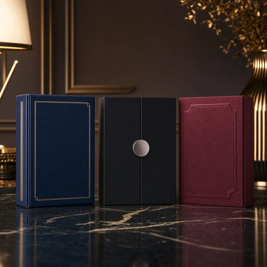
Blind Debossing
Blind debossing is the purest form of the technique. You press the die into the material with no ink, no foil, no color at all. The result is entirely about texture, light, and shadow. What you see depends entirely on the ambient light and the angle you’re holding the piece.
This is the go-to choice for understated branding. Think of a moleskine-style notebook with a small, centered logo sunk just below the surface. Or a wedding invitation suite where the couple’s initials are debossed into heavy cotton stock. Blind debossing rewards people who pay attention, and that’s exactly the psychological effect luxury brands want to cultivate.
One thing to know: blind debossing works best on thicker materials where the impression has room to breathe. On anything below about 200 gsm, you’ll struggle to get meaningful depth without risking the paper tearing or the impression ghosting through to the reverse side.
Registered Debossing
Registered debossing aligns the impression with a printed image. First, the material is printed (offset or digital) with your full-color artwork. Then the debossing die is precisely registered to hit specific elements within that print — a logo, a title, a decorative border, a character illustration.
The registration tolerance here is tight. We’re talking sub-millimeter alignment between the printed image and the physical impression. When it’s done right, the effect is stunning: a printed flower with debossed petal veins, a color portrait with a recessed outline, a colorful book title where certain letters sink back into the cover. When it’s done wrong, the misalignment is immediately obvious and the piece looks broken. This is where your printer’s skill — and the quality of their registration system — makes or breaks the budget.
Combination Debossing (with Foil Stamping)
This is the luxury heavy-hitter. The die applies metallic foil and creates a recessed impression in a single press cycle. You get the reflective pop of foil plus the tactile depth of a deboss — all perfectly aligned because they happen simultaneously from the same die.
Gold and silver are the classics, but modern foil comes in copper, rose gold, holographic, matte pigment, and even clear gloss. Pair a deep navy book cloth with a matte gold foil deboss for the title and author name, and you’ve got something that looks — and feels — like an heirloom.
The catch? Combination dies are more expensive to produce, and the setup time on press is longer because the operator has to balance heat (to activate the foil adhesive), pressure (to create the impression), and dwell time (how long the die stays in contact) all at once. Copper and brass dies are preferred for combination work because they hold heat more evenly than magnesium.
Multi-Level (Sculpted) Debossing
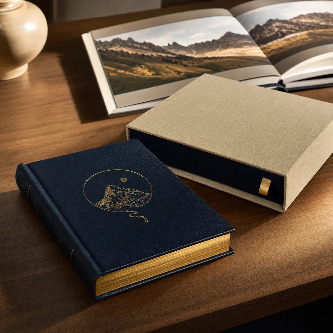
Multi-level debossing uses a die with varying depths — some parts of the design sink deeper than others. Imagine a mountain range debossed onto a journal cover: the peaks receive a shallow impression, the valleys go deeper, and the sky area stays flat. The result is a genuine 3D contour map in your material.
This technique requires a hand-sculpted or CNC-machined brass die, and it’s significantly more expensive than single-level debossing. It’s also material-dependent: you need a stock thick enough to accommodate the deepest impression without bottoming out or tearing. Hardcover cases wrapped over gray board are ideal. Thin card stock, less so.
Multi-level debossing is a statement piece technique. You don’t use it on a throwaway flyer. This is for limited edition books, premium packaging, and collector’s items where the budget supports craftsmanship that buyers can feel.
Four debossing variants: blind, registered, foil combination, and multi-level sculpted Material Selection Guide
The material you choose doesn’t just carry the debossing — it shapes how the impression looks and feels. Here’s a practical reference for the most common substrates.
Paper and Cardstock
250 gsm+ Coated Paper (Gloss or Matte): This is the workhorse of premium softcover books and high-end brochures. The coating gives the surface some resilience during pressing, resulting in a crisp, well-defined impression. Matte coating tends to show the shadow play better than gloss, simply because there’s less reflection competing for attention. If your cover stock is 250 gsm or heavier with a coating, you can achieve reliable single-level debossing with good edge definition.
200 gsm+ Single-Side Coated (C1S) Paper: Think of packaging and rigid box wraps. The coated side gives you print fidelity; the uncoated back allows the fibers to compress more naturally during debossing, which can actually deepen the impression. C1S stock at 200 gsm and above is a smart middle-ground choice when you want full-color printing on one side with a clean deboss.
Hardcover Case-Wrapped Gray Board (2-3mm): This is where debossing really shines. The board provides a thick, forgiving substrate that can accept deep impressions — sometimes 1mm or more — without showing through to the inside. Almost every hardcover book you’ve picked up with a debossed cover uses this construction: printed paper or cloth wrapped over a gray board case, then debossed through the wrap into the board beneath. The depth you can achieve here is dramatically greater than on any single-ply cover stock.
Uncoated and Textured Stock: Uncoated papers absorb the impression with a softer, more organic edge. The fibers compress rather than crease, giving the deboss a natural, handcrafted character. This works beautifully for letterpress-style projects, art books, and artisan packaging. Textured stocks (laid, felt, linen finish) add another layer of complexity — the texture interacts with the debossed impression in ways that are hard to predict but often gorgeous.
Leather and Bonded Leather
Genuine leather takes a debossed impression with a warmth that paper can’t replicate. The natural oils and fiber structure allow the material to compress and hold shape permanently. Heat helps here — a warm die will actually “set” the leather fibers in their compressed state. Vegetable-tanned leather responds especially well because it’s more malleable during pressing.
Bonded leather (reconstituted leather fibers with a polyurethane top layer) also debosses well, and it’s more consistent batch-to-batch than genuine leather. The PU surface holds a crisp edge, though very deep impressions can risk separating the surface layer from the fiber backing. For journals, executive portfolios, and high-end corporate gifts, bonded leather with blind debossing is a proven combination that looks premium without the unpredictability of natural hide.
Fabric and Cloth
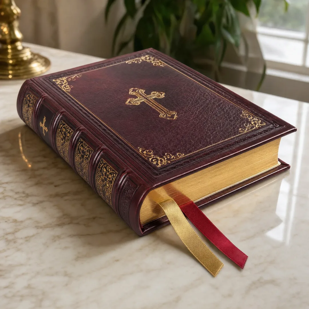
Book cloth — typically a woven cotton or rayon fabric backed with paper for stability — is a classic substrate for debossing. Library editions, bibles, and premium hardcover series have used cloth debossing for centuries. The fabric weave adds its own micro-texture to the impression, and the final result often has a archival, timeless quality that coated paper can’t match.
The limitation with cloth is detail resolution. Very fine lines (under about 1.5pt) tend to get lost in the weave. Intricate serif typefaces, delicate filigree, and photographic detail are all risky on cloth. Bold, simple shapes work best. Faux leather and leatherette materials sit somewhere between leather and cloth in terms of detail retention — they’ll hold finer detail than cloth but won’t match the edge definition of coated paper.
The same debossed mark across four substrates — each material tells a different story Debossing vs. Embossing: A Direct Comparison
You’ll face this choice on almost every project. Both techniques use a metal die. Both apply heat and pressure. Both create a dimensional effect. But the end result feels fundamentally different, and the practical considerations diverge in ways that matter for production.
Aspect
Debossing
Embossing
Direction Design presses into the material
Design rises above the material
Visual character Subtle, understated, shadow-dependent
Bold, prominent, catches light on raised surface
Reverse side Generally invisible from the back
Often shows a mirrored bump on the reverse side
Best for double-sided designs Yes — won’t interfere with the opposite side
Requires special construction (duplex/2-ply) to mask
Detail retention Good on most materials; depth absorbs fine detail
Fine detail can flatten during handling over time
Ink compatibility Works with or without ink (blind or registered)
Ink can crack on raised areas if not formulated properly
Perceived message Quiet confidence, luxury, restraint
Energy, prominence, “look at me”
Cost Comparable die cost; similar press setup
Comparable die cost; similar press setup
The one sentence summary: embossing says “notice this,” debossing says “feel this.” Which one fits your brand voice? If you’re not sure, ask for a sample pair from your printer. Hold both in your hand. The answer usually becomes obvious within five seconds. For a deeper dive into the raised alternative, see our complete embossing guide .
Real-World Applications
Let’s move from theory to practice. Here’s how debossing shows up in actual print products — and what makes each application work.
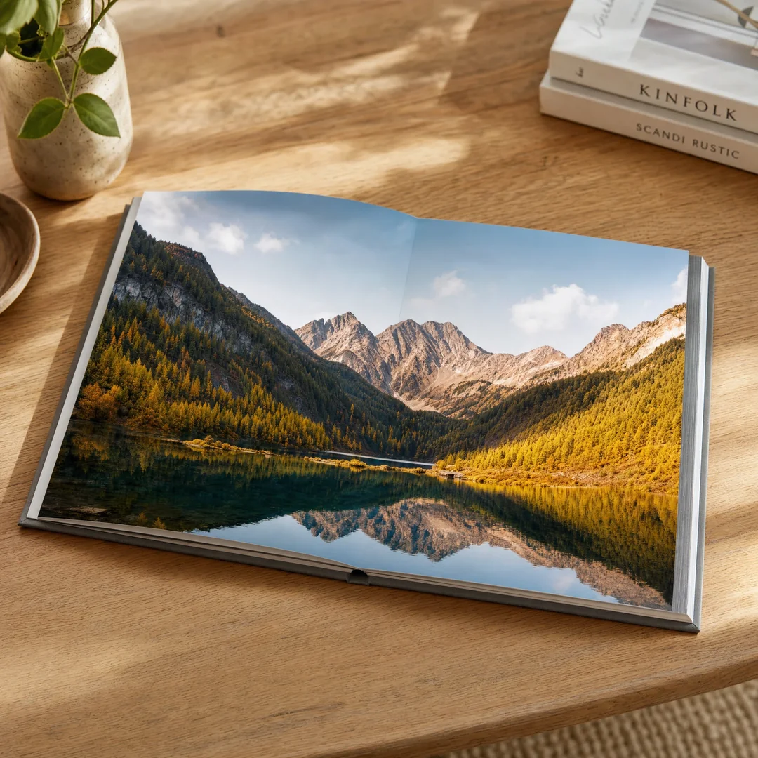
Book Covers (Hardcover and Paperback)
The hardcover book market runs on debossing. Pop into any bookstore and flip through the new releases: you’ll find debossed titles, debossed author names, debossed decorative borders, and increasingly, debossed artwork that spans the entire cover. The reason is straightforward — when a hardcover book costs $28.99, the physical object needs to justify its price against the $9.99 paperback alternative. Debossing signals permanence and quality at the moment of first touch.
For case laminate hardcovers (where the artwork is printed directly onto the case rather than wrapped with a dust jacket), registered debossing takes center stage. The printer debosses specific elements of the printed artwork — the title, a central illustration, a border pattern — so the debossed impression perfectly aligns with the colors beneath.
Paperback covers can be debossed too, though the effect is shallower due to the thinner stock. A debossed title on a trade paperback gives it a premium edge over other books in the same price bracket.
Notebooks and Journals
This is debossing’s natural habitat. A hardcover journal with a blind-debossed geometric pattern or logo is a product that sells itself through feel alone. Customers in stationery shops pick these up, run their fingers over the cover, and that tactile moment often closes the sale before they’ve even opened the book.
At EcoPrinting, journal projects frequently combine multiple techniques: a blind deboss for the cover pattern, with a small foil-stamped logo debossed into the lower back corner. The restraint communicates more than a full-cover print ever could.
Business Cards and Greeting Cards
A debossed business card tells a story in the 0.3 seconds between someone receiving it and them reading your name. The card feels heavier than it looks. The logo has actual depth. The contact information — usually printed flat — reads cleanly while the branding sinks in.
The sweet spot for business card debossing is 300-400 gsm stock. Anything lighter and the impression ghosts through to the back. Anything heavier and you’re into crazy-thick territory that won’t fit in standard card holders. Blind deboss works beautifully for minimalist brands; registered deboss with a spot color logo hits the sweet spot for professional services firms like architects, interior designers, and photographers.
Packaging Boxes
Unboxing videos have turned packaging into a marketing channel. When someone opens your product on camera, the box itself becomes content. A debossed logo or pattern on the lid of a rigid box adds that moment of texture that makes the viewer lean in. The rigid box construction — typically 2-3mm gray board wrapped in printed paper — is ideal for deep, dramatic debossing.
For subscription boxes, where the packaging needs to feel special every single month, debossing is a one-time die cost that pays off across the entire print run. The same die gets used on every box, and the impression quality stays consistent from the first unit to the ten-thousandth.
Invitations and Event Stationery
Wedding invitations, gala programs, and corporate event suites all benefit from debossing for the same reason: they’re meant to be handled. A debossed monogram on heavy cotton stock says “this is an occasion” before the guest reads a single line of text.
Blind debossing dominates this category. The absence of color keeps the focus on the paper’s natural texture and the impression’s shadow play. Pair a blind-debossed crest with a simple typeset in letterpress, and the result is restraint at its most effective.
Debossing in action: book covers, business cards, packaging, and luxury stationery The Debossing Process Step by Step
Understanding how debossing actually happens — from file to finished piece — helps you design better, communicate more clearly with your printer, and troubleshoot problems before they become expensive. Here’s the full sequence.
Step 1: Design and Artwork Preparation
Everything starts with your design file. For debossing, you need to supply a vector file (usually .AI or .EPS, sometimes .PDF with vector elements intact) that shows only the elements to be debossed, rendered in solid black on a white background. This becomes the master for die production. Keep line weights at 1pt or thicker. Fine hairline strokes — under 0.5pt — will either etch too shallow on the die to make an impression, or they’ll fold over during pressing. Spacing between separate elements should be at least 1mm to prevent the die from “plugging” (where adjacent recesses merge into one blob).
If you’re doing registered debossing, you’ll supply two files: the full-color print file and the debossing-only vector file. Both must share identical dimensions and registration marks so the printer can align them perfectly.
Step 2: Die Production
Your vector file goes to a die maker, who transfers the design onto a metal plate using either chemical etching (for magnesium) or CNC engraving (for copper and brass). The choice of metal matters:
Magnesium: Least expensive, chemically etched, suitable for short to medium runs (up to tens of thousands of impressions with moderate heat). Best for single-level blind debossing on paper. Depth capability is limited to about 1mm.Copper: More durable than magnesium, handles higher heat and pressure, suitable for longer runs and more detailed work. Depth capability up to about 1.5mm.Brass: The premium option. CNC-machined or hand-sculpted, holds the finest detail, distributes heat most evenly. Essential for multi-level debossing and combination foil/deboss work. The most expensive die material but also the most durable — a well-made brass die can last for hundreds of thousands of impressions.
Die production typically takes 3-7 business days depending on complexity and material. Rush services exist but expect to pay a premium.
Step 3: Material Preparation
Your chosen material is cut to the required sheet or piece size before debossing. This sounds obvious, but it matters: debossing on pre-cut stock means the impression will be positioned exactly where you want it on the finished piece. Some shops prefer to deboss on larger parent sheets and then trim down — this is more efficient for large runs but requires extra care in layout to ensure consistent positioning after cutting.
For materials sensitive to humidity (especially paper and leather), the stock should be acclimated to the press room’s temperature and humidity for at least 24 hours before debossing. Paper that’s too dry becomes brittle and cracks under pressure. Paper that’s too damp doesn’t hold a crisp impression.
Step 4: Press Setup and Make-Ready
This is where the operator’s skill becomes the most important variable. The die is mounted on the upper platen of the press. The material is positioned on the lower bed. The operator sets three critical parameters:
Temperature: Hot enough to soften the material fibers (or activate foil adhesive, if applicable) but not so hot that the material scorches or the die warps. Typical ranges: 93-149°C (200-300°F) for paper, lower for leather to avoid burning the surface.Pressure: Enough to create a clear, defined impression without cutting through the material. This is dialed in during make-ready using scrap sheets from the same stock.Dwell Time: How long the die stays in contact with the material. Longer dwell = deeper impression (up to the material’s limit). Too long = risk of material damage or throughput bottlenecks.
Make-ready — the process of getting all three parameters dialed in — might take 30 minutes for a simple blind deboss on familiar stock, or several hours for a complex registered deboss with foil on a new material.
Step 5: Production Run
Once the setup is approved (usually via a signed-off press sheet), the full run proceeds. The operator monitors consistency, checking every nth sheet (frequency depends on run length and job complexity) to make sure the impression depth, registration, and material condition stay within tolerance. Dies don’t wear out quickly, but they do accumulatively pick up microscopic material residue that can soften the impression over very long runs. Occasional die cleaning may be needed.
Step 6: Quality Inspection
Finished pieces are inspected under controlled lighting — angled light is essential to spot shallow or inconsistent impressions that would pass unnoticed under flat light. Key checks include impression depth consistency across the entire design, registration accuracy (for registered work), absence of cracking or tearing around the impression edges, and no ghosting or show-through on the reverse side.
Reject rates for well-set-up debossing are typically low — under 2% for experienced operators on proven material combinations. But those first few setup sheets can be brutal. That’s the cost of craftsmanship.
From vector file to finished impression — the six stages of debossing production Combining Debossing with Foil Stamping
We touched on this in the types section, but it deserves its own deeper look because combination work is where many projects go either brilliantly right or expensively wrong.
The classic approach: a single brass or copper die, heated to foil-transfer temperature, presses foil onto the material while simultaneously creating a recessed impression. The foil bonds to the material in the recessed area. When you run your finger over it, you feel the depression — and you see the metallic reflection from within it. It’s a two-sense experience from one press cycle.
Why not just foil stamp first and then deboss separately? Some shops do this — it’s called “stamp and bump.” The foil is applied with a flat die, then a second debossing die comes back and presses into the foiled area. It works, but it introduces registration risk. If the second die is off by even 0.25mm, the debossed impression will sit slightly misaligned with the foil, and the result looks sloppy. A single combination die eliminates that risk because both effects happen simultaneously from the same tool.
The trade-off is die cost and setup complexity. A combination die in brass costs more than a single-purpose magnesium die, and the press setup takes longer because the operator is chasing three variables (heat, pressure, dwell) simultaneously, with foil behavior adding a fourth variable (the foil’s own release temperature and adhesive characteristics).
When it works, though, combination deboss-and-foil is arguably the most luxurious print finishing effect available short of hand-tooled leather. It belongs on limited editions, premium packaging, and any product where the physical object is positioned as a luxury good.
File Preparation Tips
Good file prep prevents 90% of debossing problems before they happen. Here’s what your printer wants you to send.
Vector Artwork Only
Debossing dies are made from vector paths. Raster images (photos, pixel-based graphics) don’t translate cleanly into die production. Convert all type to outlines before sending. If your design includes raster elements that need debossing, talk to your printer first — they may need to create a simplified vector interpretation, and you should approve that interpretation before the die is made.
Minimum Size and Spacing
Line weight minimum: 1pt (0.35mm). Anything thinner may not etch deep enough to create a visible impression or, worse, may fold over during pressing. Element spacing minimum: 1mm between separate shapes. This prevents the die material between closely-spaced design elements from being too thin and breaking under pressure. For text, this means certain condensed typefaces and scripts with tight kerning can be problematic — test with your printer before committing to a die.
Material-Specific Adjustments
Design for your material, not for your screen. A design that looks perfectly proportioned at 100% scale in Illustrator may need adjustments for different substrates:
For cloth and textured materials: Bump up minimum line weight to 2pt. Simplify complex details.For leather: Allow for slight impression spread (the leather compresses and the impression area expands marginally).For coated paper over 300 gsm: You can push detail further — 1pt lines with 1mm spacing are reliable here.
Annotation for Your Printer
Don’t assume your printer can read your mind. Include a marked-up proof that clearly indicates: which elements are debossed (vs. printed flat), the desired impression depth (shallow/medium/deep — or a numeric specification if you have one), any areas where debossing should NOT occur, and registration expectations for registered work. A five-minute annotation can save a $200 die remake.
File Formats to Deliver
Vector debossing file: .AI, .EPS, or vector .PDF. Full-color print file (for registered work): print-ready .PDF with bleed and crop marks. Combined package: many printers appreciate receiving both files in a single .ZIP with a descriptive folder name. Label everything clearly — “Cover_Deboss_Die_Artwork.ai” is much more helpful than “file_final_v3.ai.”
Proper vector setup (left) and the resulting debossed impression (right) Frequently Asked Questions
What’s the minimum order quantity for debossing?
There’s no universal minimum — it depends on your printer’s setup. Some shops will deboss a single sheet for a prototype or sample. For production runs, the cost driver isn’t really the minimum quantity; it’s the die cost amortized across your run. If a magnesium die costs $150 and you’re printing 100 pieces, that’s $1.50 per piece just for the die. If you’re printing 5,000 pieces, it’s $0.03 per piece. The economics get dramatically better with volume, but very small runs (under 50 units) are possible if you’re willing to absorb the per-unit die cost.
Can you deboss on both sides of the same sheet?
Technically yes, but it’s tricky. If you deboss the front, the back surface is slightly disturbed — even if you can’t see a visible ghost, the material fibers have been compressed across the entire thickness. A second deboss on the reverse side, aligned anywhere near the first impression, risks the two impressions interfering with each other. For double-sided debossing, use a thicker stock (300 gsm minimum) and keep the debossed areas on opposite sides well apart from each other. Better yet, consider a duplex construction where two sheets are mounted back-to-back.
How deep can a debossed impression be?
It depends entirely on the material. On a hardcover case wrapped over 2-3mm gray board, you can achieve impressions of 1-1.5mm depth without compromising the structure. On 250 gsm coated cover stock, practical depth is closer to 0.2-0.5mm before you risk tearing or show-through. On leather, depth is limited by the hide’s thickness — around 0.5-1mm for most upholstery-weight leathers. Your printer can run depth tests on your specific material during make-ready.
Does debossing work with digital printing?
Yes, but with a critical caveat. Digital print toner sits on top of the paper surface rather than absorbing into it like offset ink. When you deboss over a digitally printed area, the toner can crack at the edges of the impression, especially on heavier toner coverage. This isn’t always visible — it depends on the design, the toner density, and the impression depth — but it’s a known risk. If you’re printing digitally before debossing, tell your printer so they can adjust the process (or recommend against it if the design is high-risk). Offset printing is generally more forgiving for registered debossing.
Is debossing more expensive than foil stamping?
It depends on what you’re comparing. A simple blind deboss with a magnesium die is generally less expensive than foil stamping because there’s no foil material cost and the setup is simpler. A combination deboss-and-foil with a brass die is more expensive than foil stamping alone because the die is more complex. For the most direct comparison — blind deboss vs. foil stamp, both with magnesium dies on the same stock — the deboss will typically be 15-25% less expensive per unit. But always get comparative quotes from your specific printer on your specific project. Generalizations in print pricing are dangerous.
What if I want a sample before committing to a full run?
Most printers, including EcoPrinting, offer pre-production samples. You’ll pay for the die and a small setup charge, and they’ll run a handful of sheets on your chosen material. This lets you see — and feel — exactly what the final product will look like before you greenlight the full quantity. A pre-production sample is the single smartest investment you can make in a debossing project. It costs a fraction of the total run and can save you from discovering, after 5,000 units are produced, that the impression depth doesn’t match your expectations.
Make Your Next Print Project Worth Touching
Debossing doesn’t require a luxury budget or a heritage brand name. It requires a clear design, the right material choice, and a printer who knows how to dial in the press. When those three things line up, the result is a print product that people don’t just look at — they pick it up, turn it over, run their thumb across it, and remember it.
That’s the difference between printed matter and a printed object. One gets glanced at and discarded. The other gets kept, displayed, and talked about. In a world oversaturated with flat, forgettable print, that tactile difference is your competitive edge.
At EcoPrinting, we specialize in bringing this kind of craft to independent publishers, brand owners, and designers who care about the physical experience of their products. Whether you’re working on your first debossed cover or refining a production spec you’ve used before, we’re here to help you get it right.
Get in touch for a free consultation and a free sample. Tell us about your project, your material, and the impression you want to leave — literally and figuratively — and we’ll send you a physical sample that shows exactly what debossing can do for your product. No pressure, no hard sell, just a sample you can hold in your hands and decide for yourself.