Why Texture Still Matters in a Screen-Obsessed World
We spend ten hours a day staring at glass. Everything is flat. Scroll, tap, swipe — the same cold surface, the same zero-feedback loop. You barely notice it anymore because you’ve trained your fingers not to expect anything back.
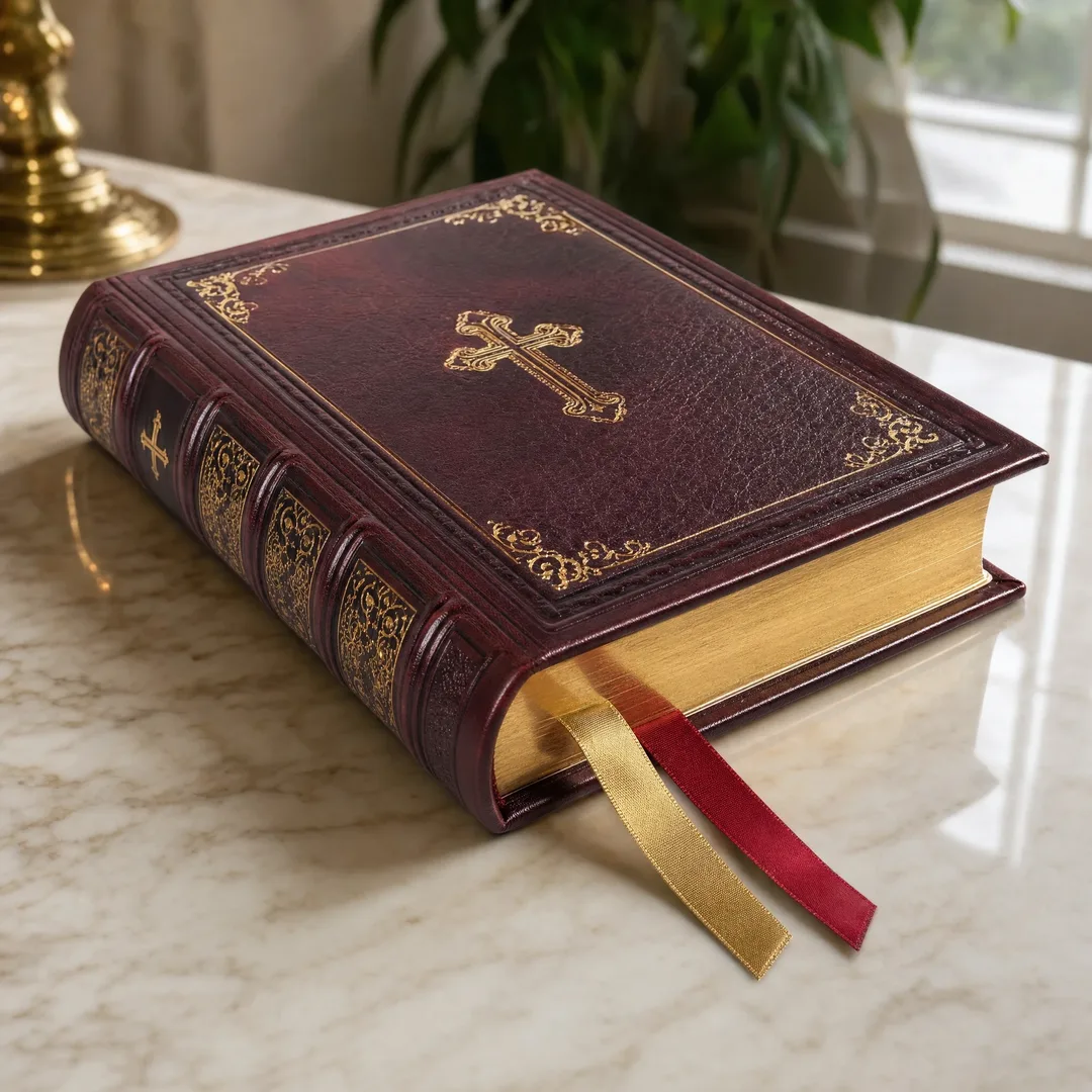
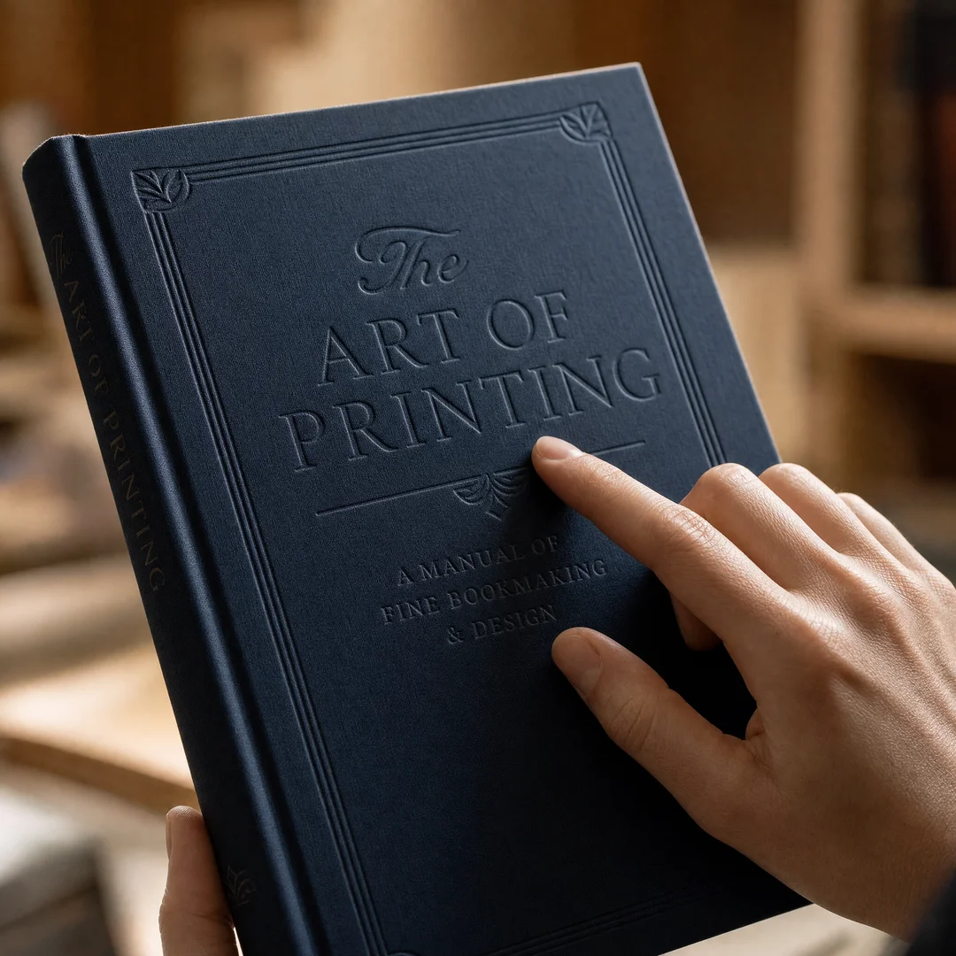
Then someone hands you a book with a cover that actually embosses into your palm. The title rises out of the board. Your thumb traces the raised letters without you telling it to. Something clicks, and you keep the book in your hand longer than you planned.
That moment is not an accident. It is the result of a centuries-old finishing technique called embossing — and it is having a serious resurgence right now. Publishers, packaging designers, and luxury brands are pouring budget into tactile finishes because they have figured out what digital cannot replicate: physical presence. You can’t scroll past a raised surface. You have to feel it.
This guide walks through everything worth knowing about embossing for book covers and packaging surfaces — the process, the types, the design rules, the common mistakes, and how to combine it with foil, spot UV, and other finishes for genuinely memorable results.
What Actually Happens When You Emboss Something
At its core, embossing is straightforward: you squeeze paper or board between two matched metal plates — a raised die on top and a recessed counter-die on the bottom — under heat and pressure. The fibers compress and stretch permanently. What was flat is now three-dimensional.
But that sentence hides a lot of craft. The die is typically made of magnesium, brass, or copper, with brass being the gold standard for long runs because it holds edge detail through tens of thousands of impressions. The counter-die — often a resin or fiberglass composite these days — is the negative mold that receives the male die. Without a properly registered counter-die, you get a soft, mushy impression that looks cheap.
Heat matters more than most people realize. If the die runs too cold, the paper fibers won’t relax enough to hold the shape, and the emboss collapses over time. Too hot, and you scorch the surface or burn through coatings. The sweet spot depends on the stock — coated papers need less heat than uncoated, thick board needs more dwell time under pressure than thin stock. A skilled press operator adjusts these three variables — pressure, temperature, and dwell time — continuously throughout a run.
The technique branches into several distinct categories depending on what you are trying to achieve:
Blind embossing is the purest form — raised design, no ink, no foil. The image comes entirely from light and shadow hitting the sculpted surface. It whispers rather than shouts, and it is devastatingly effective on uncoated stocks where the contrast between compressed and uncompressed fibers creates a subtle tonal shift.
Registered embossing aligns the raised area with a printed image. Think of a floral illustration where the petals actually lift off the page. Registration tolerances here are tight — half a millimeter off and the print and emboss drift apart, making the piece look sloppy. This requires a press operator who knows what they are doing and a pre-press setup that accounts for paper stretch.
Combination embossing marries embossing with foil stamping in a single pass. The foil is applied and the image is raised simultaneously. You get shimmer plus depth. It is the most technically demanding of the common embossing methods because foil release characteristics and dwell time have to sync perfectly with the embossing pressure curve.
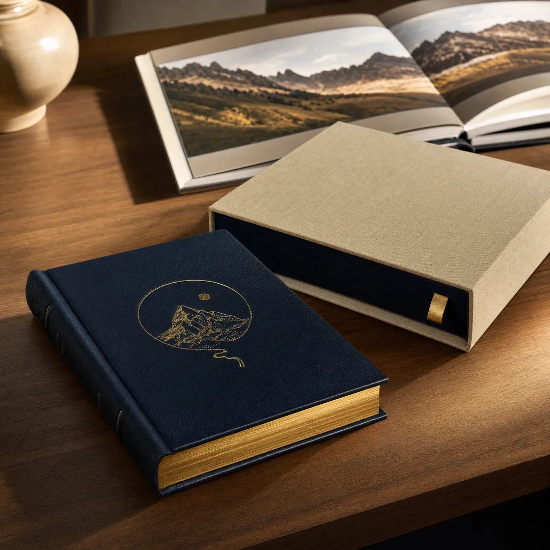
Sculpted embossing uses a multi-level, hand-tooled brass die to create varying depths across the design. Instead of one flat raised plane, you get contours — a bird’s wing that curves, lettering that graduates from shallow to deep. This is custom die work at its highest level and costs accordingly, but the results are unmistakable.
Glazing applies heat and pressure to specific areas without significant raising. The paper surface becomes polished and darkened, creating a tonal effect that sits somewhere between printing and embossing. It works beautifully on dark, heavily coated stocks where a blind emboss would be hard to read.
What Embossing Actually Does for Your Product
Let me skip the marketing fluff and talk about what happens in practice when you add embossing to a book cover or a package.
First, brand perception shifts measurably . A 2023 study by Two Sides found that physical texture on packaging increased perceived product value by an average of 23% across consumer goods categories. People associate weight and texture with quality because they have a lifetime of data telling them cheap things feel smooth and mass-produced. Embossing tells a different story immediately — before the customer reads a single word.
Second, visual impact compounds under retail lighting . An embossed surface catches light differently at different angles. As someone walks past a shelf, the raised areas create moving shadows that act as visual hooks. Flat print stays flat no matter where you stand. Embossed print changes as you move. That dynamic quality is what makes people pick the product up, and once they pick it up, conversion odds jump dramatically.
Third, there is a tactile engagement loop that psychologists call the “endowment effect” — touching something increases your sense of ownership. When you put an embossed book cover in someone’s hands, their fingers naturally trace the raised elements. That micro-interaction builds attachment. I have watched people at trade shows literally stroke embossed covers without realizing they were doing it. You cannot buy that kind of engagement with a flat print.
Fourth, retention improves with multi-sensory encoding . Memory researchers have known for decades that information processed through multiple sensory channels sticks better. When someone reads a title and simultaneously feels it, they encode the information twice — once visually, once haptically. Embossed packaging and covers are remembered more accurately and for longer. For a publisher trying to make a title stand out in a crowded category, that difference matters.
Fifth, customization versatility opens creative doors . Embossing does not exist in a vacuum. Pair it with foil stamping and you get metallic depth that photographs beautifully. Combine it with spot UV and you create a glossy-over-texture contrast that changes as the viewing angle shifts. Layer it with debossing on the same sheet and you build a topography across the surface that the eye reads like a landscape. At EcoPrinting, we have seen clients use these combinations to turn a standard paperback into a gift-worthy product that commands a premium price point.
Embossing Types and Techniques: A Technical Breakdown
The embossing world splits into more categories than most designers realize. Here is a breakdown of what each technique actually involves, what it costs, and where it makes sense.
Type
Die Material
Depth Range
Best For
Relative Cost
Blind Emboss
Magnesium / Brass
0.5–1.5 mm
Text, logos, subtle patterns on uncoated stock
$$
Registered Emboss
Brass
0.3–1.2 mm
Print-aligned designs, illustrated covers
$$$
Combination Emboss
Brass (heated)
0.3–1.0 mm
Foil + raised effect in one pass
$$$$
Sculpted / Multi-Level
Hand-tooled Brass
0.2–2.5 mm (variable)
Illustrations, crests, luxury packaging
$$$$$
Glazing
Brass (flat, polished)
Minimal (< 0.2 mm)
Dark stocks, subtle tonal effects
$$$
Textured / Pebble
Etched Magnesium
0.3–0.8 mm
Background textures, all-over patterns
$$
A quick note on die choice because it trips people up: magnesium dies are cheaper and perfectly fine for runs under 5,000 impressions on softer uncoated papers. Past that, the edges start to wear and your embossing goes from crisp to fuzzy. Brass dies cost three to five times as much upfront, but they will hold detail through 50,000-plus impressions and produce sharper results on coated and heavily sized stocks. If you are printing a first edition of 2,000 copies, magnesium is fine. If you are running a luxury brand’s packaging program for the next three years, go brass.
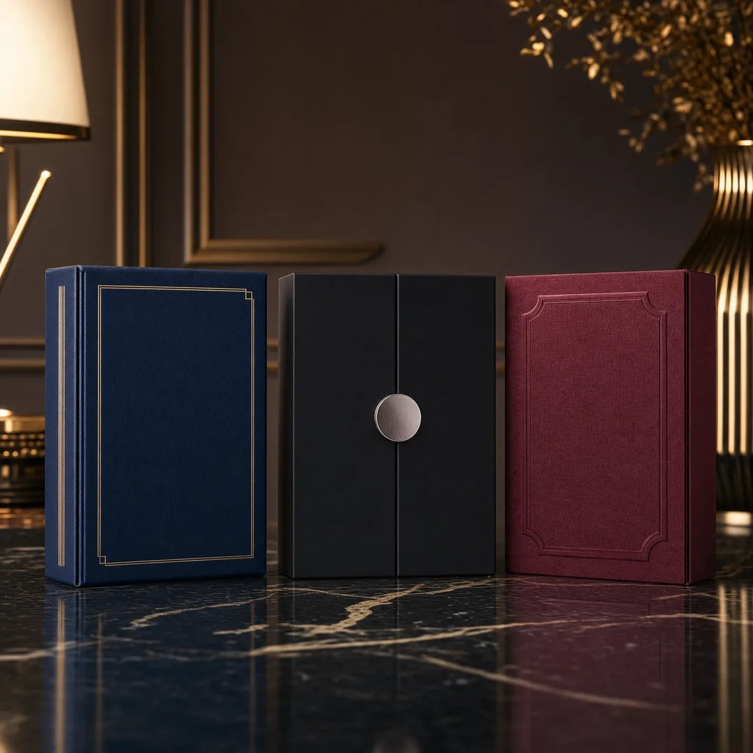
Embossing vs. Debossing: Raised or Recessed?
This is the question every designer hits at some point. Both techniques use the same basic setup — a die and counter-die under heat and pressure. The difference is which side of the stock the male die hits.
With embossing , the male die pushes from the back, raising the image toward the viewer. Light catches the raised surfaces from above, creating highlights on the top edges and shadows underneath. The result feels outward, expressive, attention-grabbing.
With debossing , the male die pushes from the front, pressing the image down into the stock. The recessed area catches shadow from ambient light, creating depth through darkness rather than height. The result feels inward, understated, subtle.
Aspect
Embossing (Raised)
Debossing (Recessed)
Visual effect
Highlights catch light, stands out
Shadows create depth, recedes
Tactile experience
Fingers trace raised contours naturally
Fingers dip into recessed areas — more intimate
Best stock weight
Works on 200–400 gsm board; needs back support
Works on 150–400 gsm; more forgiving on lighter stocks
Readability
Excellent — raised text is easy to read by touch
Good — recessed text needs stronger contrast
Durability in handling
Raised elements can crush under heavy stacking
Recessed elements are protected from surface wear
Back side appearance
Visible impression on reverse — needs a liner or design accommodation
Visible impression on reverse — needs a liner or design accommodation
Best paired with
Foil stamping, spot UV, metallic inks
Foil stamping, blind deboss on dark stocks
Typical use cases
Book titles, logos, luxury packaging, invitations
Notebook covers, subtle branding, minimalist packaging
One thing the table does not capture: the psychological difference. Embossing says “look at this.” Debossing says “lean in closer.” Neither is better — they serve different intentions. A bold thriller novel cover wants embossing. A refined literary memoir wants debossing. The technique should flow from the message.
Choosing Between Embossing and Debossing: A Practical Decision Guide
Here is how I think about it when I am helping a client decide.
Start with the brand personality. If the brand voice is confident, premium, and commanding — think luxury fashion, high-end spirits, ambitious non-fiction — embossing aligns naturally. The raised surface mirrors the outward energy. If the brand voice is quiet, sophisticated, and understated — think boutique literary presses, minimalist skincare, architectural firms — debossing often fits better. The recessed impression mirrors restraint.
Then consider the material. Heavily coated stocks like C1S (coated one side) or C2S (coated two sides) emboss beautifully because the coating softens under heat and then sets in the new shape. Uncoated stocks also emboss well but may require more pressure and show more fiber disruption at the edges — which can be either a feature (rustic, handmade feel) or a flaw (messy, unprofessional look), depending on your intent. Thin papers under 150 gsm are risky for deep embossing because they can tear under the strain; if you need texture on light stock, consider a shallow blind emboss or switch to debossing, which distributes stress differently.
Factor in the functional purpose. If the embossed area needs to be readable — like a book title on a shelf — raised text catches more light and is easier to parse at a distance. If the surface will be stacked or packed tightly in shipping, debossed elements survive better because they are protected by the surrounding plane. I learned this lesson the expensive way on a project where 2,000 embossed covers were shipped in tight boxes and half arrived with the raised areas flattened. Now I always ask about packaging and transit conditions before specifying depth.
Think about the back side. Both techniques leave an impression on the reverse of the sheet. On a book cover, the inside flap or pastedown endpaper hides the reverse impression. On a package, the reverse might be visible — plan for it or use a double-thickness lamination. At EcoPrinting, we often recommend a backing liner for single-sided packaging pieces where the reverse impression would look unfinished.
Where Embossing Shows Up in the Real World
Embossing is everywhere once you start looking. Here are the applications that consistently deliver the best return on the technique.
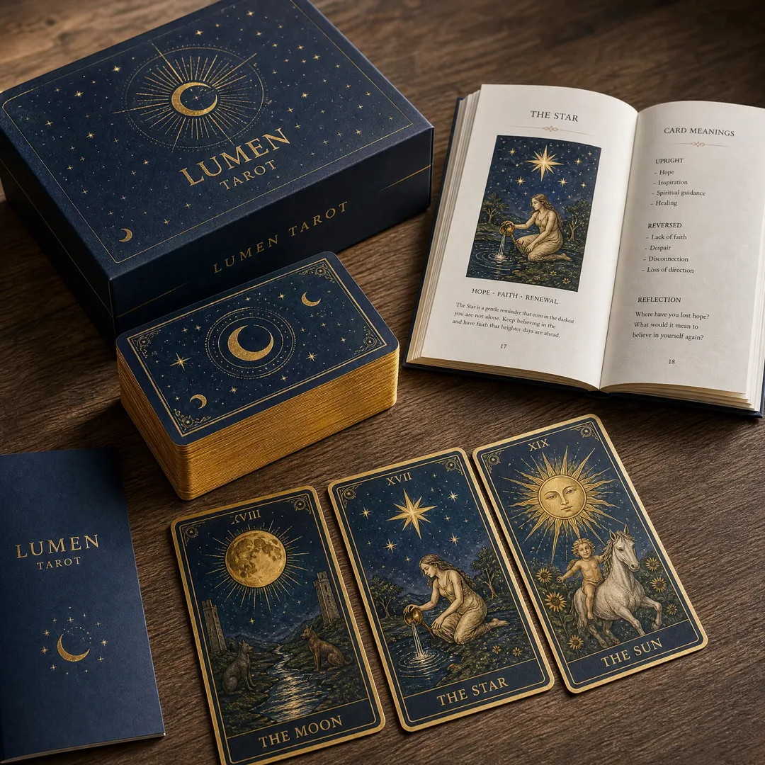
Book covers. This is the category where embossing earns its keep most reliably. A raised title on a paperback or hardcover spine catches the eye on a crowded bookstore shelf. Trade publishers use blind embossing for author names and titles on case-bound hardcovers. Independent presses use combination emboss-and-foil for limited editions that sell at a premium. The tactile quality turns a commodity paperback into something people want to keep on their shelf. I have seen self-published authors invest in embossed covers and report a measurable bump in Amazon conversion rate — the cover thumbnail itself communicates depth even at thumbnail size.
Business cards. In a stack of forty cards collected at a conference, the one with a raised logo gets pulled out and looked at twice. The person holding it runs their thumb over the embossed area during the conversation. They keep it. A blind-embossed logo on a thick, uncoated stock says “established” without shouting it. A foil-embossed element says “premium” in a way that digital printing alone cannot approach.
Packaging. This is where embossing gets industrial. Cosmetic boxes, spirit cartons, perfume packaging — the competition for shelf attention in these categories is brutal, and embossing is one of the last unfair advantages available. A rigid box with a sculpted, multi-level emboss across the lid becomes a keepsake rather than disposable packaging. This has secondary benefits: consumers reuse embossed boxes for storage, which extends brand exposure for months or years beyond the initial purchase.
Invitations and stationery. Wedding invitations with blind-embossed monograms are a staple of the high-end stationery market. The technique signals care and cost without needing to add color or complexity. Personal letterhead with a blind-embossed logo in the corner of a heavyweight cotton sheet telegraphs attention to detail before the recipient reads a word.
Luxury goods. Watch packaging, jewelry boxes, premium chocolate cartons — embossing is practically mandatory in these categories. Consumers expect physical texture at this price point, and its absence is noticed as a cost-cutting signal. Sculpted multi-level embossing with foil accents has become the benchmark for ultra-premium packaging in the spirits industry in particular.
The Embossing Process: From Design File to Finished Piece
Here is what actually happens between sending your artwork and receiving finished embossed pieces. Understanding this sequence helps you avoid the most common production delays.
Step 1 — Die creation. Your vector artwork goes to a die maker who uses it to engrave or etch the embossing die. For magnesium dies, a photo-etching process removes material around the design areas, leaving the raised image. For brass dies, CNC engraving or hand-tooling creates the positive relief. This step typically takes 3 to 7 business days depending on complexity and die material. Sculpted brass dies with variable depths can take two to three weeks. Rush service is available but the upcharge is steep — plan accordingly.
Step 2 — Counter-die fabrication. The counter-die (or counterforce) is the female mold that mates with the male die. Historically made from papier-mâché pressed against the male die and hardened, modern counter-dies are often cast from epoxy resin or CNC-machined from fiberglass composite. A well-made counter-die is absolutely critical — if the fit is loose, the embossed edges will be soft. If the fit is too tight, the paper will tear or the die will wear prematurely.
Step 3 — Make-ready and setup. The press operator mounts the die and counter-die on the press, aligns them precisely, and begins running setup sheets. This is where the craft happens. The operator dials in the right combination of pressure, heat, and dwell time for the specific stock being used. Setup can take anywhere from 15 minutes for a simple blind emboss to several hours for a registered combination emboss with tight tolerances. Make-ready waste is part of the cost — expect 50 to 200 setup sheets, more for complex registered work.
Step 4 — Production run. Once the makeready is dialed in, the press runs at a steady pace. A skilled operator monitors every few sheets — checking for consistency of depth, looking for die wear, adjusting heat if ambient conditions change, and watching for paper dust buildup on the die surface. Most embossing presses run between 800 and 2,000 sheets per hour, slower than offset printing but significantly faster than hand-finishing work.
Step 5 — Quality control and finishing. Embossed sheets are inspected for consistency — depth uniformity across the sheet, edge sharpness, absence of cracking or tearing at stress points. Sheets that pass QC move to final trimming, folding, or binding. Expect a small spoilage allowance on any embossing run — 2% to 5% is normal, higher for complex work on sensitive stocks.
Combining Embossing with Other Finishes: The Multi-Layer Approach
Embossing alone is powerful. Embossing combined with a second finish technique is often spectacular. Here are the pairings worth knowing about.
Foil stamping plus embossing. This is the most popular combination and for good reason. A metallic foil — gold, silver, copper, holographic — applied in the same pass as the embossing die creates a raised, shimmering element that photographs beautifully and catches light from every angle. The foil sits on the raised surface, so the metallic effect is amplified by the dimension. This combination dominates premium book covers, spirit labels, and luxury cosmetic packaging. The technical challenge is synchronizing foil release temperature with embossing pressure — not every press shop can do it well, so ask for samples before committing.
Spot UV plus embossing. Here you apply a high-gloss UV coating to specific areas, then emboss those same areas — or emboss first and apply UV over the raised surface. The contrast between glossy UV and matte uncoated stock, amplified by physical dimension, creates a depth effect that flat printing simply cannot achieve. This combination works particularly well on dark, solid-color backgrounds where the gloss contrast pops hardest.
Debossing plus foil. Flipping the script — pressing the foil into a recessed area rather than onto a raised surface — produces a completely different visual character. Light pools in the debossed foil area, creating a jewel-like effect. This combination is a favorite of minimalist luxury brands who want the richness of metallic shine without the extroversion of raised surfaces.
Multi-level emboss plus soft-touch lamination. Apply a soft-touch (velvet-feel) laminate to a sheet first, then sculpted-emboss over it. The laminate adds a tactile warmth, and the embossing adds structure. The combination is overwhelmingly seductive — it is the finish equivalent of a perfectly tailored suit. Tablet and phone packaging use this combination extensively for unboxing impact.
Emboss plus deboss on the same sheet. This is technically demanding because the sheet has to register for both operations, but the result is worth it. You can build a topography with peaks and valleys — raised title text, a recessed background pattern — that reads like a physical landscape. This requires two separate die passes (or a very sophisticated dual-action die setup) and costs more, but for limited-edition products, the impact justifies the expense.
File Preparation Tips That Save Time and Money
I have watched too many embossing projects stall at the pre-press stage because the artwork was not prepared correctly. Here are the rules to follow.
Use vector artwork. Embossing dies are made from vector paths, not pixels. Send your design as a vector file — Adobe Illustrator (.ai), EPS, or PDF with embedded vectors. If you send a raster image, the die maker has to manually trace it, which adds time and cost and usually degrades the result. Keep all text converted to outlines to avoid font substitution issues.
Mind your line weights. Embossing does not handle hairline strokes well. The minimum reliable line weight for embossing is about 0.5 pt for blind embossing and 1 pt for combination embossing with foil. Lines thinner than that risk collapsing under pressure or filling in with foil. Reverse — small recessed areas within a larger embossed field — need even more breathing room, typically 1.5 pt minimum. If your artwork has fine detail, test it on the actual stock before committing to a full run.
Choose your paper wisely. Not every stock embosses equally well. Long-fiber papers (cotton, linen content) handle deep embossing better than short-fiber sheets (many recycled stocks) because the longer fibers stretch rather than break. Coated papers emboss more sharply than uncoated because the coating layer deforms cleanly. Dark, solid-color stocks show embossing beautifully because the contrast comes entirely from light and shadow. White or light stocks with heavy print coverage can hide a shallow emboss — plan for more depth if your design relies on contrast for visibility.
Account for paper grain. Paper has a grain direction — the fibers align predominantly in one orientation. Embossing across the grain can cause cracking, especially at higher depths. Always specify grain direction in your artwork and discuss it with the press operator. For book covers, grain should run parallel to the spine; this also happens to be the safest orientation for embossing on the cover board.
Include bleed and safety margins. Embossing dies need at least 3 mm of clearance from trim edges. Putting an embossed element right up against a cut edge invites tearing and creates registration headaches at the guillotine. Build a 5 mm safety margin between embossed areas and trim lines, and another 3 mm between embossed areas and fold lines.
Provide a reference mockup or strike sheet. The single most helpful thing you can give your embossing supplier is a physical reference — a previous project with similar depth and stock, or a hand-cut paper mockup showing the desired effect. Describing depth in microns or millimeters rarely communicates what you want as clearly as handing someone a sample and saying “like this.”
Frequently Asked Questions
Can you emboss on any paper? Technically yes, but results vary enormously. Papers below 150 gsm risk tearing or puckering. Coated stocks produce sharper results than uncoated. Recycled and short-fiber papers are more prone to cracking at stress points. The ideal stock for embossing is a long-fiber, medium-to-heavyweight sheet — think 200 to 350 gsm cotton or alpha-cellulose board. If your heart is set on a specific paper, ask your supplier to run a strike-off before committing to the full quantity.
How deep can embossing go? Standard embossing depth ranges from 0.3 mm to about 1.5 mm. Sculpted and multi-level dies can push to 2.5 mm in the deepest areas on heavy board. Beyond that, paper fibers tear rather than stretch. If you need extreme depth — say, for a braille-like effect — talk to your die maker about specialized tooling and expect higher spoilage rates.
Does embossing add significant cost? It does add cost, but the question is whether the return justifies it. The main costs are the die (one-time, reusable for reprints) and the press setup time (per-run). For a run of 1,000 pieces, the die cost dominates and the per-unit embossing premium is high. For a run of 10,000 pieces, the die cost amortizes across more units and the per-unit premium drops significantly. As a rough rule, expect embossing to add 15% to 40% to your finishing cost depending on complexity, run length, and die material.
Can I emboss digitally printed sheets? Yes, with caution. Digital toner does not react to heat the same way offset ink does. Some toner formulations can soften or offset onto the die under embossing temperatures. Test on the exact stock and digital press combination before committing. Dry-toner digital prints are generally more embossing-friendly than liquid-toner or inkjet prints. Ask your printer to run a test sheet through the embossing press before printing the full run.
How long does embossing take from order to delivery? Typical turnaround for a standard embossing job is 7 to 14 business days, including die fabrication and production. Complex sculpted brass dies can push that to 3 to 4 weeks. Rush service is available at most shops — expect a 25% to 50% premium for halving the lead time. Plan for embossing early in your production timeline; it is not the step you want to rush.
Can embossing be combined with rounded corners or die-cut shapes? Yes, and it is increasingly common. Emboss first, then die-cut. Doing it the other way creates registration headaches because the die-cut piece shifts under embossing pressure. The press operator needs the full sheet for proper registration control. Plan your production sequence accordingly.
Making the Physical Choice
Embossing sits at an interesting intersection right now. Digital marketing costs keep climbing. Ad blindness keeps getting worse. Screens keep getting flatter. Meanwhile, a book cover with a raised title or a package with a tactile logo breaks through the noise in a way that costs far less than another round of paid ads — and the impression lasts longer.
The technique itself is not new. It has been around for centuries. But the strategic value of physical texture has shifted because the baseline has shifted. When every competitor’s product shows up as a flat thumbnail on a screen, the one that arrives in the customer’s hands with dimension — with something their fingers want to explore — occupies a different category in their mind.
If you are considering embossing for a book cover, a packaging line, or a branded product, start with a conversation. Talk through your stock choices, your design constraints, your budget parameters. Get a strike-off on your actual paper. Feel the difference between blind, registered, and combination embossing before you commit.
At EcoPrinting, we offer a free consultation on embossing specifications for your project — whether you are publishing a single title or launching a full packaging line. We can also send you a free sample kit showing different embossing types, depths, and combination finishes on various paper stocks so you can experience the tactile differences firsthand before making any decisions.
Reach out to our team and let us know what you are working on. Tell us about your paper stock, your design vision, and your timeline. We will help you figure out which embossing approach makes sense — and send you samples you can actually hold.