A Box Lands on a Shelf in New York, and Nobody Notices the Color Is Off — Until Someone Does
Color in packaging is not decoration. It is a contract between a brand and a buyer. The consumer who reaches for a familiar shade of Tiffany blue, or the exact Coca-Cola red, or the specific orange of a Home Depot apron — those people are not evaluating color with a spectrophotometer. They are evaluating it against a memory. And memory is merciless. It remembers a shade as brighter, deeper, and more precise than it ever was in reality. When the printed box does not match that memory, the brain registers “wrong” before it registers why.
This is the problem that packaging color management printing china production solves — or fails to solve — every day across thousands of press sheets. The technical distance between a Pantone swatch in a designer’s hand and a finished folding carton on a retail shelf is measured in dozens of variables: the paperboard substrate, the ink film thickness, the press sequence, the ambient humidity in the print shop, the age of the spectrophotometer lamp, the calibration of the operator who reads it. Each variable can be controlled, but only if it is understood.
This guide covers the measurement standards, the tooling, the process control frameworks, and the real-world decisions that determine whether your packaging color is identical across a run of 5,000 boxes — or drifts enough that someone on the brand side picks up the phone and asks the question no printer wants to hear.
CMYK and Pantone: The Decision Is Not About Gamut, It Is About Guarantee
Most packaging buyers learn the difference between CMYK and Pantone spot colors in their first production meeting and then spend every subsequent project trying to avoid the cost of the Pantone unit. This is understandable. Adding a spot color to a four-color job means an additional plate, an additional ink unit on the press, an additional wash-up cycle between runs, and an additional point of failure in the print sequence. The cost adder is real — typically 10 to 20 percent of the printing cost per spot color — and the temptation to “just match it in CMYK” is strong.
The temptation is wrong often enough to be dangerous. Here is why.
When does CMYK fail to reproduce a brand color accurately?
CMYK is a subtractive color model built from cyan, magenta, yellow, and black ink dots. The dots overlap on paper to create the illusion of a continuous color, but the gamut — the range of reproducible colors — is fundamentally limited by the physics of the inks and the paper. Certain hues sit outside the CMYK gamut entirely. Bright saturated orange is a notorious problem: it requires a high percentage of both magenta and yellow, but the magenta ink absorbs green wavelengths and the yellow ink absorbs blue wavelengths, and the intersection of those absorptions creates a muddier orange than the one you see on screen. The same problem afflicts bright greens, deep purples, and the specific shade of navy blue that roughly half of all corporate logos use.
A brand color that falls outside the CMYK gamut will always print as an approximation — sometimes a close one, sometimes a disappointing one, but never an exact one. The question is not whether the printer can “match” the color in CMYK. The question is whether the brand can tolerate the delta between the approximation and the target. For a background color on a secondary packaging element, maybe yes. For a logo, a brand signature color, or any visual element that appears across multiple products and must read as consistent at shelf distance, the answer is almost always no.
The practical rule that experienced packaging buyers follow: if the color has a Pantone number assigned to it in the brand guidelines, print it as a Pantone spot color. If the packaging includes photography, gradients, or multi-color illustrations that cannot be separated into spot plates, print those in CMYK and add the Pantone as a fifth color. This is not a wasteful expense. It is insurance against the meeting where someone holds up last month’s box next to this month’s box and asks why the brand color shifted.
How many spot colors can an offset press handle on one packaging job?
A standard four-color offset press has — as the name suggests — four printing units. To add spot colors, you need additional units beyond the CMYK set. A five-color press can run CMYK plus one spot. A six-color press can run CMYK plus two spots. An eight-color press can run CMYK plus four spots, or CMYK plus two spots and a coating unit. The ceiling is determined by the press configuration at the specific factory running your job, not by any theoretical limit of the technology.
For packaging color management printing china at medium-to-large factories in Guangdong and Zhejiang, six-color and eight-color Heidelberg and Komori presses are standard equipment. Two to four spot colors beyond CMYK is a routine specification. The constraint is cost, not capability: each additional spot color adds a plate (USD 50 to 100), an ink formulation and mixing step, a press unit setup, and a quality control checkpoint. At some point — usually three or four spot colors — the cost and complexity outweigh the benefit, and a gravure or flexographic process with extended gamut printing becomes more economical. But for rigid boxes and folding cartons in offset lithography, CMYK plus one or two Pantone spots is the everyday configuration that covers the vast majority of packaging projects.
Delta E and the Spectrophotometer: The Numbers Behind “It Looks Wrong”
Human color perception is subjective, fatigable, and influenced by ambient lighting, adjacent colors, and what the observer ate for breakfast. Two people looking at the same printed sheet under the same light source will describe the color differently. One person looking at the same sheet in the morning and again in the afternoon will perceive it differently because their eyes have adapted to different light temperatures over the course of the day. Subjective color approval — “it looks right to me” — is not a quality control method. It is a risk that gets more expensive as the print run gets larger.
Instrumental color measurement replaces subjectivity with a number. That number is Delta E.
What is Delta E and how is it used in packaging color quality control?
Delta E (ΔE) is the calculated distance between two colors in a three-dimensional color space — typically the CIELAB space, which plots every perceivable color on three axes: L* for lightness (0 is black, 100 is white), a* for green-to-red, and b* for blue-to-yellow. The formula calculates the straight-line distance between the target color coordinates and the measured sample coordinates. The result is a single number that represents the total color difference.
In packaging printing, Delta E is the standard language between the brand, the designer, the prepress operator, and the press operator. A Delta E of 1.0 is considered a just-noticeable difference — under ideal viewing conditions, a trained observer can detect that the colors are not identical, but an untrained consumer probably cannot. A Delta E of 2.0 is a visible difference to an attentive observer. A Delta E of 3.0 is a difference that most people would notice if the two colors were side by side. A Delta E above 5.0 is a failure — the two colors read as distinctly different, and the brand integrity is compromised.
There are multiple Delta E formulas, and the distinction matters. Delta E 1976 (ΔE*ab) is the simplest and oldest. It treats all color differences equally, which is not how human vision works — our eyes are more sensitive to shifts in some hue ranges than others. Delta E 2000 (ΔE*00) incorporates weighting factors that better match human perception, giving less weight to differences in dark colors (where the eye is less sensitive) and more weight to differences in the neutral grey region (where the eye is more sensitive). For packaging color management printing china production, Delta E 2000 is the standard that G7 and GMI certification programs use, and it is the metric you should specify in your print quality agreement.
What Delta E tolerance should a packaging print run target?
The answer depends on the brand tier and the application, but the industry consensus breaks down into three brackets. For luxury packaging — cosmetics, spirits, premium electronics, any box where the packaging is part of the product experience and a color mismatch would devalue the product — a Delta E 2000 tolerance of 2.0 or below is the standard. For standard retail packaging — consumer goods, food cartons, everyday product boxes — a tolerance of 3.0 to 4.0 is acceptable. For shipping and logistics packaging where brand color is present but not the primary driver of consumer choice, a tolerance of 5.0 to 6.0 is common.
One critical distinction: a Delta E tolerance is not a pass-fail on every individual measurement point. A production run of 5,000 sheets will show normal variation — the first sheet off the press, the 500th sheet, the 3,000th sheet, and the last sheet will all measure slightly differently. A good tolerance specification accounts for this: “average Delta E 2000 ≤ 2.0, maximum ≤ 4.0, with no more than 5% of measurements exceeding 3.0.” The averaging clause prevents the printer from chasing every natural fluctuation and overcorrecting, which can introduce more variation than it removes.
What equipment measures color in a packaging print shop?
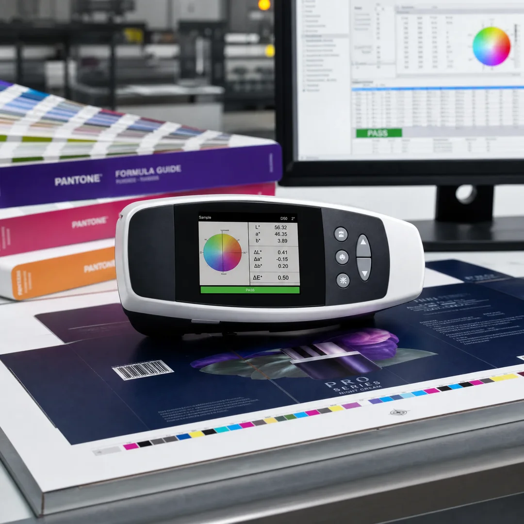
The workhorse instrument is the spectrophotometer — a device that shines a controlled light source onto the printed surface and measures the spectral reflectance across the visible wavelength range (typically 400 to 700 nanometers at 10-nanometer intervals). The reflectance data is then converted to CIELAB coordinates and compared against the target values. Handheld spectrophotometers from X-Rite (the eXact series) and Techkon (the SpectroDens) are the standard tools on packaging pressroom floors. They are fast — a measurement takes two to three seconds — and accurate to within 0.1 Delta E when properly calibrated.
Above the handheld level, automated scanning spectrophotometers — like the X-Rite IntelliTrax or Techkon SpectroDrive — mount on a track and scan an entire printed color bar in roughly 15 seconds, measuring every patch and generating a full report. These systems are common in high-volume packaging color management printing china facilities where manual measurement of every sheet would be impractical. The scanner feeds data directly into quality control software that tracks trends across the run, flags measurements outside tolerance, and alerts the press operator before the drift becomes a reject pile.
The third tier is the inline spectrophotometer — a sensor mounted directly on the printing press that measures color on every sheet in real time as it comes off the last unit. Inline systems are the gold standard for long-run packaging because they close the feedback loop instantly: the system detects a density drift in the magenta unit on sheet 2,347 and adjusts the ink keys on sheet 2,348, before a human operator would have noticed anything was wrong. This is not standard equipment at every factory, but it is increasingly common at G7-certified and GMI-certified facilities that serve international brands.
The Substrate Is Never Neutral: How Paperboard Changes Everything
Color does not exist in isolation. It exists on a surface, and the surface changes it. An ink film that measures 1.50 density on SBS white board might measure 1.35 density on grey board and 1.10 density on uncoated kraft. The ink is the same. The press is the same. The only variable is the substrate — and that variable alone is enough to destroy color consistency if it is not accounted for in prepress.
Why does the same ink look different on grey board versus white board?
The answer starts with the physics of light. When light hits a printed ink film, some wavelengths are absorbed by the pigment and some pass through the ink, reflect off the substrate underneath, and pass back through the ink again. The color your eye perceives is the combination of the light reflected directly from the ink surface and the light that traveled through the ink, hit the substrate, and bounced back. If the substrate is white (like SBS or coated duplex board), that bounced-back light is full-spectrum — it carries all wavelengths — and the ink color reads as bright and saturated. If the substrate is grey or brown (like grey board or kraft), the bounced-back light has already lost some of its spectral energy, and the ink color reads as darker and duller.
This effect is not subtle. A Pantone 185 C red printed on a 157 GSM coated art paper wrapped over 1.5 mm grey board will read approximately 8 to 15 percent less saturated than the same ink printed directly on 350 GSM SBS white board. The difference is visible to an untrained eye at arm’s length. It is catastrophic to a trained eye in a light booth. The practical consequence for packaging designers: if your brand color was specified on a white substrate — a Pantone swatch book, a digital proof on bright white stock, a screen rendering on a white background — and your finished box uses grey board as the structural core, the ink formulation must be adjusted to compensate for the substrate shift. This is standard practice at experienced packaging printers: they mix the Pantone ink slightly more saturated than the swatch, knowing that the grey board underneath will pull it back toward the target.
How does corrugated board change color reproduction compared to folding carton stock?
Corrugated board introduces a third variable beyond the substrate color: the surface texture. The outer liner of a corrugated sheet — even a white-topped liner — is not as smooth as coated folding carton stock. Under magnification, the surface is a landscape of microscopic peaks and valleys created by the paper fibers. Ink applied to this surface sits unevenly. Some of it pools in the valleys. Some of it sits on the peaks. The light scattering from this uneven ink film further desaturates the color, typically by another 5 to 10 percent beyond the substrate color effect alone.
For packaging color management printing china facilities that run both offset litho-laminated corrugated and direct-print flexo corrugated, the color targets are different even when the ink formulation is the same. A CMYK build that produces a specific brown on coated SBS will produce a visibly different brown on B-flute corrugated with a kraft liner. The solution is not to use the same color specification across substrates — it is to create substrate-specific color targets with separate CIELAB reference values and separate Delta E tolerances for each material combination.
Ink Sequence, Trap, and the Order That Changes Everything
Offset printing is a wet-on-wet process — each ink unit lays down its color before the previous unit’s ink has dried. The sequence in which the inks are applied changes the way they interact on the paper, which changes the final color. This is not a theory. It is a measured, repeatable physical phenomenon that every press operator manages and most packaging buyers never think about until the color comes back wrong.
Why does the ink printing sequence affect the final color?
The standard ink sequence on a four-color offset press is K-C-M-Y: black first, then cyan, then magenta, then yellow. This sequence is not arbitrary. Black goes first because it is the densest ink and needs the most time on the paper before subsequent inks overlay it. Yellow goes last because it is the most transparent and acts as an optical modifier for the inks underneath — if yellow went first, the cyan and magenta layers on top would obscure it. The cyan-magenta order in the middle is the most debated part of the sequence, and the choice between C-M-Y and M-C-Y shifts the entire color balance of the printed sheet.
The mechanism is called ink trapping — the ability of a wet ink film to accept the next ink film on top of it. When the second ink is applied over the first, a portion of the second ink transfers onto the first ink’s surface rather than onto the paper. If the trap is efficient — meaning the first ink readily accepts the second — the overprint color is rich and saturated. If the trap is poor, the overprint color shifts toward the first-down ink because less of the second ink is actually sitting on top. The trap efficiency depends on the ink tack (stickiness) of each color, which the press operator controls by adjusting the ink formulation and the water balance on each unit.
Research comparing K-C-M-Y to Y-M-C-K sequences on multicolor offset presses has demonstrated measurable shifts in color gamut volume and overprint hue angles. The K-C-M-Y sequence consistently produces a wider overall gamut and more predictable overprint colors, which is why it is the global standard. If a packaging job requires a non-standard sequence — for example, running a metallic Pantone as the last-down color so it sits on top of the CMYK for maximum reflectivity — the prepress department must adjust the color separations accordingly, because the trapping assumptions built into the standard ICC profile no longer hold.
What is trapping and why does it matter for packaging with tight color registration?
Trapping in prepress is a different concept from ink trapping on press, and confusing the two causes production errors. Prepress trapping — sometimes called “spread and choke” — is the deliberate slight overlap of adjacent colors in the artwork file to prevent white gaps from appearing if the printing plates are microscopically misaligned. On a packaging job with a gold foil logo over a dark blue background, the blue background is “spread” slightly into the area under the gold, so that if the foil stamping die is off by 0.1 mm, there is no white sliver of exposed board peeking through.
The standard trap width for offset packaging printing is 0.08 mm to 0.15 mm (roughly 0.003 to 0.006 inches). This is invisible to the naked eye at normal viewing distance — the overlap is smaller than a human hair — but it is the difference between a box that looks professionally printed and a box that shows a hairline of unprinted board at every color boundary. Most packaging prepress software (Esko, Kodak Prinergy, Heidelberg Prinect) applies trapping automatically based on the ink sequence and the substrate characteristics. For manual trapping in Illustrator or InDesign, packaging designers should apply the trap in the opposite direction of the more visible color — spread the lighter color into the darker, or spread the background into the foreground element.
Proofing, Sign-Off, and the Moment Truth Meets Expectation
The proof is the only objective link between the designer’s intent and the printed output. Everything before the proof — the screen rendering, the soft proof, the Pantone swatch — is an approximation. The proof is the target. If the proof is wrong, the entire production run will be wrong, and the printer is technically not at fault because they matched the proof you approved. This makes proof evaluation the single highest-leverage activity in the entire packaging color workflow.
What is the difference between a digital proof and a press proof for packaging?
A digital proof — produced on an inkjet proofer like the Epson SureColor series with a RIP that simulates the press’s CMYK output — is fast and cheap. The file is sent to the proofing RIP, color-managed against the press’s ICC profile, and printed on a substrate that approximates the final paper stock. A digital proof costs USD 20 to 50, arrives in hours or a day, and gives a close approximation of the color that the press will produce. The key words are “close approximation.” A digital proof uses inkjet pigments, not offset inks. It is printed on proofing paper, not the actual packaging board. Its gloss level, dot structure, and optical brightener content are different from the production sheet.
A press proof — also called a wet proof or a machine proof — is produced on the actual offset press using the actual inks, plates, and paper stock that will be used for the production run. It is identical to the final product because it is the final product, just in small quantity. A press proof costs USD 300 to 800, takes 5 to 10 working days to schedule and produce, and represents the ground truth for color expectations. For packaging where color accuracy is brand-critical — luxury goods, cosmetics, spirits, any product where the packaging color is a brand identifier — the press proof is not optional. It is the only way to verify that the color on the actual substrate, under the actual ink film thickness, at the actual press speed, matches the designer’s intent.
The workflow that experienced packaging buyers follow: request a digital proof first to verify the layout, text, and general color balance. Once the digital proof is approved, request a press proof on the actual production stock. Compare the press proof to the Pantone swatch under D50 lighting (5000K daylight, the industry standard for color evaluation). If the press proof is within Delta E 2.0 of the Pantone target, sign it and instruct the printer to use it as the contract proof for the production run. If it is outside tolerance, reject it with specific measurement data and have the printer adjust the ink formulation and produce a new press proof.
What lighting conditions should be used to evaluate a packaging color proof?
The international standard for graphic arts color evaluation is ISO 3664:2009, which specifies D50 illumination (correlated color temperature of 5000K, approximating natural daylight) at an illuminance of 2,000 lux, in a viewing environment with neutral grey surroundings (Munsell N8 or equivalent, roughly 60% reflectance). The viewing booth should be the only light source in an otherwise darkened room, because ambient light from windows or ceiling fixtures will introduce a different color temperature and skew the visual assessment.
In practice, many packaging buyers evaluate proofs under whatever light is available — office fluorescent, living room incandescent, or the worst offender, a laptop screen at maximum brightness in a coffee shop. This is why color disputes happen. A box that looks perfect under warm 3000K kitchen lighting may look visibly off under the cool 5000K retail lighting where it will actually be displayed. The discipline is: evaluate the proof under D50, in a controlled viewing environment, with the Pantone swatch and any previous production samples for direct comparison. If you do not have a viewing booth, a north-facing window on an overcast day is the closest natural approximation to D50. Anything else is guesswork dressed up as evaluation.
Batch-to-Batch Consistency and the G7/GMI Question
A single production run with accurate color is an achievement. Two production runs, six months apart, with identical color — that is a system. The difference between achievement and system is process control, and in the packaging industry, process control has a name: G7 and GMI.
What is G7 certification and how does it improve packaging color consistency?
G7 is a methodology developed by Idealliance that defines a specification for grey balance and tone reproduction in CMYK printing. The “G” stands for grey, and the “7” refers to the seven primary colors in the process — CMYK plus RGB, reflecting that the methodology applies across print and display. The core principle of G7 is that if the grey balance is correct — meaning equal combinations of cyan, magenta, and yellow produce a neutral grey at every tonal value from highlight to shadow — then the overall color balance of the print will be correct. G7 specifies target CIELAB values for the three-quarter-tone (75%) and quarter-tone (25%) grey patches, as well as target density and dot gain curves for the individual CMYK channels.
A G7-certified facility has demonstrated that its printing process — from prepress through press to finishing — can consistently hit the G7 grey balance and tone reproduction targets. The certification is facility-specific and process-specific; a factory with G7 certification for its offset lithography department does not automatically have certified flexo or digital departments. For packaging buyers working with packaging color management printing china suppliers, G7 certification is a meaningful signal that the factory has invested in color management infrastructure — spectrophotometers, calibration software, operator training — and that its process is audited periodically by an external certification body.
The practical impact of G7 on a packaging print run: when a factory runs a G7-calibrated press, the printed sheet matches the proof within a predictable Delta E range, without the press operator making subjective adjustments on the fly. The operator is adjusting to keep the solid ink density and dot gain within the G7 specification, not adjusting to make “the red look redder.” The former approach produces consistency. The latter produces variation masquerading as expertise.
What does GMI certification mean for packaging printing quality?
GMI (Graphic Measures International) certification is similar to G7 in its focus on process control and color consistency, but it is more specifically targeted at packaging and it is the certification that major retailers — Target, CVS, Walgreens, Home Depot, and others — require of their packaging suppliers. GMI certification evaluates a facility’s entire quality management system: prepress workflow, proofing accuracy, press-side measurement practices, operator training records, and the physical condition of the measurement equipment. The certification is audited annually, and the standard is strict.
The GMI certification process begins with an online self-evaluation that assesses the facility against minimum requirements for equipment and process capabilities. If the self-evaluation passes, GMI sends a physical testing kit — printed color targets on standardized substrates — that the facility must measure, report, and return. The kit measurement results must fall within tight tolerances. If both the self-evaluation and the testing kit pass, the facility receives certification. If the testing kit fails twice, GMI requires an on-site audit before certification can proceed.
For packaging buyers, GMI certification is more than a logo on a factory website. It means the factory has a documented, audited process for maintaining color consistency between proof and press, between shift and shift, and between production run and production run. It means the factory can provide measurement data — not just visual assessments — to support color quality claims. And it means the factory is accountable to an external standard, not just its own internal definition of “good enough.” When choosing between two Chinese packaging factories with similar pricing and similar sample quality, GMI or G7 certification is the tiebreaker that favors process over promises.
Spot Color Formulation and the Ink Kitchen
A Pantone number is a recipe, not a color. The color happens when the recipe is mixed by a human being using a scale, an ink knife, and a spectrophotometer — or, increasingly, by an automated ink dispensing system that eliminates the human variable from the weighing step. The difference between a recipe and a color is the ink kitchen, and the ink kitchen is where spot color consistency is won or lost before the first sheet hits the press.
How is a Pantone spot color mixed and verified in production?
The process begins with the Pantone formula guide, which specifies the proportions of base inks — typically from a set of 14 to 18 Pantone base colors plus transparent white — required to produce each numbered color. An experienced ink technician weighs the base inks on a digital scale accurate to 0.01 gram, mixes them thoroughly with an ink knife on a glass or stone mixing surface, and draws down a thin film of the mixed ink onto the actual production paper stock using a hand roller or a laboratory proofer. The drawdown is measured with a spectrophotometer against the target CIELAB values for the specific Pantone number, on the specific substrate. If the Delta E is within tolerance — typically ≤ 2.0 at the mixing stage, with the understanding that press-side adjustments will fine-tune further — the ink batch is approved and sent to the press.
The variables that can go wrong at the mixing stage are predictable but numerous. The technician uses an older edition of the formula guide that lists different base proportions. The scale drifts out of calibration by 0.5 gram, which is enough to shift a light pastel color by a visible amount. The technician substitutes a similar-looking base ink from a different manufacturer, not realizing that the spectral reflectance curves are different even though the visual appearance is close. The transparent white component — which makes up the majority of many pastel and light-color formulations — is from a different batch with slightly different opacity. None of these errors is catastrophic on its own. Cumulatively, they produce an ink that measures Delta E 4.0 off the swatch before the press even starts up.
Automated ink dispensing systems — from manufacturers like Inkmaker, Rexson, and GSE — eliminate the weighing error by pumping precise volumes of base ink components into a mixing container under computer control. The system stores the formula database digitally, eliminates the scale calibration variable, and records every batch for traceability. The cost of an automated dispensing system is significant — typically USD 30,000 to 100,000 — but for factories producing high volumes of spot-color packaging, the reduction in ink waste and color rejections pays for the system within 12 to 24 months. For packaging buyers, the presence of an automated ink kitchen is a strong signal that the factory takes spot color consistency seriously.
Eco-Friendly Inks and the Color Gamut Trade-Off
The printing industry’s shift from petroleum-based inks to vegetable-based and water-based alternatives is driven by environmental regulation, brand sustainability commitments, and consumer preference. The shift has been largely successful from a printability standpoint — modern soy-based offset inks run on standard Heidelberg and Komori presses with minimal formulation adjustments. But the color characteristics are not identical, and understanding the differences prevents the discovery of a gamut limitation after the production run is complete.
Do soy-based and water-based inks produce the same color as petroleum-based inks?
Soy-based offset inks — in which a portion of the petroleum-derived vehicle is replaced with soybean oil — produce color that is functionally equivalent to conventional inks for the vast majority of packaging applications. The pigment load is the same, the transparency is comparable, and the color gamut is within 2 to 3 percent of conventional inks across the CIELAB space. The practical difference is in drying behavior: soy-based inks dry slightly slower than petroleum-based inks, which affects the trap window (the time between ink units where the ink film is still receptive to the next color) and can shift overprint colors by a small amount if the press speed and water balance are not adjusted accordingly. A competent press operator accounts for this, and the resulting color shift is typically within Delta E 1.0 — not perceptible to consumers, but measurable and correctable in prepress.
Water-based inks — used primarily in flexographic printing for corrugated packaging — are a different story. The color gamut of water-based flexo inks is noticeably smaller than solvent-based flexo or offset inks, particularly in the saturated red and blue regions. A rich, deep navy blue that is achievable in offset with a 100% cyan, 80% magenta build may reproduce as a lighter, slightly purplish blue in water-based flexo because the pigment load is lower and the ink film thickness is thinner. The solution is not to expect water-based flexo to match offset lithography — it will not. The solution is to create separate color targets for each print process and to communicate those targets to the brand owner before the design is finalized, not after the first production run reveals the limitation.
For packaging color management printing china projects that specify eco-friendly ink as a requirement, the practical approach is: for offset-printed folding cartons and rigid boxes, soy-based inks will deliver color that is indistinguishable from conventional inks to the end consumer. For flexo-printed corrugated, request a press proof on the actual water-based ink system and manage color expectations from the start. The sustainability credential is real and marketable. The color gamut is what it is, and pretending otherwise helps nobody.
Color Problems in Production: The Patterns That Repeat
Every packaging print facility on earth has a drawer full of rejected sheets. The reasons are varied but the patterns are consistent. Knowing what those patterns are, and what causes them, lets a packaging buyer ask the right questions before the run starts instead of after the boxes arrive.
What causes color to shift during a long packaging print run?
Color drift during a run is caused by three interacting variables: ink-water balance, ink temperature, and plate wear. The ink-water balance on an offset press is a dynamic equilibrium: the dampening system applies a thin film of fountain solution to the non-image areas of the plate, and the ink system applies ink to the image areas. The two films must coexist on the plate without the ink emulsifying into the water or the water diluting the ink. As the press runs, the temperature of the ink rollers increases due to friction, which reduces the ink’s viscosity and changes its water-holding capacity. The operator compensates by adjusting the water feed, but the compensation is reactive — the drift happens first, and the correction happens after.
The result is a gradual color shift that typically moves in one direction over the course of a run: density decreases as the ink emulsifies with more water, or density increases as the operator overcorrects the water reduction and starves the dampening system. A spectrophotometer reading every 500 to 1,000 sheets catches this drift early. A visual check every 5,000 sheets may not catch it at all until the drift has accumulated enough to be visible. This is why G7-certified and GMI-certified facilities specify measurement intervals in their quality control procedures — not because they distrust their operators, but because human eyes adapt to gradual change and stop registering it as change.
Why does the printed color change as the ink dries?
Freshly printed offset ink looks different from the same ink after it has fully dried and oxidized. The effect is most pronounced on uncoated and matte-coated papers, where the ink film sinks into the paper surface as it dries, reducing the gloss and shifting the perceived color toward a duller, slightly lighter appearance. The phenomenon is called dry-back, and it is primarily a surface effect: the pigment does not change, but the microscopic surface texture of the dried ink scatters light differently than the wet ink surface.
The dry-back delta varies by ink type and substrate, but a typical range is Delta E 2.0 to 4.0 between the wet sheet at the delivery end of the press and the same sheet 24 hours later after full oxidation. Experienced press operators compensate by running the color slightly heavier than the target, knowing it will dry back to the target. Inexperienced operators match the wet sheet to the proof, and the dried boxes show up lighter than expected. For a packaging buyer evaluating a press check at the factory, the rule is simple: ask to see a dried production sample from an earlier run on the same stock, not just the wet sheet coming off the delivery. The wet sheet will always look richer. The dried box is what your customer will see.
What causes uneven color across a single printed sheet?
Uneven color within a sheet — darker on one edge, lighter in the center, striations along the print direction — has three primary causes in offset lithography. The first is uneven ink distribution across the ink roller train: if the ink fountain keys are set incorrectly, the ink film thickness varies across the width of the sheet, producing a visible density gradient from one side to the other. The second is ghosting — a faint repetition of a heavy-image area appearing in a lighter area further along the sheet — caused by the ink form roller not fully replenishing its ink film before contacting the plate again. The third is mechanical: a worn or uneven impression cylinder, a plate that is not mounted at uniform tension, or a blanket that is thicker on one edge than the other.
For packaging with large areas of solid color — which is common on boxes where a brand color covers the entire outer surface — any density variation above roughly 0.05 across the sheet is visible at normal viewing distance. The solution is a combination of proper ink key setting (which a closed-loop color control system handles automatically), correct roller pressure calibration (which is a maintenance function), and solid-ink-density measurement at multiple points across the sheet (left, center, right at minimum). A print facility that measures density only at the center of the sheet is not controlling color. It is hoping that the edges match the center.
Remote Color Communication: Pixels Are Not Pigment
A packaging buyer in Los Angeles cannot walk the press floor of a factory in Shenzhen. This is the operational reality of global packaging production, and it creates a communication problem that no amount of email bandwidth or video call quality can fully solve. The color on your screen is not the color on the press sheet. Understanding the gap — and the tools that bridge it — is the difference between approving a production run with confidence and approving it with a prayer.
Can packaging color be evaluated reliably from a photo or video?
No. This is the shortest answer in this entire guide and the one that causes the most expensive mistakes. A digital photo of a printed box, viewed on a phone screen or a computer monitor, is a representation of the color — not a measurement of it. The chain of variables between the physical box and the pixels on the screen includes: the color temperature of the room lighting, the camera sensor’s white balance setting, the camera’s internal color processing pipeline, the file compression (JPEG discards color information), the screen’s color gamut and white point, the ambient light in the viewing room, and the viewer’s own color adaptation state. Every link in that chain shifts the color by a small amount. Cumulatively, the shift can be Delta E 10.0 or more — three times the failure threshold for production color matching.
A photo or video is useful for evaluating structural details — box assembly, foil registration, embossing alignment, glue joint quality — but useless for evaluating color. The only reliable remote color evaluation method is a spectrophotometer measurement reported as CIELAB values or Delta E against a known target, ideally accompanied by a physical sample shipped by express courier for simultaneous visual inspection. The physical sample method adds 3 to 5 days and USD 30 to 80 in courier costs to the approval process. It is worth every penny and every day compared to the cost of approving a color from a photo, running 5,000 boxes, and discovering on delivery that the photo was wrong.
How do packaging brands manage color approval with overseas printers?
The workflow that professional packaging buyers use for remote color approval has three layers. First, a contract proof — a color-managed digital proof or, ideally, a press proof — is produced by the printer and shipped to the buyer. The buyer evaluates the proof under D50 lighting against the Pantone swatch and any previous production samples. If the proof is approved, it becomes the reference standard for the production run, and the printer is contractually obligated to match it.
Second, during the production run, the printer provides measurement data — not photos, not videos, not “it looks good to me” — in the form of a spectrophotometer report showing CIELAB values and Delta E 2000 for the key color patches on each signature. A typical report includes measurements at the start, middle, and end of the run, plus any sheets measured during the run at the specified interval (typically every 500 to 1,000 sheets). The buyer reviews the data for trends: if the Delta E is increasing across the run, there is a process control issue that will get worse before the run completes.
Third, for the first production run with a new printer or a new packaging design, the buyer requests a small number of finished boxes — 5 to 10 units — to be air-freighted ahead of the main sea freight shipment. This gives the buyer a physical reference to evaluate before the bulk shipment arrives, creating a window for correction if something went wrong that the measurement data did not catch. The cost of this step is roughly USD 80 to 200 in air freight. The cost of not doing it is the total value of a full production run with a color problem that could have been caught with a physical sample.
Frequently Asked Questions
How long does ink take to fully cure on packaging, and does it affect the color I see at press check?
Offset ink cures through a combination of absorption (the liquid vehicle soaks into the paper) and oxidation (the oil-based vehicle reacts with oxygen to form a solid film). Absorption is rapid — seconds to minutes. Oxidation is slow: the ink is touch-dry within 4 to 8 hours but not fully cured for 24 to 72 hours depending on the ink formulation, the paper stock, and the ambient humidity. The color changes during this window — the dry-back effect described earlier — and stabilizes once oxidation is complete. A press check conducted on a wet sheet will show a color that is visibly different from the final dried product. The standard practice is to compare the wet sheet to a dried standard (not to the wet proof) or to wait for a dried sheet before making color adjustments on press.
What is a color bar, and where does it go on a packaging print sheet?
A color bar is a strip of standardized color patches — typically including solid CMYK patches, two-color overprints, grey balance patches, and sometimes Pantone spot color patches — printed along the trim edge of the press sheet. It provides the measurement targets that the press operator and the quality control system use to evaluate color consistency. The color bar is positioned in the gripper margin or the tail margin of the sheet, outside the live print area, so that it is trimmed off after printing and does not appear on the finished box. The standard color bar for offset packaging printing is the FOGRA media wedge or the Idealliance ISO 12647-7 control strip, depending on the certification standard the factory follows. If a factory cannot show you a color bar measurement report from your production run, they are not measuring color — they are evaluating it by eye, and every measurement standard in this guide depends on the existence of a measured color bar.
Can different paper batches from the same supplier produce different color results?
Yes. Paper manufacturing has its own batch-to-batch variation in brightness, whiteness, and surface smoothness, and those variations directly affect printed color. A paper batch with a CIE whiteness of 130 will produce visibly brighter, more saturated color than a batch with a whiteness of 120, even with identical ink coverage. Optical brightening agents (OBAs) — fluorescent compounds added to paper to make it appear whiter — degrade over time and shift the paper’s color temperature toward yellow. A reprint six months after the original run, on paper from a different production batch, may show a color shift of Delta E 2.0 to 3.0 before any ink is applied, simply because the paper itself is different. The solution is to request that the printer use paper from a single batch for the entire order, and to provide a new contract proof on the current paper batch for any reprint that is separated from the original run by more than 90 days.
What is the most common color management mistake in packaging printing?
Designing in RGB and expecting the printed result to match the screen. This single error is responsible for more color-related packaging rejections than all other causes combined. An RGB color space — whether sRGB, Adobe RGB, or the monitor’s native gamut — can display colors that no printing press on earth can reproduce. The conversion from RGB to CMYK is a gamut compression: out-of-gamut colors are remapped to the nearest reproducible color, which is often visibly different from the original. The solution is to design in CMYK from the start using the printer’s ICC profile, soft-proof against that profile at every stage, and never, ever approve a color based on how it looks on an uncalibrated screen in a bright room. The screen is a liar. The spectrophotometer is not.
Is food packaging subject to different ink and color regulations?
Yes, and the regulations are not about color accuracy — they are about chemical migration. Inks used on food packaging must be formulated with low-migration properties: the ink components must not transfer through the packaging material into the food product. This is governed by regulations such as EU Framework Regulation (EC) No. 1935/2004, the Swiss Ordinance on materials and articles in contact with food, and the Nestlé Guidance Note on Packaging Inks. Low-migration ink systems use specially selected pigments and vehicles that have been tested for migration potential, and they are more expensive than conventional inks — typically 15 to 30 percent more. The color gamut of low-migration inks is comparable to conventional offset inks for most applications, but certain bright pigments (particularly in the yellow and orange range) may not be available in low-migration formulations. For food packaging that requires bright, saturated colors, confirm with the printer that the color targets are achievable with the specific low-migration ink system before committing to the design.