Your Files Are the Bottleneck — Not the Press
Last month, a self-published author sent us her children’s book files three days before her launch event. She had spent six months on the illustrations. The artwork was beautiful. Every single page was an RGB PNG exported from Canva at 96 DPI. No bleeds. No trim marks. Fonts were rasterized because Canva does not embed fonts in PNGs — it flattens everything into pixels. We had to tell her the files would not print. She missed her launch date by two weeks.
This scenario plays out constantly. In our prepress department, roughly 90% of file submissions need revision before they can go to plate. The printing itself takes maybe 48 hours on a Heidelberg press. The file fixing eats days, sometimes weeks. Every hour of back-and-forth corrections is an hour the press sits idle. You pay for turnaround time whether your files are ready or not.
This guide covers every technical requirement you need to meet before submitting your print-ready files for book printing . No fluff. No generic advice. Just what the prepress team actually checks when your files land in their inbox.
What Actually Counts as a Print-Ready File?
A print-ready file meets every technical specification required to transfer your design onto paper without interpretation, adjustment, or compromise. When we receive a truly print-ready file, it goes from inbox to plate in under an hour. Here are the six non-negotiable requirements:
1. Correct file format. PDF/X-1a is the industry standard. It strips out everything the press cannot use and embeds what it needs: fonts, color profiles, and image data. Other accepted formats include PDF/X-4, packaged InDesign folders, packaged Illustrator files, and TIFF sequences. Word documents, Canva native files, and loose JPGs or PNGs are not print-ready.
2. Bleeds included. Artwork must extend 3 mm (0.125 inches) beyond the trim line on all four sides. A 6″ × 9″ book needs a 6.25″ × 9.25″ file. Without bleed, the guillotine cutter exposes a hair-thin white edge — the most common reason covers get rejected.
3. Trim marks present. Thin corner lines telling the cutter operator exactly where to slice. They sit outside the bleed area, offset by at least 3 mm. Do not confuse these with crop marks from layout software.
4. Minimum 300 DPI at final print size. Images at 72 or 150 DPI print soft and pixelated. Check effective PPI in your Links panel — an image placed at 200% scale halves its resolution.
5. CMYK color mode with embedded ICC profile. RGB is for screens. CMYK is for ink on paper. Sending RGB files means the conversion happens on the printer’s RIP, and you lose control.
6. All fonts converted to outlines or fully embedded. Missing fonts trigger substitution dialogs that break layouts. Either outline type before export or use PDF/X standards to embed everything. Never assume your printer has your font licenses.
Accepted and Rejected File Formats
Printers are not being difficult when they reject certain formats. Most formats were never designed for commercial offset printing.
Formats We Accept
PDF/X-1a (Preferred). This subset of PDF requires embedded fonts, CMYK or spot colors, and flattened transparency. There is no ambiguity. If a PDF/X-1a looks right on screen, it will look right on press.
PDF/X-4 (Accepted with Caution). PDF/X-4 supports live transparency and layers, which is more flexible but riskier. Different RIPs flatten transparency differently. For most book projects, PDF/X-1a is the safer choice.
Packaged InDesign (.indd + Links + Fonts). Use File → Package to collect your document, linked images, and fonts into one folder. This gives prepress full source access if adjustments are needed.
Packaged Illustrator (.ai + Links + Fonts). Same principle. An AI file with missing linked images is a puzzle, not a print file.
TIFF Sequences. For photobooks where every page is a full-bleed image: individual TIFFs, one per page, numbered sequentially, 300 DPI, CMYK, flattened.
Formats We Reject — And Why
Microsoft Word (.docx). Word is a word processor, not a layout tool. It does not support bleeds or reliable font embedding. Its color management is nonexistent. Every Word file needs rebuilding in InDesign, adding cost and time to your project.
Canva Exports (PNG, JPG). Canva is screen-first. Default exports are RGB, 96 DPI, and unbleeded. Even “PDF Print” exports often miss proper bleed settings and always rasterize text. If you must use Canva, follow the export instructions in Section 6, then get your file reviewed before committing to a print run.
PowerPoint (.pptx) and Individual JPGs/PNGs. Presentations belong on projectors, not printing presses. A folder of loose images has no page order, no bleed, and rasterized text — which prints soft at the edges. Vector text prints sharp because the RIP traces outlines mathematically.
Bleed and Trim Marks: The 3 mm That Determines Your Cover Quality
A guillotine blade does not land with surgical precision on an imaginary line. It lands within a fraction of a millimeter, and that fraction shifts across 500 sheets in a lift. Bleed absorbs those shifts by giving the cutter operator room to work without exposing raw paper at the edges.
The standard is 3 mm (0.125″) on all four sides. Here is how the three zones work on a 6″ × 9″ cover:
Bleed zone: 6.25″ × 9.25″ total document size. Edge-to-edge images and backgrounds must fill this entire area. It gets printed but cut away after binding.
Trim line: 6″ × 9″. Where the blade cuts. Never place critical content on this line — the cut may shift up to 1 mm.
Safe zone: At least 0.25″ (6 mm) inside trim on all sides — roughly 5.5″ × 8.5″. All text, logos, faces, and page numbers stay within this boundary.
For interior pages of perfect-bound books, add extra inner margin: 0.75″ inside minimum. The glued spine eats into visible page area, and readers should not have to crack the binding to read text near the gutter.
Image Resolution and Color: 300 DPI and CMYK Are Not Suggestions
Your screen displays images at 72-96 PPI and looks sharp because it emits light directly at you. Paper reflects light. Ink spreads slightly as it absorbs into fibers — this is dot gain. To compensate, you need at least 300 DPI at final output size. Below that threshold, halftone dots become individually visible — that is what “pixelated” means in print.
The RGB-to-CMYK conversion is where things go wrong. RGB (additive, light-based) has a far larger color gamut than CMYK (subtractive, ink-based). Neon green, electric blue, and hot pink simply cannot be reproduced with ink. When you convert RGB to CMYK, out-of-gamut colors shift to the nearest printable equivalent — almost always duller and muddier. We have seen entire photobooks print with a green cast because an automatic RGB-to-CMYK conversion pushed every warm tone toward cyan-green.
The fix: work in CMYK from the start in Photoshop and Illustrator. Assign Coated FOGRA39 for most book projects. Soft-proof using View → Proof Colors. For black-and-white interiors, convert all images to grayscale with 20% dot gain — this prevents color casts from four-color black builds.
How to Export a Print-Ready PDF from Four Platforms
The export step is where most mistakes get baked in permanently. Here are the exact settings for each platform.
Adobe InDesign (Recommended)
File → Export → Adobe PDF (Print). Select PDF/X-1a:2001 from the Preset menu. Go to Marks and Bleeds: check Crop Marks and Use Document Bleed Settings (or enter 3 mm manually). Under Output, confirm Convert to Destination with Coated FOGRA39. Export, then open the PDF and zoom to 400% on random pages to verify sharp text and correct trim marks.
Adobe Illustrator
File → Save As → Adobe PDF. Select PDF/X-1a:2001. Under Marks and Bleeds, check Trim Marks and set bleed to 3 mm. Critical: check your Links panel before exporting. Illustrator does not embed linked images by default when saving as PDF. Any missing-link image prints as a low-resolution proxy.
Canva (Last Resort)
Set your document to trim size + bleed (e.g., 6.25″ × 9.25″ for a 6″ × 9″ book). Add guides at 0.125″ from each edge. Keep text at least 0.375″ inside the trim. Share → Download → PDF Print, check Crop marks and bleed, set color to CMYK. Then open the PDF in Acrobat, run Preflight (Tools → Print Production → Preflight), and check for PDF/X-1a compliance. Canva exports frequently fail this check — professional review is strongly recommended.
Microsoft Word (Bridge Only)
File → Save As → PDF → Options → check ISO 19005-1 compliant (PDF/A). This embeds fonts. But Word still cannot handle bleeds, color conversion, or image resolution. The honest path: if your manuscript lives in Word, hire a layout designer to rebuild it in InDesign. The $300-500 layout fee saves far more in reprints and schedule delays.
The Seven Prepress Mistakes We See Every Week
Our prepress team reviews roughly 200 file submissions per month. The same seven errors appear again and again.
1. Missing bleeds. About 40% of cover files arrive with artwork stopping at the trim edge. Fix: extend all backgrounds 3 mm beyond trim. Set up your document correctly before designing — adding bleed at the end is painful.
2. Low-resolution images. Screen-resolution images at 72 or 96 PPI sneak into layouts constantly, especially when designers pull images from websites. Fix: check effective PPI in your Links panel. Any image below 250 effective PPI needs replacing.
3. RGB color mode. Auto-converted RGB produces unpredictable results — color shifts, muddy four-color blacks. Fix: convert to CMYK before export. Set document color mode to CMYK at project start.
4. Fonts not outlined or embedded. Missing-font substitution changes kerning, line breaks, and sometimes the typeface itself. Fix: in Illustrator, Create Outlines. In InDesign, PDF/X-1a embeds fonts automatically — verify by checking File → Properties → Fonts in Acrobat.
5. Wrong page order or DIY imposition. We handle imposition. Do not try to arrange pages into printer spreads based on a YouTube tutorial. Send pages in sequential reading order and let prepress do the rest.
6. Thin lines in rich black. Rich black (CMYK mix) looks deeper than 100% K alone. But fine lines under 1 pt and small text under 12 pt in rich black show color fringing from plate registration shifts. Fix: use 100% K for body text and fine lines. Reserve rich black for areas larger than 25 mm.
7. Transparency flattening artifacts. Drop shadows and blend modes look great in InDesign. Flattened, white boxes appear behind transparent objects and gradient banding shows up. Fix: export complex transparency as PDF/X-4 and communicate with your printer. Or flatten manually in Photoshop before placing.
The 10-Point Prepress Checklist
Run through this list before uploading or emailing files. It takes five minutes. It saves days of corrections.
☐ 1. Document size includes bleed. Cover: trim + 6 mm. Interior: trim size with bleed on edge-to-edge elements only.
☐ 2. Trim marks present and offset. Outside bleed area, 3 mm from trim. No registration targets or color bars cluttering the page.
☐ 3. All images at 300 DPI (100% placed size). Check every image in Links panel. Do not skip logos and icons — they are common offenders.
☐ 4. CMYK with embedded ICC profile. Coated FOGRA39 for coated paper. Verify in Acrobat Output Preview.
☐ 5. Fonts embedded or outlined. Acrobat → File → Properties → Fonts. Every font shows “Embedded” or “Embedded Subset.”
☐ 6. Total ink coverage ≤ 300%. Check in Acrobat Output Preview. Higher coverage causes set-off and extended drying.
☐ 7. Safety margins respected. No critical content within 6 mm of trim edge or spine. Check every page.
☐ 8. Page count divisible by 2. Every book has an even number of pages. Handle blank pages yourself rather than leaving surprises.
☐ 9. Black text is 100% K only. Not rich black. Check body copy, page numbers, and small text especially.
☐ 10. Opened the PDF and checked every page at 100% zoom. What you see in Acrobat is what the RIP sees. What the RIP sees is what prints.
Frequently Asked Questions
What file formats do you accept for book printing?
We accept PDF/X-1a (strongly preferred), PDF/X-4, packaged Adobe InDesign files with all links and fonts, packaged Adobe Illustrator files with all links and fonts, and single-page TIFF sequences. PDF/X-1a is the safest choice — it requires embedded fonts, flattened transparency, and CMYK color, leaving no ambiguity. We do not accept Word documents, Canva native files, PowerPoint files, or loose JPG/PNG images as print-ready submissions. If you are working in a non-design tool, budget for professional layout conversion.
What resolution should my images be for book printing?
All images must be 300 DPI at 100% placed size. An image at 200% scale effectively halves its resolution — 300 DPI becomes 150 DPI. Check effective PPI in your layout software’s Links or Document Info panel. Line art and bitmap images benefit from 600-1200 DPI for razor-sharp edges. For black-and-white interiors, convert images to grayscale and target 20% dot gain to prevent color casts.
How do I prepare my files for book printing?
Start with correct document dimensions: trim size plus 3 mm bleed on all four sides. Work in CMYK from the first pixel — never design in RGB and convert at the end. Set safe margins at least 6 mm inside trim, with extra inner margin (18-20 mm) for perfect-bound books. Place all images at 300 DPI at 100% scale. Export as PDF/X-1a with crop marks enabled and bleed included. Open the PDF in Acrobat, check every page at 100% zoom, and run the preflight tool. If any step feels uncertain, have your files professionally reviewed before committing to a full print run.
What are bleeds and trim marks, and why do I need them?
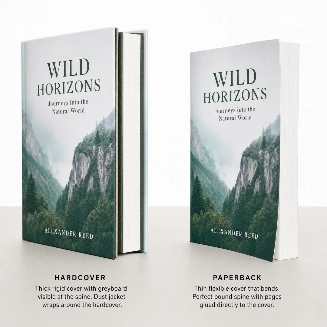
Bleed is the extra 3 mm of artwork extending beyond your book’s final trim size. It accounts for mechanical variation in the guillotine cutting process. Without bleed, even a 0.5 mm shift exposes white paper at the page edge — a thin unprinted line that makes finished books look amateur. Trim marks are thin corner lines telling the cutter operator exactly where to cut. They must sit outside the bleed area. Both are required on every job; files without them get rejected. For production specifications beyond file setup, see our book printing cost guide and hardcover vs paperback comparison .
Get Your Files Reviewed Before You Print
Even experienced designers miss things. A stray RGB image. A font that did not embed properly. A transparency effect that flattens with a ghost box around it. This is not incompetence — it is the nature of print production, where a hundred variables interact and your eyes get tired after weeks on the same layout.
EcoPrinting offers a free file review with every quote. Send us your files before committing to a print run. Our prepress team checks every page against the exact specifications of our Heidelberg presses. If there is a problem, we tell you what it is and how to fix it — no charge, no obligation. It takes 24 hours on our end. It can save you from printing hundreds of books with a green color cast, fuzzy cover text, or missing bleeds. Those mistakes are not fixable after the books leave the bindery.
If you are not ready for a quote yet, our Book Printing Cost 2026 guide and Hardcover vs Paperback comparison cover the full production picture. For deeper file specifications including specialty scenarios, we also have a detailed artwork preparation guide .