When it comes to producing a professionally printed book, the quality of your artwork can make or break the final product. Even a flawless manuscript falls short if the design files sent to the printer aren’t properly prepared. This is where prepress artwork comes in — a critical step that bridges your creative vision and the physical printed page.This guide walks you through everything you need to know about preparing print-ready artwork, from understanding the fundamentals to avoiding the most common mistakes authors, designers, and publishers make.
What is Pre-press Artwork?
Pre-press artwork refers to the process of preparing visual elements — cover designs, internal layouts, graphics, and images — to meet the technical specifications required for commercial printing. It is not about creating the content itself, but about ensuring that every design file is formatted, colored, and structured so that a printing press can reproduce it accurately and consistently.
Think of it as the quality control layer between design and production. Without proper prepress artwork preparation, you risk color shifts, cropped images, missing bleeds, and text that prints blurry or misaligned. In short: great books start with great prepress.
6 Essential Artwork Requirements for Print-Ready Files
Meeting these six core requirements will ensure your files are accepted by any reputable book printer and produce the highest quality output.
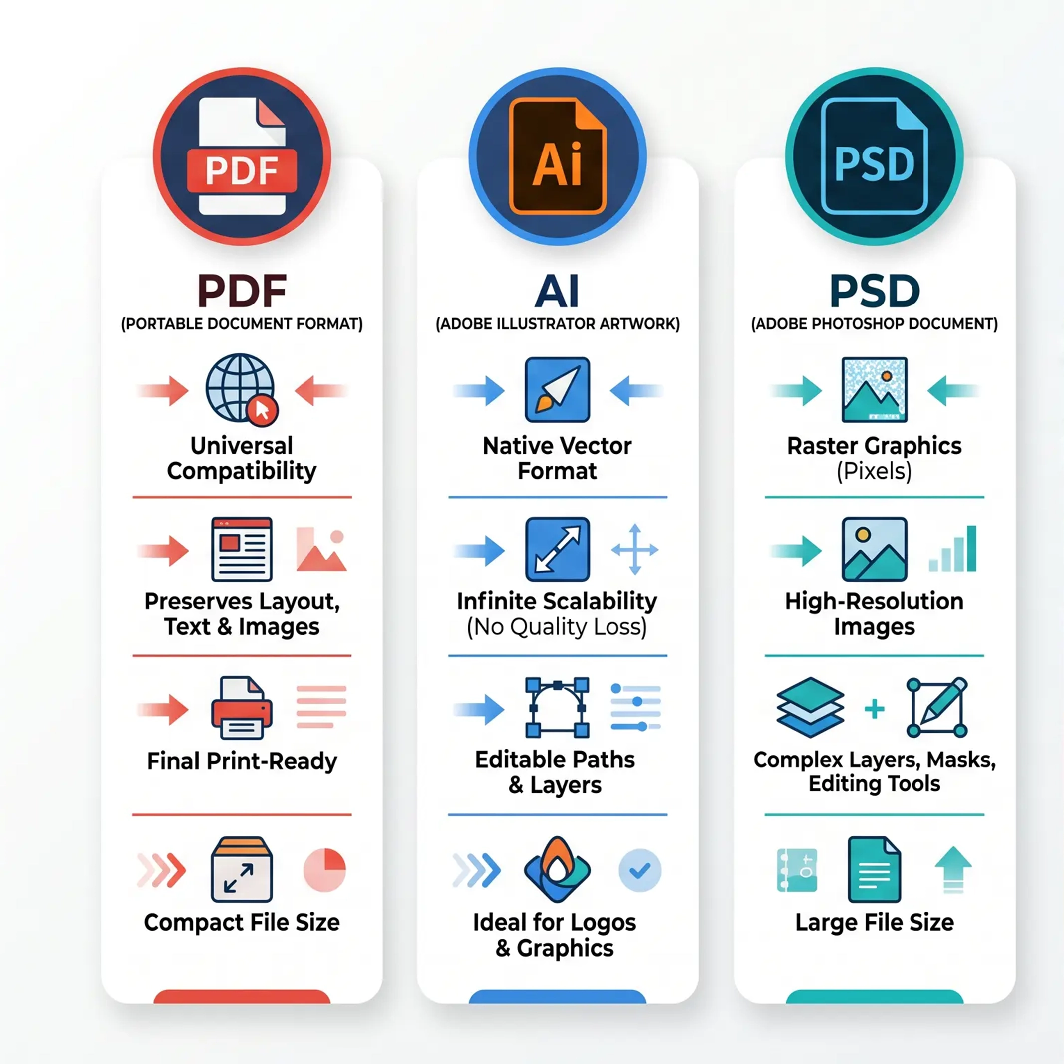
1. Export as PDF
Always submit your artwork as a high-resolution PDF . PDF files preserve fonts, images, and layout across all operating systems and software versions. Never send open files (like InDesign, Photoshop, or Illustrator source files) as your final print-ready deliverable. The PDF/X-1a and PDF/X-4 standards are the most widely accepted formats in commercial printing.
2. 300 DPI Minimum Resolution
Every image in your artwork must be at least 300 dots per inch (DPI) at the final printed size. Images below this threshold will appear pixelated, fuzzy, or blocky when printed. This is especially critical for cover photos, illustrations, and any photographic content.
3. CMYK Color Mode
Offset printing uses CMYK (Cyan, Magenta, Yellow, and Key/Black) inks, not RGB (Red, Green, Blue) screen light. If you design in RGB and convert at the last moment, colors can shift dramatically — especially vibrant blues, oranges, and greens. Always work in CMYK from the start, or convert well before export and review the results carefully.
CMYK (print) vs RGB (screen) color models ??always design in CMYK for offset printing
4. 100% Black Text
Black text should always be set as 100% K (black) — never as a rich black (e.g., C:60 M:40 Y:40 K:100). Rich black can cause text to appear muddy, bleed unexpectedly, or register poorly on press, especially at small font sizes.
5. 3mm Bleed on All Sides
Bleed is the amount of artwork that extends beyond the final trim size. For most book printers, a 3mm (0.125-inch) bleed is required on all sides. This accounts for the tiny variations that occur during the cutting process. Without bleed, even a 1-2mm trim shift can leave a white edge on your finished book.
6. Outlined or Embedded Fonts
To ensure text appears exactly as intended, all fonts must be either embedded in the PDF or outlined/converted to vector paths . If a printer doesn’t have your specific font installed, the fallback typeface can completely change your layout, line breaks, and overall design.
Standard bleed, trim line, and safe zone layout for print-ready book artwork
How to Set Up Bleed, Margins & Safe Zone
Understanding the spatial anatomy of a print-ready page is essential before you send anything to press.
Bleed Zone — extends 3mm beyond the trim size. Any background color, image, or design element that touches the edge of the page must extend into this zone.
Trim Line — marks the final finished size of your book. Everything inside this line is what the reader sees; everything outside is cut away.
Safe Zone / Margin — typically 3-5mm inside the trim line, where you should place all critical content: body text, important images, and page numbers. Keep essential content at least 5mm away from any edge.
Margins — minimum 5mm (0.2 inches) from the binding edge to avoid text being lost in the gutter.
Book spine widths and design considerations vary by binding type ??Perfect Binding, Hardcover Case Binding, Saddle Stitch, and Board Book
Book Spine Design Guide by Binding Type
The book spine is far more than a functional element — it’s a key part of your book’s visual identity.
Paperback (Perfect Binding)
Spine width depends on the number of pages and paper thickness. Keep any spine text centered within the calculated spine width, and avoid placing critical design elements near the spine on the cover.
Hardcover Case Binding
Hardcover spines are wrapped in cloth or paper and attached to stiff boards. Spine artwork typically allows for more detailed design, including embossing or foil stamping areas.
Saddle Stitch (Stapled)
Because there is no adhesive spine, the spine width is minimal — sometimes zero on very thin books. Avoid placing text or design elements directly on the fold.
Board Book
Spine design is similar to hardcover but with distinct panel sections. Each board is printed as a separate spread, so treat each board face as its own design area.
Page Numbers
Page numbers must be placed consistently within the safe zone throughout your book. They should use the same font and style across all pages.
Common Artwork Mistakes to Avoid
RGB instead of CMYK : Designing in RGB leads to color shifts.Insufficient bleed : Files submitted without bleed will produce white edges after trimming.Low-resolution images : Using 72 DPI web images in print is a guaranteed quality problem.Rich black for body text : Using multi-channel black for small text results in blurry output.Missing font embedding : Non-embedded fonts may default to system fonts.No bleed extension : Background colors must extend past the trim line.
How to Submit Artwork to Your Printer
Once your artwork meets all the requirements above, you can submit it to your printer. Most printers accept uploads via:
Direct upload on their order portalFile transfer services such as Dropbox, WeTransfer, or Google DriveEmail (for small files under 20MB)
After receiving your files, a professional printing company’s prepress team will typically review them and contact you if any adjustments are needed. At Ecoprinting, our design team reviews every artwork file before printing to ensure the best possible result.