You’ve spent months—maybe years—writing your book. You’ve perfected every recipe in your cookbook. You’ve curated every image for your portfolio. You’ve tested every mechanism in your pop-up book design. But here’s the thing: even the best content gets ignored if the design doesn’t grab attention in the first three seconds.
That’s where we come in.
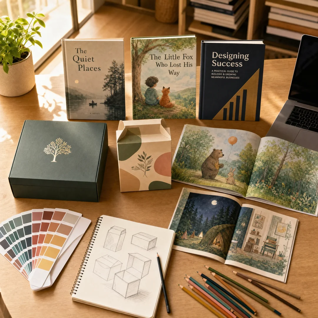
Our in-house design team isn’t a generic graphic design shop that does “a bit of everything.” We specialize in three categories—and we’re really good at them: books, packaging, and children’s books. Why these three? Because each one requires a fundamentally different design approach, and we’ve built deep, category-specific expertise that generalist designers simply don’t have.
Why Category-Specific Design Matters
Here’s a hard truth you’ve probably already suspected: a designer who’s great at corporate brochures might produce a terrible children’s book cover. Someone who nails minimalist packaging for a skincare brand might completely miss the mark on a fantasy novel layout.
Every print category has its own visual language. Its own rules. Its own audience expectations.
A trade paperback novel needs typography that disappears—invisible design that lets the reader sink into the story. A luxury gift box needs to communicate value before the lid is even lifted. A children’s board book needs to hold a toddler’s attention for more than four seconds while surviving everything that toddler can throw at it.
Our team lives and breathes these distinctions. We don’t apply a one-size-fits-all template. We start every project by asking: who is this for, where will they encounter it, and what do they need to feel when they see it?
Book Design: Where Content Meets Craft
Book design is deceptively difficult. It’s not just about making things “look nice.” It’s about typography that enhances readability across 300 pages without fatiguing the eye. It’s about margins and gutters that account for binding methods. It’s about a cover that works equally well as a tiny Amazon thumbnail and as a full-sized bookstore display.
Our book design process covers:
Cover Design
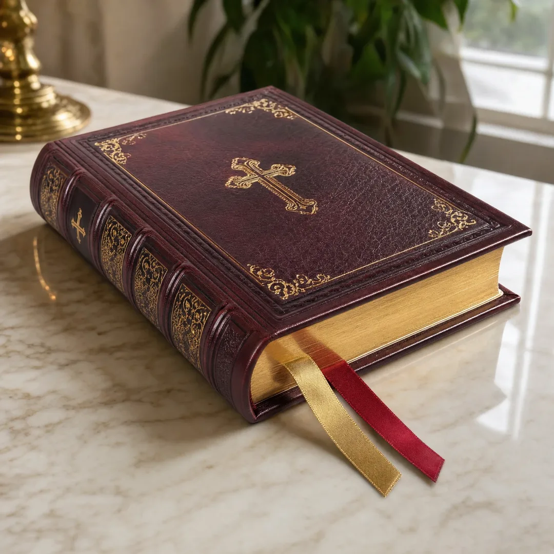
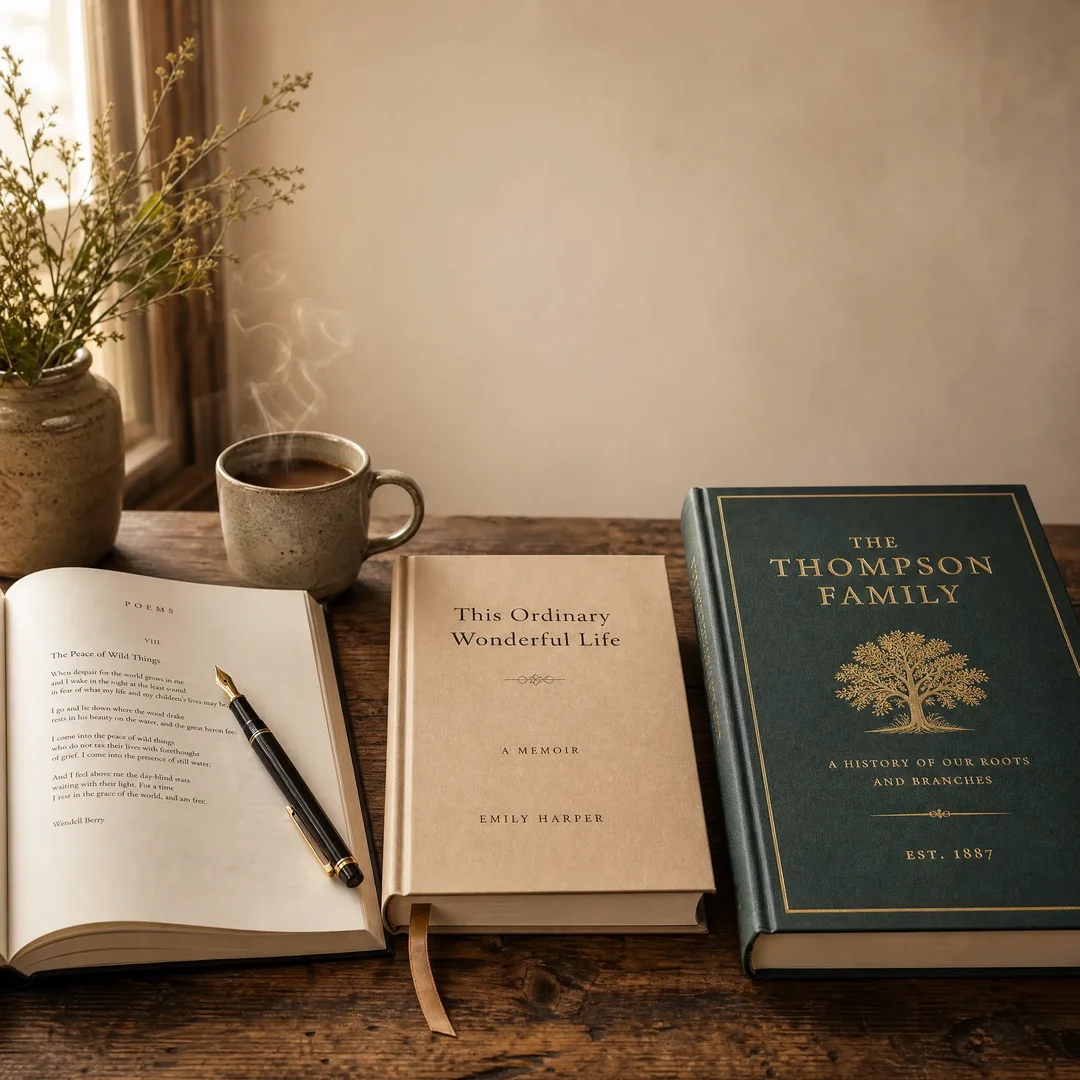
The cover is your book’s handshake with the world. We design for both impact and category signals—a reader should know within half a second whether they’re looking at a romance novel, a business book, or a literary memoir. We handle front cover, back cover, and spine as a unified composition, because in the real world, all three surfaces matter.
Interior Layout & Typesetting
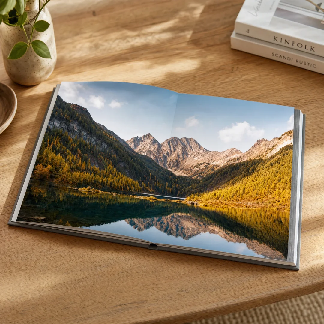
Bad typesetting is invisible to most readers—but they feel it. They’ll put the book down after ten pages and not know why. Good typesetting is what keeps them reading until 2 AM. We obsess over typeface selection, leading, kerning, widow/orphan control, and the rhythm of page turns. For image-heavy books like cookbooks, art books, and photography collections, we design layouts that give images room to breathe while keeping the reading flow intuitive.
Format-Specific Considerations
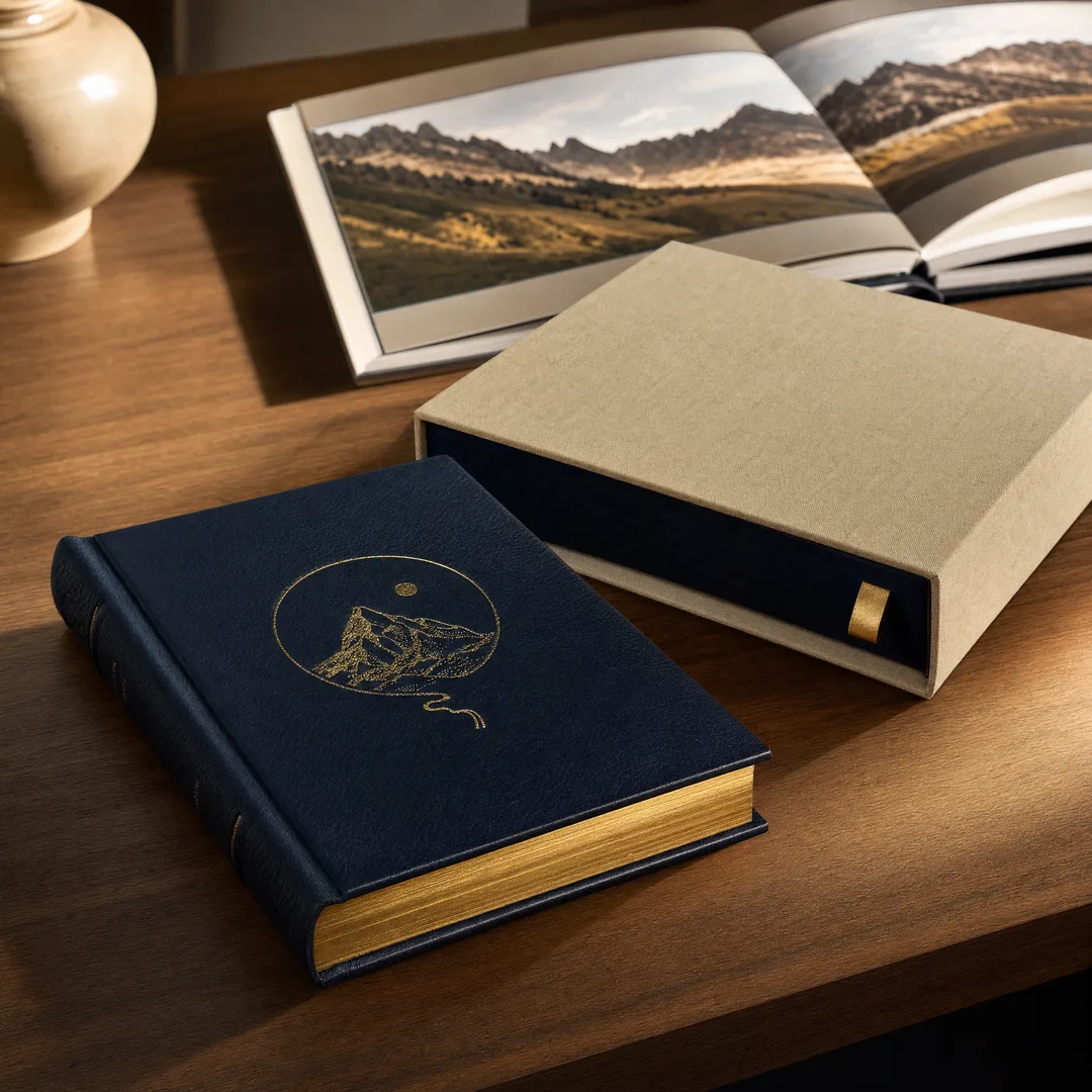
A hardcover case-bound book needs different design treatment than a wire-o bound workbook. A perfect-bound paperback handles differently than a saddle-stitched zine. We design for the binding , not despite it—accounting for gutter loss, hinge space, and how the book actually opens in a reader’s hands.
Packaging Design: The Silent Salesperson
Packaging is the most honest form of design. Your box sits on a shelf—or arrives on a doorstep—and has roughly two seconds to communicate quality, category, and brand identity. No salesperson standing next to it. No explainer video. Just the box.
Our packaging design process is rooted in understanding the full unboxing journey:
Structural Thinking
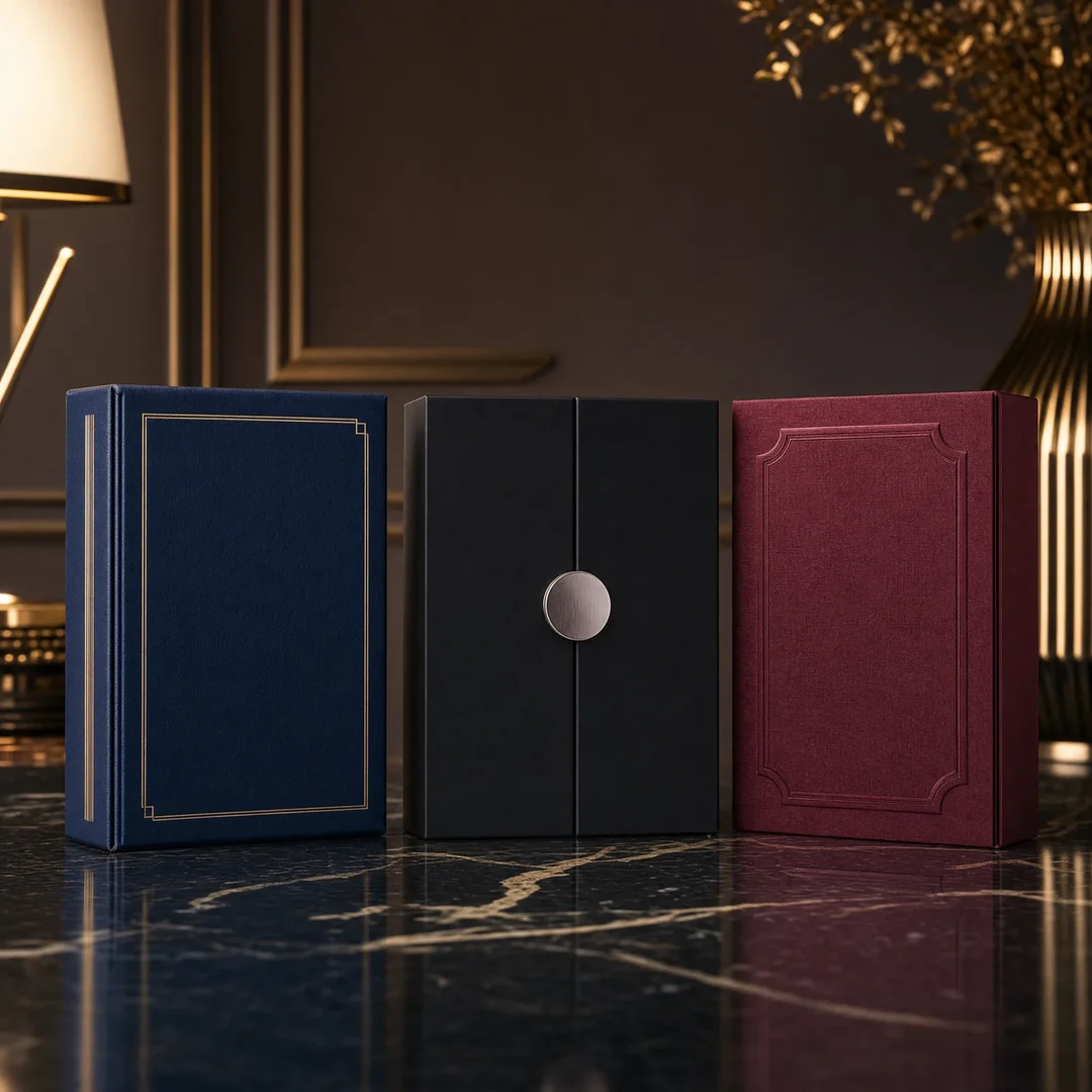
We don’t just design the graphics—we think about how the box is constructed, opened, and experienced. A rigid magnetic-closure box should feel substantial. A folding carton should be intuitive to open. A tuck box for retail should survive being picked up, examined, and put back down a hundred times. We design knowing the physical reality of the product.
Surface Design & Finishes
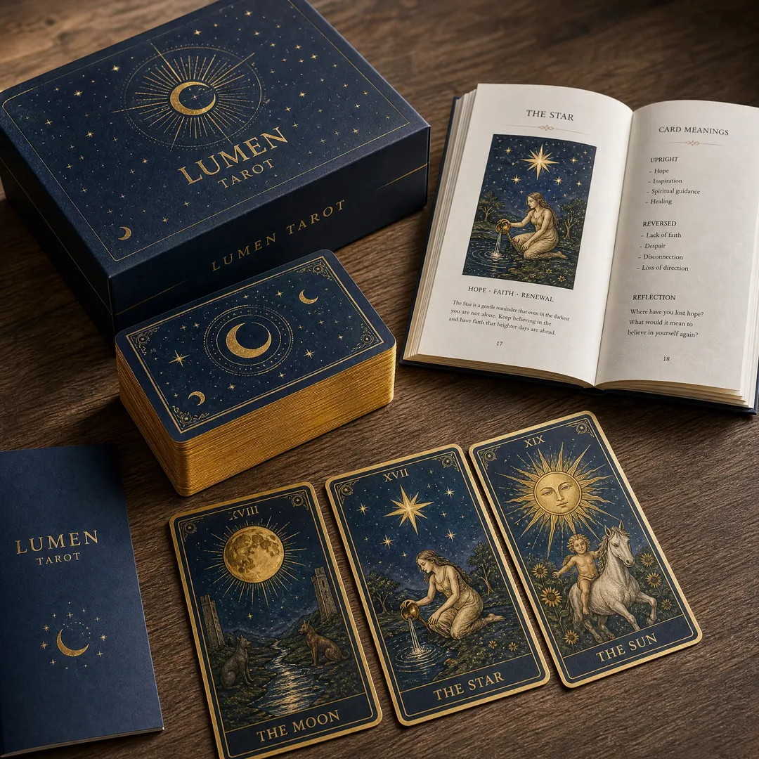
The most stunning packaging design in the world means nothing if it can’t be produced. We specify materials, coatings, and finishes with production reality in mind—whether it’s matte lamination with spot UV accents, foil stamping on textured paper, or full-color printing on kraft board. We know what works at scale because we work directly alongside the production team.
Brand Consistency at Scale
If you’re launching a product line, every box in the family needs to feel like part of the same story. We develop design systems, not just individual designs—color palettes, typography hierarchies, and visual motifs that scale across SKU variations while maintaining instant brand recognition.
Children’s Book Design: The Hardest Easy Job
Children’s book design looks simple. It’s anything but.
You’re designing for possibly the most demanding audience on the planet: a four-year-old who will judge your book entirely by its cover and interior spreads, in about three seconds total. Meanwhile, you also need to appeal to the adult making the purchasing decision—the parent, grandparent, teacher, or librarian who’s scanning shelves for something that looks trustworthy, educational, and worth $15.99.
We bridge both audiences simultaneously.
Age-Appropriate Visual Language
A board book for 0–2 year olds uses high-contrast, simple shapes and limited color palettes optimized for developing eyesight. A picture book for 3–5 year olds introduces more narrative complexity in the illustrations while keeping text sparse and integrated. A middle-grade chapter book transitions toward more sophisticated cover illustration while maintaining interior readability. We know the developmental stages and design accordingly.
Illustration Integration
Whether you’re working with your own illustrator or need us to connect you with one from our network, we ensure illustrations and text work as a unified reading experience—not two separate things that happen to share a page. We handle image placement, text wrapping, bleed considerations, and the flow from spread to spread that makes a picture book feel like a journey rather than a collection of pages.
Safety & Production Awareness
Children’s books have unique production requirements—rounded corners on board books, non-toxic inks, tear-resistant paper options, and compliance with safety standards like CPSIA and EN71. Our designs account for these from the start, so you don’t get to the production stage and discover your beautiful design can’t actually be manufactured safely for its intended audience.
Our Design Process
Every project follows a structured but flexible workflow that keeps you in the loop without drowning you in back-and-forth:
1. Discovery. We start by understanding your project, your audience, your market, and your goals. What’s the book about? Who’s buying it? What are the top three competing titles on the shelf? What’s the emotional response you want?
2. Concept Development. We produce 2–3 initial design directions, each with a distinct visual approach. You’re not choosing between minor variations of the same idea—you’re seeing genuinely different creative strategies.
3. Refinement. Based on your feedback, we refine the chosen direction. This is where we dial in typography, adjust color balances, test readability at different sizes, and ensure every detail serves the design’s purpose.
4. Production-Ready Files. We deliver print-ready files with correct color profiles (CMYK), bleed settings, safe zones, and resolution. No back-and-forth with the printer about “the file isn’t set up correctly.” We speak printer.
5. Pre-Production Proof Review. Before anything goes to press, we review the physical proof alongside you—checking color accuracy, binding alignment, finish quality, and overall execution against the design intent.
Why Design + Print Under One Roof Matters
Most publishers and brands work with separate design agencies and printing companies. The designer creates something beautiful. The printer receives the files. And somewhere in between, things get lost—a color that can’t be reproduced in CMYK, a foil stamp that bleeds into text at production scale, a spine width that doesn’t match the actual page count.
When design and print live under the same roof, those gaps don’t exist. Our designers sit down the hall from our production team. They know what each machine can and can’t do. They specify finishes and materials with firsthand knowledge of how those choices will actually look in the final product. The result: fewer revisions, faster turnaround, and a finished product that matches the vision.
Let’s Talk About Your Project
Whether you’re a self-published author with a finished manuscript, a brand launching a new product line, or a children’s book creator with illustrations ready to go—we’d love to hear about what you’re building.
Every project starts with a conversation. Tell us what you’re working on, and we’ll tell you how we can help make it look as good as it deserves to.
Ready to make your book, packaging, or children’s book visually stand out? Our design team is here to turn your vision into a production-ready reality.
Get a Free Design Consultation →